Icon - Arrow LeftAn icon we use to indicate a rightwards action. Icon - Arrow RightAn icon we use to indicate a leftwards action. Icon - External LinkAn icon we use to indicate a button link is external. Icon - MessageThe icon we use to represent an email action. Icon - Down ChevronUsed to indicate a dropdown. Icon - CloseUsed to indicate a close action. Icon - Dropdown ArrowUsed to indicate a dropdown. Icon - Location PinUsed to showcase a location on a map. Icon - Zoom OutUsed to indicate a zoom out action on a map. Icon - Zoom InUsed to indicate a zoom in action on a map. Icon - SearchUsed to indicate a search action. Icon - EmailUsed to indicate an emai action. Icon - FacebookFacebooks brand mark for use in social sharing icons. flipboard Icon - InstagramInstagrams brand mark for use in social sharing icons. Icon - PinterestPinterests brand mark for use in social sharing icons. Icon - TwitterTwitters brand mark for use in social sharing icons. Icon - Check MarkA check mark for checkbox buttons.
You are reading

A Revived Catalan-Modernist Apartment: Quintana Partners in Barcelona

Search

A Revived Catalan-Modernist Apartment: Quintana Partners in Barcelona

April 19, 2019

Several summers ago, our friend Megan Wilson returned from a vacation on the Spanish island of Menorca and introduced us to the work of Quintana Partners, a local interior design firm run by Pol Castells and Benito Escat. Tasked with revitalizing historic houses, the duo do more than respect the existing bones, they inject new life into them by assembling rooms that are all about joie de vivre: see, for instance, Casa Telmo and the QP Way with Kitchens.

The results are the opposite of most “decorated” projects. But make no mistake, plenty of thought and labor goes into every square foot: painted walls are scraped down to their atmospheric under layer, crumbling and non-existent period details are re-created rather than updated, and the duo supply furnishings found all over—but rarely in contemporary showrooms. “The most important aspect of what we do is the reutilization of existing elements in the renovation,” they write. “And we extend that mission to furniture: we believe in giving a second chance to waste.” Translation: they celebrate the used and the vintage.

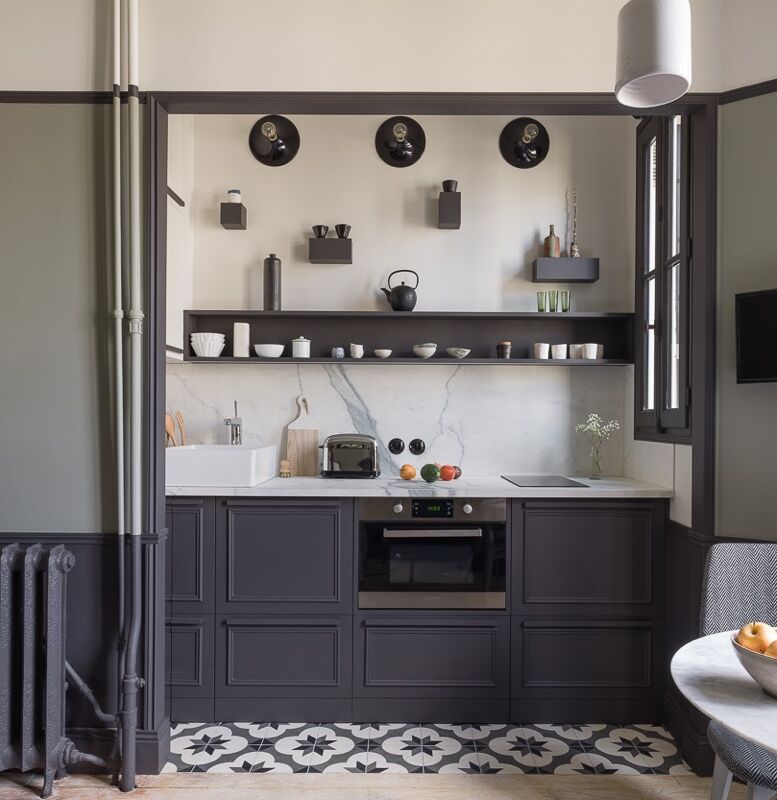
Demand for their work of late has grown far beyond Menorca, and so the duo recently took over an apartment in a Catalan-modernist building in Barcelona as a live/work second base. Its kitchen and bathrooms, they tell us, are tiny and impossible to photograph, but there’s still plenty to see.

Photography courtesy of Quintana Partners.
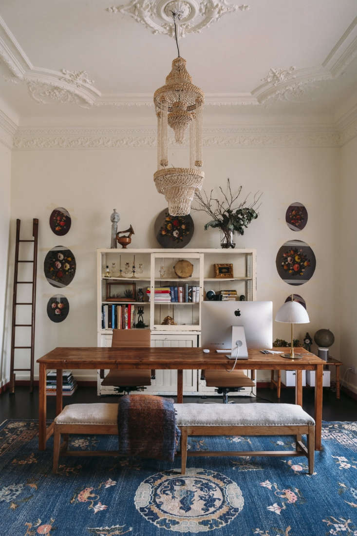
off the entry, a work table stands on a chinese art deco rug under a beaded cha 17
Above: Off the entry, a work table stands on a Chinese art deco rug under a beaded chandelier.

“We were looking for a big, beautiful, well-located space,” says Pol, “Catalan modernist is a building style inspired by visionaries like Gaudí that has attracted us since ever.” Located in Barcelona’s Eixample district, the apartment is in a late-19th century family residence with soaring ceilings and moldings typical of fin-de-siècle Spanish design. The space had been  well-maintained and mainly required repair work and paint.

design books and magazines are surrounded by some of the duo&#8\2\17;s late 18
Above: Design books and magazines are surrounded by some of the duo’s latest finds, including a pair of Venetian glass candelabra and a Wardian-style terrarium case.
the other half of the room has a sitting area, a dining table/meeting space, an 19
Above: The other half of the room has a sitting area, a dining table/meeting space, and a sculptural faux ham on the wall. The baseboards are trimmed in the same brick color that’s used on the wainscot in the adjacent sun room.
an arched entry leads to a long, narrow lounge with its original divided glass  20
Above: An arched entry leads to a long, narrow lounge with its original divided glass wall and a refinished ebonized floor. The designers scraped away the ceiling paint and left it as is, detailed with a small blue milk glass pendant.
the room overlooks a roof terrace with a tiled pavilion. just about all of the  21
Above: The room overlooks a roof terrace with a tiled pavilion. Just about all of the furnishings are flea market finds.
fish patterned majolica plates and a combination lamp and plant stand. 22
Above: Fish-patterned majolica plates and a combination lamp and plant stand.
a marble topped table and iron chairs on the terra cotta tiled terrace with a r 23
Above: A marble-topped table and iron chairs on the terra-cotta tiled terrace with a rear-window view.
a \1970s leather sofa looks surprisingly at home in the stripped bare living ro 24
Above: A 1970s leather sofa looks surprisingly at home in the stripped-bare living room.
the hallway walls were stripped down to their first layer of paint and the orig 25
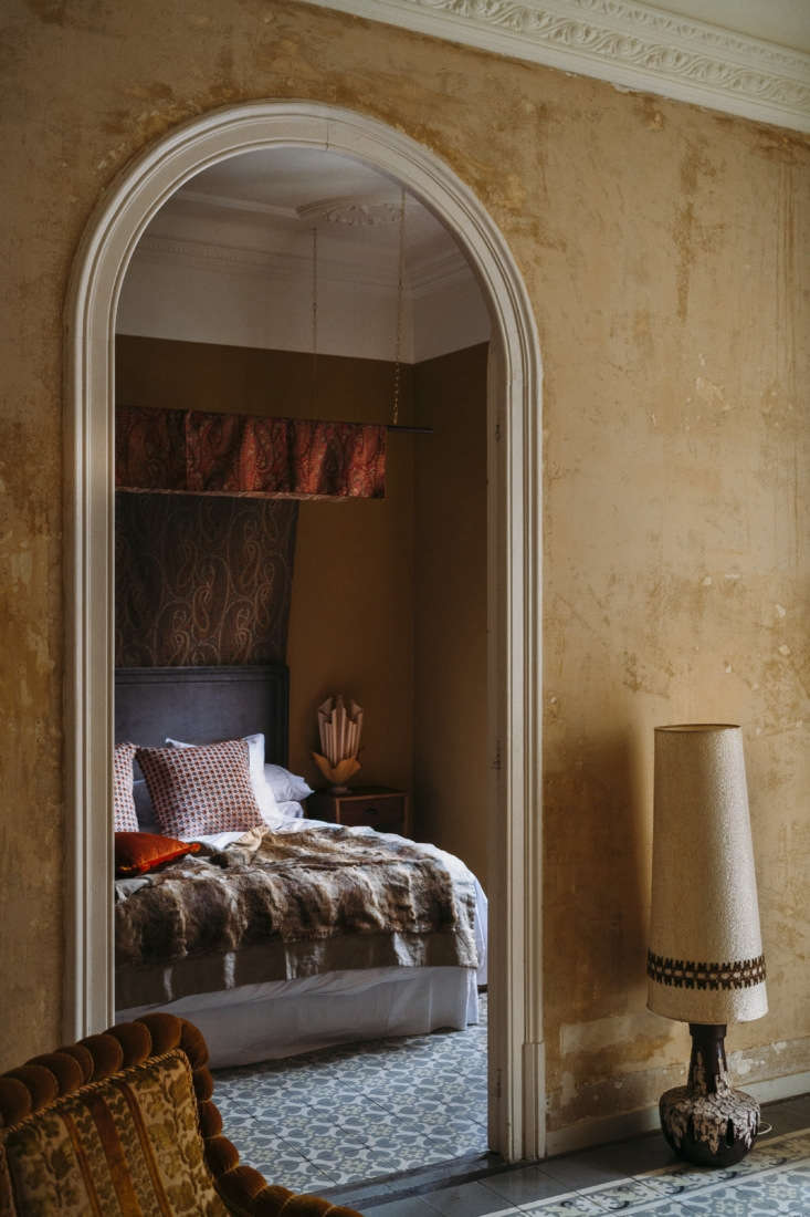
Above: The hallway walls were stripped down to their first layer of paint and the original cement floor tiles were preserved. In the master bedroom, a homemade paisley canopy hangs against an unusual upper wall treatment.

Where Quintana Partners go, we follow. Here are some projects of theirs on Menorca, their home base:

(Visited 2,837 times, 1 visits today)
You need to login or register to view and manage your bookmarks.

Have a Question or Comment About This Post?

Join the conversation

v5.0