Icon - Arrow LeftAn icon we use to indicate a rightwards action. Icon - Arrow RightAn icon we use to indicate a leftwards action. Icon - External LinkAn icon we use to indicate a button link is external. Icon - MessageThe icon we use to represent an email action. Icon - Down ChevronUsed to indicate a dropdown. Icon - CloseUsed to indicate a close action. Icon - Dropdown ArrowUsed to indicate a dropdown. Icon - Location PinUsed to showcase a location on a map. Icon - Zoom OutUsed to indicate a zoom out action on a map. Icon - Zoom InUsed to indicate a zoom in action on a map. Icon - SearchUsed to indicate a search action. Icon - EmailUsed to indicate an emai action. Icon - FacebookFacebooks brand mark for use in social sharing icons. flipboard Icon - InstagramInstagrams brand mark for use in social sharing icons. Icon - PinterestPinterests brand mark for use in social sharing icons. Icon - TwitterTwitters brand mark for use in social sharing icons. Icon - Check MarkA check mark for checkbox buttons.
You are reading

Sculptural Minimalism: A Winery Guesthouse by a French Architect in Portugal’s Douro Valley

Search

Sculptural Minimalism: A Winery Guesthouse by a French Architect in Portugal’s Douro Valley

February 28, 2022

Ever since Julie stumbled upon Quinta da Corte, a newly revamped guest house at a winery in Portugal’s Douro Valley, we’ve been admiring its warm minimalism, the way the silhouettes of the furniture balance each other, and how plenty of negative space—textural plaster walls—frames the rooms like art.

The 200-year-old winery, renowned for its ports and red wines and owned by French art collector and winemaker Philippe Austruy, had fallen into disrepair before he bought it, and has recently been brought back from the ashes by French architect-of-the-moment Pierre Yovanovitch. Among the buildings is a guest house, complete with sitting areas, a library, a kitchen, and eight bedrooms.

Yovanovitch, a collector and a furniture designer himself, filled the rooms with vintage pieces, his own designs, a palette of neutrals and rust, and objects—ceramics, ashtrays—by local Portuguese makers. We can’t quite put our finger on this style that we’re noting everywhere—sculptural minimalism? Or, as Quinta da Corte calls it, “studied simplicity?” But it’s our new favorite point of view when it comes to interiors. Take a look inside the guest house.

a living area is a study in balance (sculptural ceiling light, curvaceous firep 17
Above: A living area is a study in balance (sculptural ceiling light, curvaceous fireplace, slim-limbed armchairs), color (neutral furniture paired with deep blue-grey and rust), and pattern (on the coffee table, armoire, painted geometric ceiling, and the woven straw and leather Tuareg mat, which we included in our post New Directions: 18 Design Trends for 2018).
 plenty of empty space and unadorned walls keep the room from feeling too  18
Above: Plenty of empty space and unadorned walls keep the room from feeling too busy.
another living space in a cohesive color palette, with a black painted ceiling  19
Above: Another living space in a cohesive color palette, with a black-painted ceiling and black rug. The sheepskin chair is Yovanovitch’s own design, and on the shelves are the winery’s own bottles. Note how the floor tiles continue up the walls, into a geometric baseboard of sorts.
Sculptural Minimalism A Winery Guesthouse by a French Architect in Portugals Douro Valley portrait 6
Above: In a small living area off of the kitchen, a vibrant rug sets off a surprising palette of pale yellows and greens. The table is a collaboration between Yovanovitch and ceramist Armelle Benoit.

Nearby is the library, where Yovanovitch chose each of the titles himself.

 the table in the dining area is inspired by one the architect remembers f 21
Above: The table in the dining area is inspired by one the architect remembers from his childhood, in his family’s Alpine chalet; this recreation features tiles hand-painted with a map of the Douro Valley. The diamond pattern on the floor is hand-drawn and slightly imperfect.
in the combined kitchen and dining room, walls are tiled in traditional portugu 22
Above: In the combined kitchen and dining room, walls are tiled in traditional Portuguese azulejosFor the pale-pink glass light installation, Yovanovitch collaborated with Swiss glassmaker Matteo Gonet.

Meals cooked at the casa include “toasted almonds, homemade jams,” honey, and olive oil, all procured locally and from the grounds.

 the eight guest bedrooms are coated in plaster, so that even empty walls  23
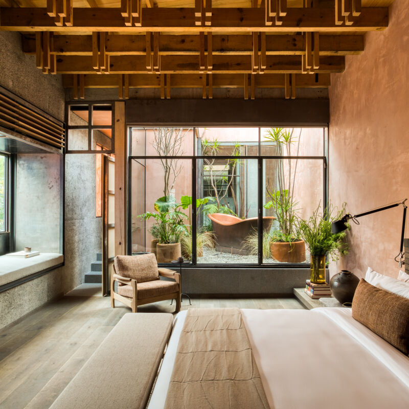
Above: The eight guest bedrooms are coated in plaster, so that even empty walls feel textural. Note the sense of balance here, too, with a pear-shaped sconce weighted against the small black-painted window on the other side of the room, and a chair and tall lamp on either side of a recessed niche.
another guest bedroom, with embroidered bed linens and subtle dashes of color. 24
Above: Another guest bedroom, with embroidered bed linens and subtle dashes of color.
each bedroom is fitted with rattan lamps, mix and match patterned blankets, and 25
Above: Each bedroom is fitted with rattan lamps, mix-and-match patterned blankets, and a rotary phone, an indication of the property’s low-fi, off-the-grid ethos.
a glimpse into a tile clad guest bathroom. 26
Above: A glimpse into a tile-clad guest bathroom.
 &#8\2\20;with its old style windows and shutters and its whitewashed  27
Above: “With its old-style windows and shutters and its whitewashed walls which blend the colors of the surrounding greenery with the sparking yellow of the sun, this old building seems to be alive with the souls of its various past owners,” according to the Quinta da Corte site.

Interested in booking a stay? Go to Quinta da Corte for more information.

Portugal is having a moment. For more places to stay, eat, and shop, see our Portugal Design Guide. And for more examples of what we’re calling “sculptural minimalism,” see:

(Visited 1,867 times, 2 visits today)
You need to login or register to view and manage your bookmarks.

Have a Question or Comment About This Post?

Join the conversation

v5.0