Icon - Arrow LeftAn icon we use to indicate a rightwards action. Icon - Arrow RightAn icon we use to indicate a leftwards action. Icon - External LinkAn icon we use to indicate a button link is external. Icon - MessageThe icon we use to represent an email action. Icon - Down ChevronUsed to indicate a dropdown. Icon - CloseUsed to indicate a close action. Icon - Dropdown ArrowUsed to indicate a dropdown. Icon - Location PinUsed to showcase a location on a map. Icon - Zoom OutUsed to indicate a zoom out action on a map. Icon - Zoom InUsed to indicate a zoom in action on a map. Icon - SearchUsed to indicate a search action. Icon - EmailUsed to indicate an emai action. Icon - FacebookFacebooks brand mark for use in social sharing icons. flipboard Icon - InstagramInstagrams brand mark for use in social sharing icons. Icon - PinterestPinterests brand mark for use in social sharing icons. Icon - TwitterTwitters brand mark for use in social sharing icons. Icon - Check MarkA check mark for checkbox buttons.
You are reading

Plain English in Brooklyn Heights: A Very Proper Elizabeth Roberts Townhouse Remodel

Search

Plain English in Brooklyn Heights: A Very Proper Elizabeth Roberts Townhouse Remodel

November 14, 2018

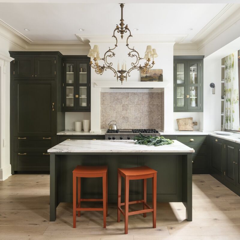
If Brooklyn townhouses could speak this one would have a detectable British accent. The structure’s local claim to fame is two-fold: its intensive renovation was done entirely in character with its first half of the 19th century Greek Revival/Italianate heritage, a job tackled by Brooklyn It Firm Elizabeth Roberts Architecture & Design. And the kitchen is the very first that Plain English installed in this country (the longstanding Remodelista favorite recently established a Manhattan showroom).

Back in 2010, the owners, a European couple who work in finance, found the property to their amazement on Craiglist. Situated on one of Brooklyn Heights’ stateliest streets, the place hadn’t been lived in for so long it still had gas fixtures: “Nothing was working and the kitchen looked like a scary movie,” says the design-minded member of the couple. She reached out to Elizabeth Roberts for what was initially going to be a “light-touch project.” Back then the architect, who also has a masters in historic preservation, ran a two-person office out of her own Clinton Hill townhouse–see House Call and pages 76 to 91 of Remodelista: A Manual for the Considered Home. The firm has since expanded to a team of 19.

Along the way the couple had two children, and an assessment of requirements for the house and family morphed into a gut remodel plus an addition: “very little was in good enough shape to save, including the stairs and doors,” explains the owner. Having lived in London for a time, she has an eye for traditional workmanship and old-school detailing—and was able to swing for what she wanted. “While remaining very faithful to the original layout, great care was taken to create a new home with historic character throughout,” says Josh Lekwa, who, with Roberts, served as head architect and historian. Come see the house as it was (scroll to the very end) and now.

Photography by Dustin Aksland, courtesy of Elizabeth Roberts Architecture & Design, unless noted.
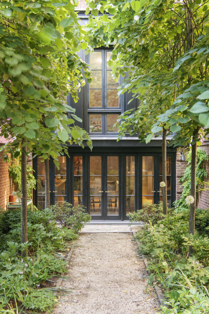
the house’s back addition was modeled after “the tea porch extens 17
Above: The house’s back addition was modeled after “the tea porch extensions often introduced to these brownstones in the 1850s,” says Lekwa. It replaced an existing dilapidated two-story addition, and, Lekwa notes, “is almost entirely window, but rather than do a huge sheet of glass, we articulated the garden floor with brick piers at the sides. We painted it black just like the old extension.”

The custom mahogany windows were built by Architectural Components and the surrounding walls are handmade brick from the Old Carolina Brick Co. Stay tuned: we’ll be exploring the Miranda Brooks-designed garden on Gardenista.

The family enter the house at the garden level front of the house (the façade wasn’t worked on during the remodel and no photos are available).

Garden Level
Plain English in Brooklyn Heights A Very Proper Elizabeth Roberts Townhouse Remodel portrait 7
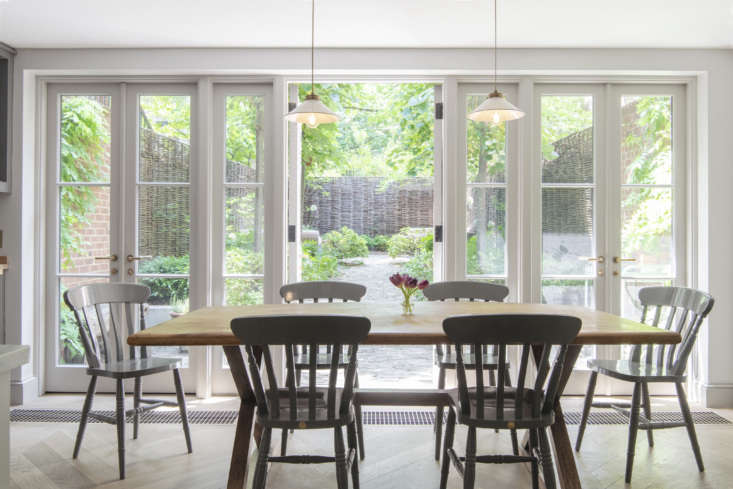
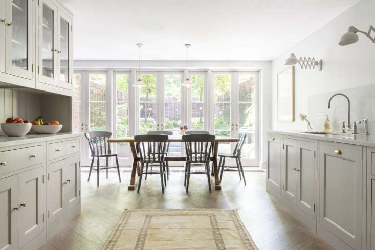
Above: The owners decided to keep the kitchen in its original location because they like the link to the garden—”when we lived on the upper stories of a townhouse, we almost never used the stairs to the garden”—and wanted a big living room on the parlor floor. The eating area is set in the extension, which is the width of the house and 10 feet deep.

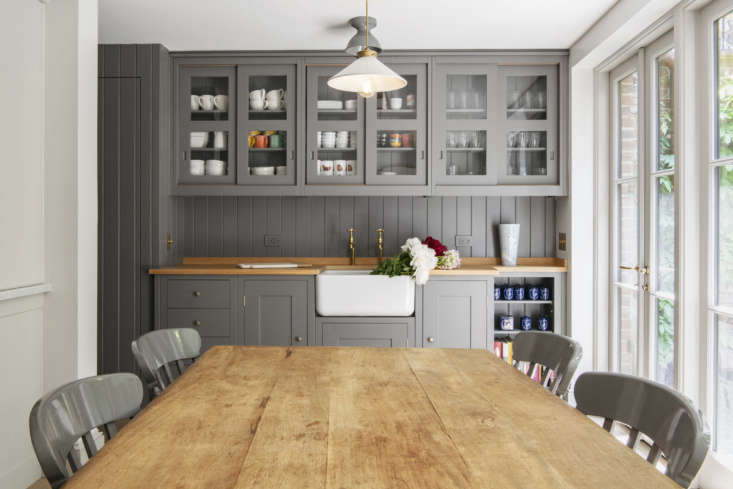
Christopher Howe painted Windsor Chairs surround a Spanish table the family have used in various ways: “it’s been everything from a dining table to a desk.” The hanging lights are Lucia Pendants from British company Hector Finch. The white oak chevron floorboards from The Hudson Company are finished with Rubio Monocoat.
on a work trip to london, the owner made a reconnaissance visit to plain englis 19
Above: On a work trip to London, the owner made a reconnaissance visit to Plain English’s showroom planning to come away with some ideas—but was so taken with the modern-traditional look and quality that with her design team’s approval she placed an order. “I explained what I wanted and Plain English came up with it,” she says. “The back and forth was almost non-existent; here you have to talk everything to death.”
the counters are topped with carrara marble that continues as a backsplash. all 20
Above: The counters are topped with Carrara marble that continues as a backsplash. All of the faucets throughout the house are Barber Wilsons designs—and like the kitchen, the owner had them sent from London: “You can get them in this country but I went to Holloway’s of Ludlow. Even with shipping, I paid considerably less.” (During installation, their crew consulted with the “very knowledgable” Barber Wilsons customer service team based in Riverhead, New York.)

Plain English supplied the unlacquered brass cabinet hardware. The scissor lights are Christian Dell’s Kaiser Idell wall lamps from Fritz Hansen. Photograph courtesy of Plain English.
plain english is known for its elegant renditions of classic british cabinetry, 21
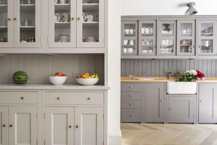
Above: Plain English is known for its elegant renditions of classic British cabinetry, all made by hand at the company’s Georgian farm in Suffolk. Shown here, the floor-to-ceiling china cupboard and, in the eating area, a second sink and work area that gets used as a bar during parties. “I asked that both have counters that are a little higher than usual, so they can be used for storage and the main sink/stove counter is kept clear for food prep,” says the owner.
the butler&#8\2\17;s sink counter is adjacent to a beadboard paneled mudroo 22
Above: The butler’s sink counter is adjacent to a beadboard-paneled mudroom. The counter is Plain English oak butcher block. The gray ceramic ceiling light is the Alabax from Schoolhouse Electric.

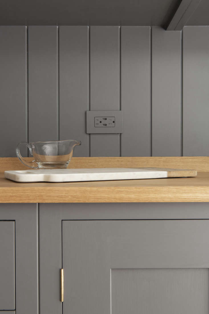
The cabinets and chairs are painted in Dark Lead 118 and the surrounding pale gray is French Grey 113, both in hard-wearing oil eggshell from Little Greene Paint of London.

barber wilsons hot and cold taps in unlacquered brass and a shaws original farm 23
Above: Barber Wilsons hot and cold taps in unlacquered brass and a Shaws Original farmhouse sink. The counter is Plain English oak butcher block.
Above L: The cabinetry was shipped from England already painted; it was given a second coat on site. The outlet is a painted Lutron with a screwless plate. Above R: A handy niche. The light switches throughout are by Forbes & Lomax.
the range is la canche&#8\2\17;s saulieu classique in matte black. the 26
Above: The range is La Canche’s Saulieu Classique in matte black. The pull-out cabinets on either side of it hold pots and pans.
an integrated sub zero double doored fridge in the back of the room is flanked  27
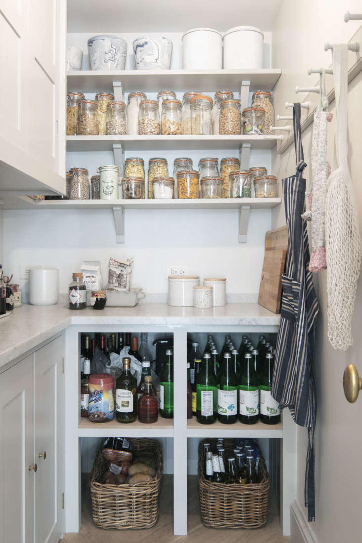
Above: An integrated Sub Zero double-doored fridge in the back of the room is flanked by a pantry on one side and the mudroom on the other.
a proper pantry with a marble counter and a peg rail for shopping bags and apro 28
Above: A proper pantry with a marble counter and a peg rail for shopping bags and aprons. Dry goods are decanted into Le Parfait Jars. The upper cabinets hold the microwave and coffee machine; bakeware is stowed in the lower ones.
the powder room is papered in cfa voysey&#8\2\17;s \19\26 pattern apothecar 29
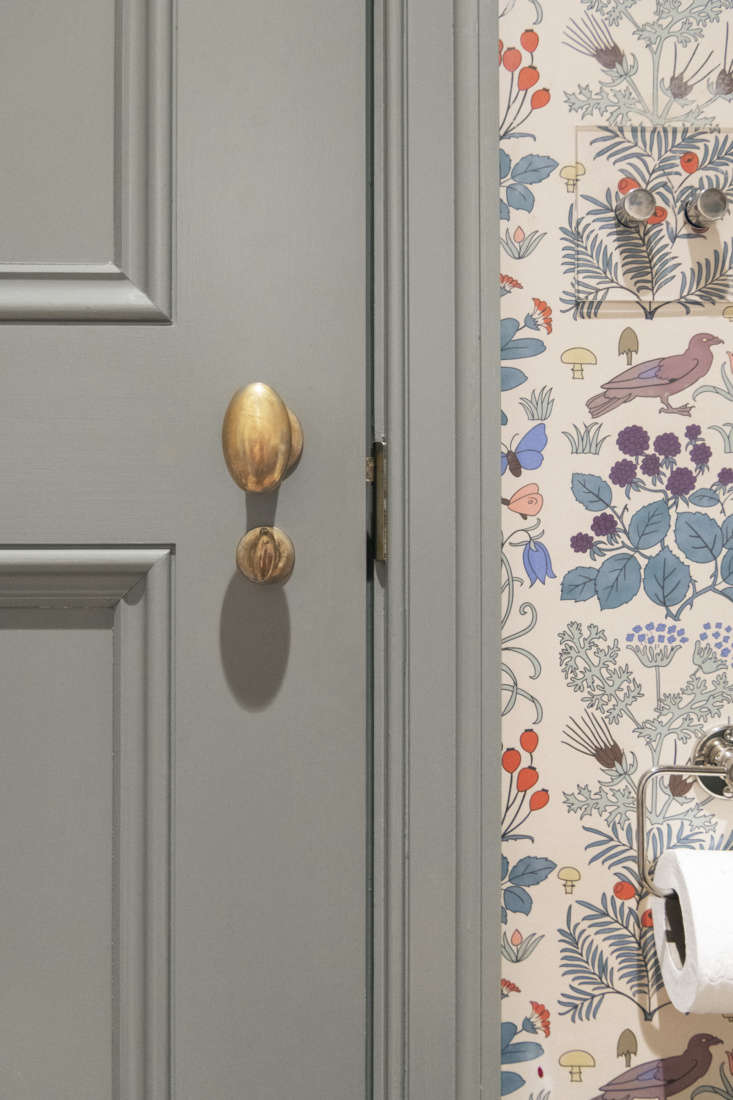
Above: The powder room is papered in CFA Voysey’s 1926 pattern Apothecary’s Garden from Trustworth Studios. (See the same pattern in a Jersey Ice Cream Co. country house bedroom.) The sconce over the mirror is the Glass Wall Light from Hector Finch.
Above L: The house’s doorknobs are Nanz’s No. 1019 in unlacquered brass. Above R: Linocut prints by Hugo Guinness.
&#8\2\20;the original stair on this level was long gone, so we created a de 32
Above: “The original stair on this level was long gone, so we created a design that felt right,” Lekwa tells us. “The treads are white oak, the handrail is mahogany to match the original on the upper floors, and Elizabeth Roberts designed the custom beadboard paneling.”

After the long process of securing building permits, general contractor Douglas Cohen of D.H.E. Company was on the job for two years.

Parlor Floor

&#8\2\20;our client really wanted the final product to feel like an intact  33
Above: “Our client really wanted the final product to feel like an intact 19th century townhouse that had been minimally updated,” says Lekwa. The south-facing parlor floor is painted Greville, a pink by Adam Bray of London (see Bespoke Color from an Accidental Decorator) and has baseboards that are reproductions of the originals.

The owner is doing all the furnishing and decorating herself: “I have a job and kids, so it’s taking a long time—my husband was threatening to go to Ikea to buy a sofa himself.” (They now we have one coming from Christopher Howe.) Shown here are placeholders: a settee purchased long ago on eBay—”it’s the most uncomfortable thing ever”—and a loveseat from their former entry.

the room&#8\2\17;s greek revival portoro marble mantel was sourced from dem 34
Above: The room’s Greek Revival Portoro marble mantel was sourced from Demolition Depot—it came out of a house of the same period in the West Village.

Second Floor

the master bath—which doubles as a study—features a six foot plus 35
Above: The master bath—which doubles as a study—features a six-foot-plus antique tub: mother and children can all fit in.

The owner bought the bath from a UK antiques dealer on eBay and asked if he’d hold onto it for her—construction on the house hadn’t even begun. She wasn’t back in touch with him for six years: “I was scared to find out he’d gone out of business. When I finally did call, he said, “‘Oh hi,’ as if no time had passed. He had it at the bottom of a storage facility and just asked for two weeks notice when we were ready for it.”

the tub&#8\2\17;s faucets are original, newly restored to working order; no 36
Above: The tub’s faucets are original, newly restored to working order; note the tub’s crackle glaze. All of the windows in the house are new—”weight and chain, double hung with restoration glass,” specifies Lekwa. The front-facing rooms have custom pocket shutters: “The originals were American-style slatted but these are solid panels, per my request,” says the owner. She found the faux-bamboo mahogany shelves on Chairish.

The room’s woodwork is painted in Farrow & Ball’s Shadow White and the walls are Benjamin Moore’s White Dove.

Third Floor

the skylit top floor is the children&#8\2\17;s quarters. the mahogany handr 37
Above: The skylit top floor is the children’s quarters. The mahogany handrail is original and the rest is a replica. The walls are painted Cromarty and the trim is Shadow White, both from Farrow & Ball.
the 0ld fashioned look continues in the children&#8\2\17;s bath. &#8\2\ 38
Above: The 0ld-fashioned look continues in the children’s bath. “Our clients’ kids are young and like to splash,” says Lekwa, “so to keep the tub surround from falling apart, it’s milled out of PVC: when carefully hand-painted, even I can’t tell the difference.”
the room is papered with lee, a tiny star pattern from hinson. the pedestal sin 39
Above: The room is papered with Lee, a tiny star pattern from Hinson. The pedestal sink is the Richmond from St. Thomas Creations. The nickel faucets are Barber Wilsons—part of the owners order placed in London.
the house&#8\2\17;s only original, untouched detail is this wooden bedroom  40
Above: The house’s only original, untouched detail is this wooden bedroom mantel: “Our client wanted to leave something that was old and not fixed up,” says Lekha. (It, nonetheless, has a new Italian slate surround selected for its matte finish.) The vintage steel and wood Result Chair is a 1950s Dutch design currently being reproduced by Hay.
spatter wallpaper in another children&#8\2\17;s bath. the framed medicine c 41
Above: Spatter wallpaper in another children’s bath. The Framed Medicine Cabinet is from Restoration Hardware—a more more affordable version of the Urban Archaeology’s Lenox Cabinet,” says the owner.
campaign canopy beds from anthropology (since discontinued) came out of storage 42
Above: Campaign canopy beds from Anthropology (since discontinued) came out of storage as temporary furnishings in one of the children’s rooms. The blankets are by Woolrich and the carpet is from Urban Outfitters.

Before

the tea room addition as found: it was likely added a century after the house w 43
Above: The tea room addition as found: it was likely added a century after the house was built and lacked a foundation.
the only thing the new kitchen has in common with the old is its location at th 44
Above: The only thing the new kitchen has in common with the old is its location at the garden level.
the top floor hall with skylight and banister that&#8\2\17;s still in use. 45
Above: The top floor hall with skylight and banister that’s still in use.

Three more Elizabeth Roberts’ townhouse transformations:

(Visited 8,030 times, 13 visits today)
You need to login or register to view and manage your bookmarks.

Have a Question or Comment About This Post?

Join the conversation

v5.0