It was the diffuse afternoon light that attracted Pia Ulin to her north-facing loft in Brooklyn’s Bed-Stuy. “I love the light: I see the sky, a church, and the Empire State Building from my windows. The orientation also means the rooms don’t get very hot,” says the star interiors photographer, who not coincidentally grew up in the north of Sweden and uses only natural light in her work.
When Ulin and her husband, a psychiatrist, made the big decision to rent their place in Skåne, Sweden, and turn New York into their main base, finding the right light wasn’t the only challenge. Located in a converted industrial building, their 950-square-foot apartment had been subdivided into “disproportionally small rooms with an even smaller living space,” says Anshu Bangia of Brooklyn’s Bangia Agostinho Architecture. Worse yet, the awkward layout obscured the expansive windows. At Ulin’s behest, Bangia and her partner (and husband) William Agostinho took down the walls. And then they erected an ingenious partial barrier that creates discreet living spaces with built-in storage while suffusing the loft with Ulin’s crucial ingredient.
Photography by Pia Ulin.
Above: “While the space of the apartment is open and continuous, it’s now regulated and partially enclosed by a hardworking cabinetry volume that contains bookshelves, a row of closets, and a photo pin-up wall,” explains Bangia. “The continuous ceiling and the now visible windows on the north side give a sense of expansive space.”
Shown here, the combination dining area/living room/study with three-quarter walls that allow the natural light to travel.

Above: Ulin brought most of the furnishings with her from Sweden. “Pia is constantly on the go for work and wanted a place that would be a respite,” says Bangia. “The renovation provides a canvas for the photographs, artwork, and objects she’s collected during her travels.”
A photograph by Ulin hangs over a sofa from Swedish furniture line Swedese layered with textiles by Aiayu (see Hello, Llama: Eco Housewares from a Danish Design Team). The rug came from Ulin’s parents’ home, and the leather swivel chair is a vintage find.
Above: “Our mandate was to find a way to infuse the light without sacrificing privacy,” Bangia told us. “Color was equally important. The walls and ceilings are the surfaces that receive this light, and the colors are tuned to their locations in the space.” The walls in the public spaces, including the study shown here, are Cornforth White and the ceiling throughout is Down Pipe, both from Farrow & Ball. The architects whitewashed the existing maple floor to harmonize with the new birch plywood cabinetry.

Above: A portrait of Georgia O’Keeffe by John Loengard rests on Ulin’s desk: “For 25 years I have been inspired by O’Keeffe, both as a woman and artist. It was a special day when I had earned enough money to buy a genuine Loengard.”

Above: The study has a built-in daybed that doubles as a guest bed (the architects note that it was “detailed to make use of stock-size birch plywood”). Brooklyn master upholsterers Interiors by George & Martha made the Kravet velvet mattress and the brass ceiling light is by Workstead. The large portrait above the daybed is of photographer Björn Terring who Ulin shared a studio with in Stockholm.
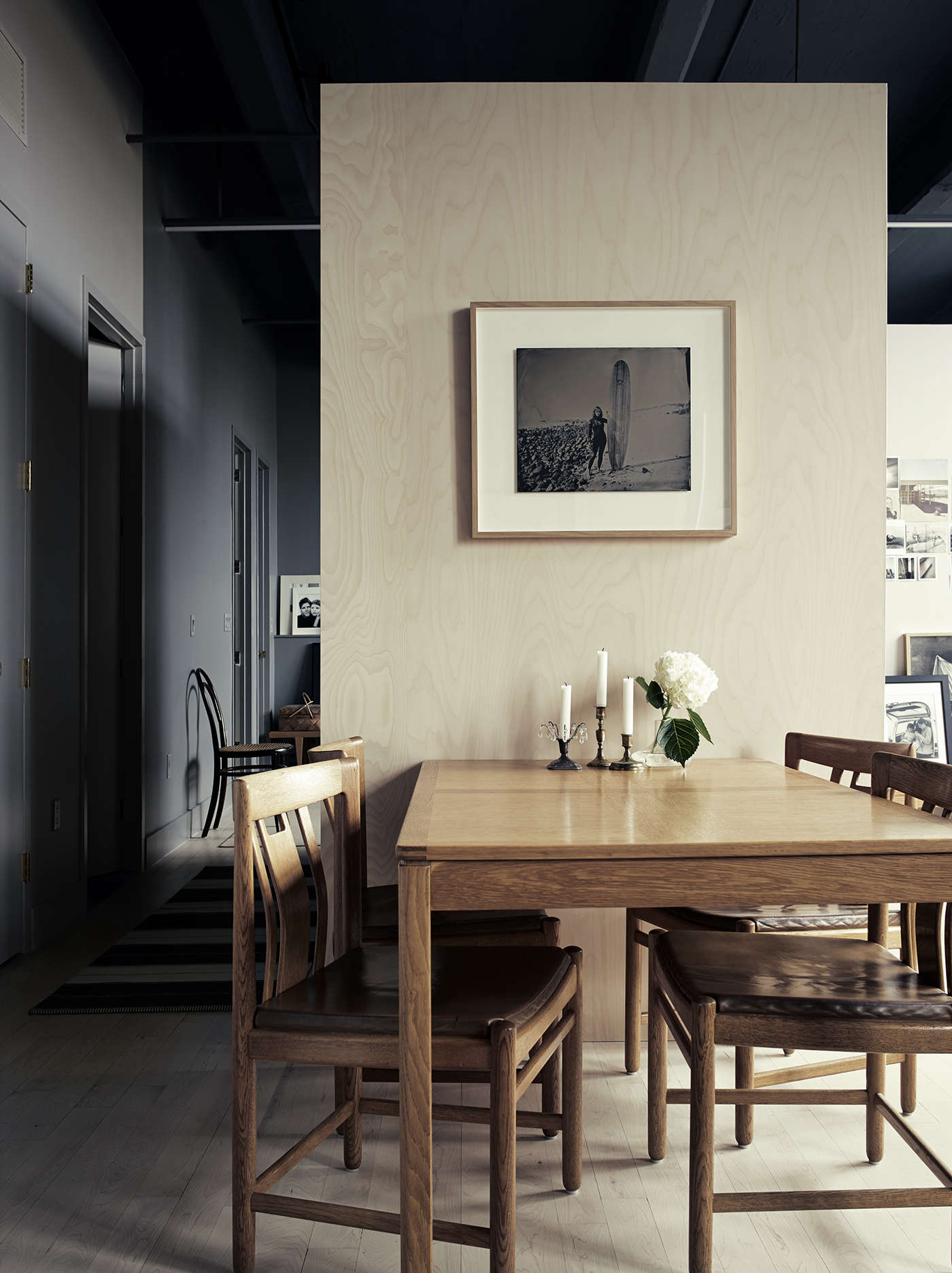
Above: Ulin spent her childhood eating at the loft’s Swedish oak dining table. The surfer portrait is by Joni Sternbach. A laundry closet and bathroom open off the adjacent hall, which leads to the master bedroom.
Above: The three-quarter wall construction extends into the all-new kitchen, which makes use of Ikea Sektion cabinetry custom finished with gray-painted fronts: “We detailed the kitchen in a simple, clean way without moldings or recessed panels. This allows the surfaces to appear unbroken and almost monolithic,” says Bangia.
Above: The counters are honed Carrara marble and the cabinets, like the ceiling, are Farrow & Ball Down Pipe. The range is a 24-inch Bertazzoni—”Americans always have such big stoves,” says Ulin, “but to fit the small scale this one looks so much better”—and the fridge is a Liebherr with custom panels and enclosure to match the cabinetry. Open shelves hold tableware and cookbooks, and carry on the birch ply design that crops up throughout. Ulin bought the brass pendant lights on a work trip in South Africa; they’re by Cape Town–based Swedish designer Alexandra Hörner.
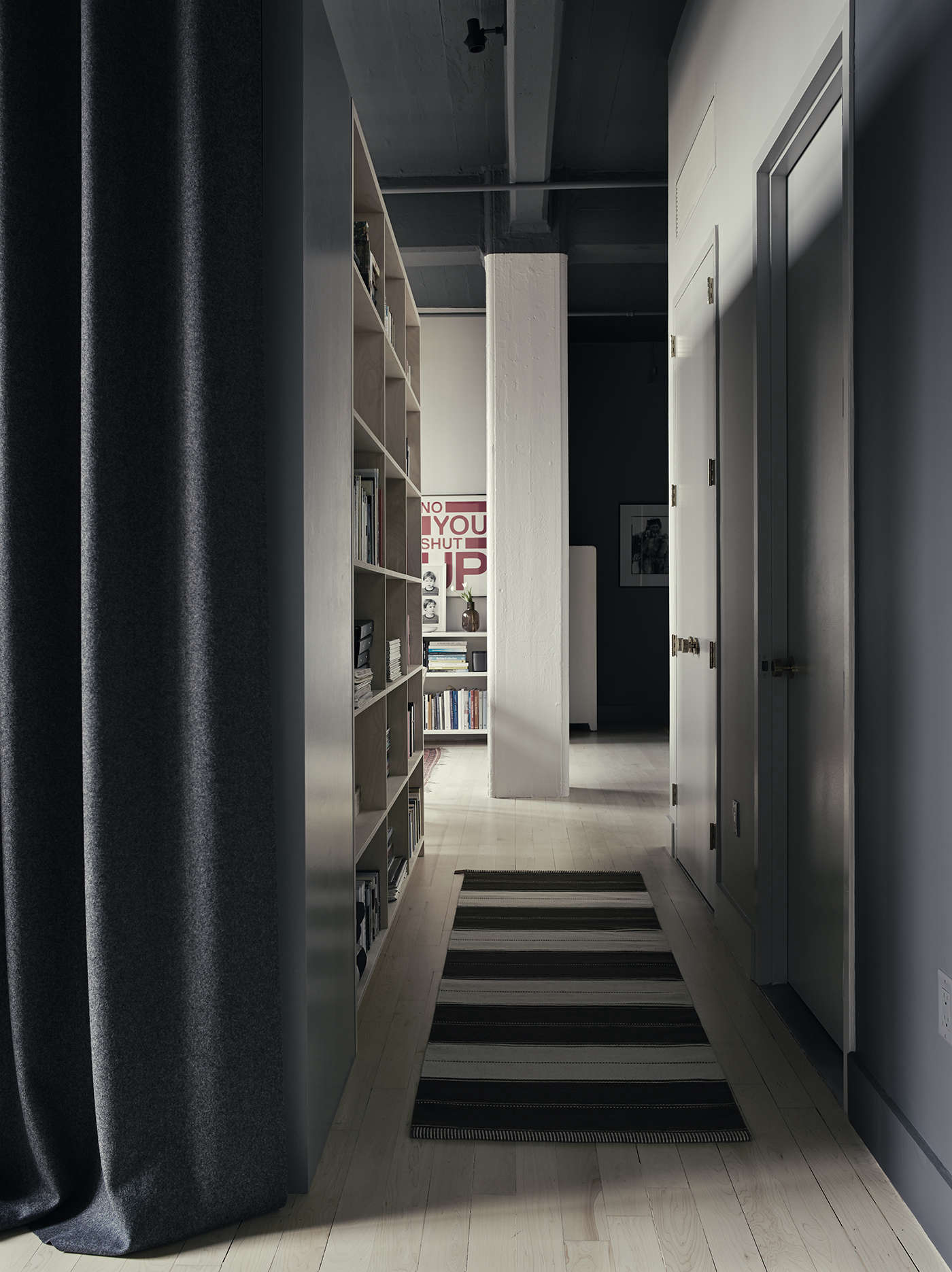
Above: Custom felt curtains, built-in bookshelves, and a striped Swedish runner lead the way to the bedroom.
Of the moody palette choice, Pia told us she was inspired by all the dark interiors she’s been photographing in Italy and Denmark in the last year: “Different shades of dark color have been the thing in the European interiors world.” And adds that since it’s such a big space, “it needed to be calmed down with color. Otherwise, it would just feel too big and naked. The colors really make it homey and help separate the ‘rooms’ in a nice way.”
Above: As in the kitchen, the architects enveloped the bedroom with “deeply painted hues of gray, indicating these areas as visually calm, and setting them in contrast with the light-filled main living space.” The walls here are Farrow & Ball’s Plummet. Note the built-in headboard: A clever design solution used here and along another wall to cover the existing fin-tube radiators, it serves as a windowsill-height ledge for artwork and lighting.
Above: There’s no lack of storage in the bedroom. And to enhance what Bangia calls “the sheltering quality of the room,” floor-to-ceiling felt curtains can be drawn along the closet wall and across the doorway. Made of Kvadrat felt, the drapes are the work of Brooklyn textile designer Elodie Blanchard. The windows, meanwhile, have simple blackout roller blinds from Mechoshades. The armchair and ottoman, from classic UK company Howard Chairs, are newly upholstered in a deep brown Kravet velvet and Ulin added the shaggy sheepskin.
Her report on Brooklyn loft life so far? “This is an amazing space for two grown-ups living in a hustle, bustle city. And the light is gorgeous.”
Above: The floor plan details the J-shaped “cabinetry volume” that forms the beating heart of the loft.
Go to Creating Calm and Luxe to see another Brooklyn space resuscitated by Bangia Agostinho Architecture.
Frequently asked questions
What is this article about?
This article is about a photographer named Pia Ulin and her Brooklyn loft remodel by Bangia Agostinho Architecture.
Who is Pia Ulin?
Pia Ulin is a photographer who has worked for publications such as Dwell, Gourmet, and T Magazine.
What kind of loft did Pia Ulin have?
Pia Ulin had a dilapidated loft in Brooklyn that was in need of a major renovation.
Who did the remodel of Pia Ulin's loft?
Bangia Agostinho Architecture did the remodel of Pia Ulin's loft.
What changes were made to Pia Ulin's loft during the remodel?
During the remodel, Pia Ulin's loft was transformed into a spacious and light-filled home with an open floor plan and custom-made furniture.
What was the inspiration behind the redesign of Pia Ulin's loft?
The inspiration behind the redesign of Pia Ulin's loft was to create a space that reflected Pia's personal style and also integrated her love of nature and travel.
What kind of materials were used in the renovation of Pia Ulin's loft?
Natural materials such as wood, stone, and metal were used in the renovation of Pia Ulin's loft.
Is there anything unique or interesting about the design of Pia Ulin's loft?
Yes, the custom-made furniture and artwork add a unique touch to the design of Pia Ulin's loft.
Where can I see more photos of Pia Ulin's renovated loft?
You can see more photos of Pia Ulin's renovated loft on the Remodelista website.







Have a Question or Comment About This Post?
Join the conversation