Icon - Arrow LeftAn icon we use to indicate a rightwards action. Icon - Arrow RightAn icon we use to indicate a leftwards action. Icon - External LinkAn icon we use to indicate a button link is external. Icon - MessageThe icon we use to represent an email action. Icon - Down ChevronUsed to indicate a dropdown. Icon - CloseUsed to indicate a close action. Icon - Dropdown ArrowUsed to indicate a dropdown. Icon - Location PinUsed to showcase a location on a map. Icon - Zoom OutUsed to indicate a zoom out action on a map. Icon - Zoom InUsed to indicate a zoom in action on a map. Icon - SearchUsed to indicate a search action. Icon - EmailUsed to indicate an emai action. Icon - FacebookFacebooks brand mark for use in social sharing icons. flipboard Icon - InstagramInstagrams brand mark for use in social sharing icons. Icon - PinterestPinterests brand mark for use in social sharing icons. Icon - TwitterTwitters brand mark for use in social sharing icons. Icon - Check MarkA check mark for checkbox buttons.
You are reading

Color Therapy: Surprising Shades in an Edinburgh Guesthouse

Search

Color Therapy: Surprising Shades in an Edinburgh Guesthouse

January 18, 2021

If I’m honest with myself, one of the main reasons I’ve gravitated toward all-white walls is that I’m indecisive and timid when it comes to color. I’ve seen so many reds-gone-awry and greens-on-acid in others’ homes that I’m quite happy to stick to palette-cleansing white. But then I come across a project like this one that uses color brilliantly, and I question my loyalty to Scandi walls.

The Pavilion at Lamb’s House, in Edinburgh, Scotland, is a “luxury self-catering” guesthouse designed and owned by architects Kristin Hannesdottir and Nick Groves-Raines, the founders of Groves-Raines Architects. Named by Conde Nast Traveler as one of the best places to stay in Edinburgh, the compact rental home features a different wall color in every room. “As the building is largely based on Georgian design, we decided to use [Georgian-inspired] colors,” says Kristin, who lives across the courtyard from the Pavilion in a beautifully restored 17th-century home with, interestingly, all-white walls (you can take a tour of the couple’s home here).

Ready for a dose of color? Let’s take a tour of the Pavilion.

Photography courtesy of the Pavilion at Lamb’s House.

the guesthouse was inspired by an early \18th century garden pavilion. the proj 17
Above: The guesthouse was inspired by an early-18th-century garden pavilion. The project took two years to complete.
a winding staircase with a rope rail greets guests. the walls here are painted  18
Above: A winding staircase with a rope rail greets guests. The walls here are painted Terre d’Egypt. (All the paint colors in the home are by Farrow & Ball.)
the house has a surprising layout, with the three bedrooms on the lower two flo 19
Above: The house has a surprising layout, with the three bedrooms on the lower two floors and the living room and kitchen on the top floor. This guestroom, on the ground floor, features walls painted Pavilion Gray.
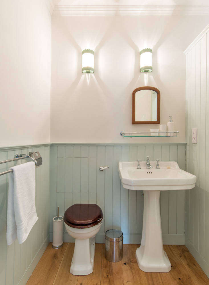
the bright bath on the ground floor. 20
Above: The bright bath on the ground floor.
a cozy room on the second floor with an alcove bed painted india yellow. 21
Above: A cozy room on the second floor with an alcove bed painted India Yellow.
the guesthouse is minimally decorated with antique finds. 22
Above: The guesthouse is minimally decorated with antique finds.
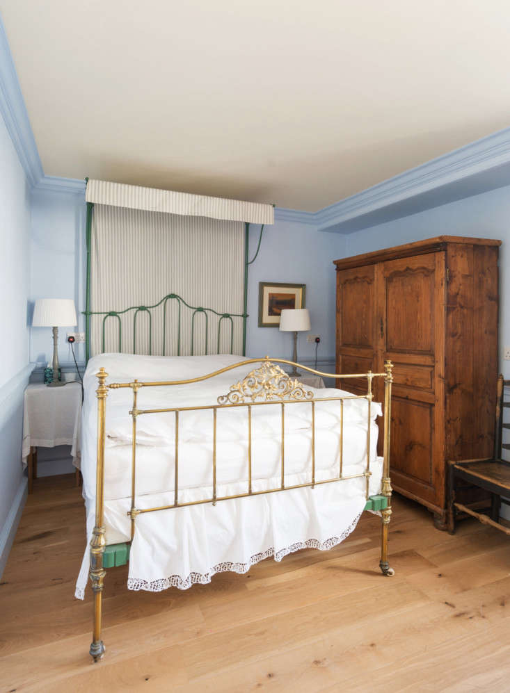
a second bedroom on the second floor has walls painted a cornflower blue. 23
Above: A second bedroom on the second floor has walls painted a cornflower blue.
a bold arsenic on the walls in the second floor bath. 24
Above: A bold Arsenic on the walls in the second-floor bath.
the living space on the top floor is painted manor house gray. 25
Above: The living space on the top floor is painted Manor House Gray.
the gray looks richer and moodier on darker days. 26
Above: The gray looks richer and moodier on darker days.
a quiet hallway moment. 27
Above: A quiet hallway moment.
guests have access to a renaissance garden in the courtyard. 28
Above: Guests have access to a Renaissance garden in the courtyard.
kristin and nick live and work in the main building; the pavilion is to the lef 29
Above: Kristin and Nick live and work in the main building; the Pavilion is to the left and features an ogee roof. “The roof is based on early Sottish garden buildings, found on large estates,” shares Kristin.

For more inspired palettes, see:

(Visited 1,534 times, 6 visits today)
You need to login or register to view and manage your bookmarks.

Have a Question or Comment About This Post?

Join the conversation

v5.0