For a client who lives outside of Paris but regularly comes to town by train, architect Philippe Harden transformed a two-room garret in Montparnasse into a well-planned, airy white pied-à-terre. If there’s architecture inside clouds, this is what it might look like.
Photography courtesy of Philippe Harden.
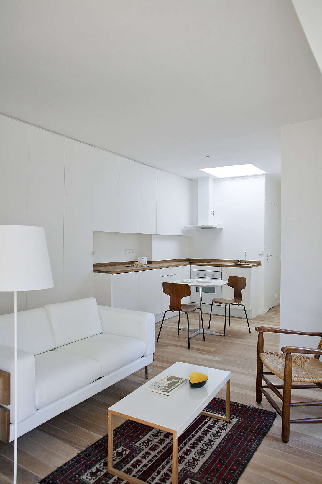
Above: The 32-square-meter (344-square-foot) apartment opens to a living space with an Ikea kitchen tucked into the corner. In place of beige pile carpeting and pink and red walls, Harden introduced pickled oak flooring and all white surfaces, including a wall of seamless built-in storage. The leather sofa is Habitat’s re-edition of its Robin Day Forum II design and the white metal coffee table is the Albers-inspired Kilo table (currently on sale for £32—$45.65—at Habitat). The Straw Armchair is a vintage Charlotte Perriand design.
Says Harden, “The choice of materials and colors is very simple and neutral to lighten the place and allow the furniture to show. Because the apartment is for occasional use, there’s not a lot in it, but each piece was carefully chosen.”
Above: The new kitchen pairs Ikea cabinets with Ikea butcher block counters, which Harden touched up with a dark stain “so they wouldn’t look like Ikea.” (Go to DIY: Upgraded Ikea Wood Countertops for ideas.) The upper cabinets are custom and the skylight is a restored original detail. Arne Jacobsen’s Super Circulaire Table, a design conceived for cafeterias, is paired with his teak Model 3103 stacking chairs (offered by Fritz Hansen in the seventies and now available through vintage dealers). The bathroom (see below) is tucked near the entry.

Above: “The charm of this flat was its situation on the top level of an old building with a curved roof,” says Harden. To open up the space and accentuate the architecture, he replaced the wall and door between the living room and bedroom with a graceful partition that connects the two while keeping the bed private. And in place of clunky curtains, Harden inserted classic Parisian interior wood shutters. The windows look out to a luminous courtyard.
Above: Pierre Paulin’s 1954 Office Model CM141 desk of coated steel and wood stands window side. The bed is slotted into a tight space, which Harden surrounded with built-in shelves that serve as side tables while allowing “a small space on each side of the bed for circulation.”
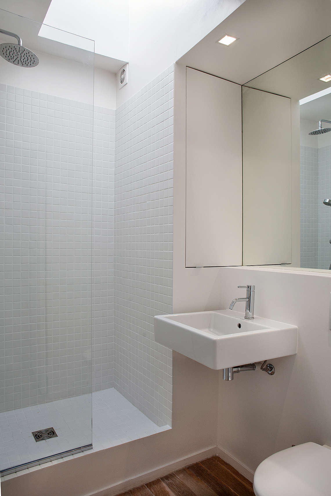
Above: The new bathroom makes use of an existing roof window for light and ventilation. The floor is the same oak used in the rest of the apartment, here with a hard wax oil treatment. The sink is a Duravit and the faucet is by Cristina, “a good Italian brand,” Harden tells us, “that’s less expensive than Vola and well distributed in France.”
Above: The floor plan details the tidy built-in cabinetry that continues from kitchen into living room, where it serves as a coat and clothes closet.
Harden designed one of our all-time-favorite kitchens (featured back in 2009): See A Paris Architect’s Fearless Use of Color.




Have a Question or Comment About This Post?
Join the conversation (6)