Icon - Arrow LeftAn icon we use to indicate a rightwards action. Icon - Arrow RightAn icon we use to indicate a leftwards action. Icon - External LinkAn icon we use to indicate a button link is external. Icon - MessageThe icon we use to represent an email action. Icon - Down ChevronUsed to indicate a dropdown. Icon - CloseUsed to indicate a close action. Icon - Dropdown ArrowUsed to indicate a dropdown. Icon - Location PinUsed to showcase a location on a map. Icon - Zoom OutUsed to indicate a zoom out action on a map. Icon - Zoom InUsed to indicate a zoom in action on a map. Icon - SearchUsed to indicate a search action. Icon - EmailUsed to indicate an emai action. Icon - FacebookFacebooks brand mark for use in social sharing icons. flipboard Icon - InstagramInstagrams brand mark for use in social sharing icons. Icon - PinterestPinterests brand mark for use in social sharing icons. Icon - TwitterTwitters brand mark for use in social sharing icons. Icon - Check MarkA check mark for checkbox buttons.
You are reading

Indoor-Outdoor Living in Paris: A Windowless Warehouse Converted into a Family Loft, Central Courtyard Included

Search

Indoor-Outdoor Living in Paris: A Windowless Warehouse Converted into a Family Loft, Central Courtyard Included

January 21, 2022

New meaning for hidden potential: When Marie and Gilles Ballard were searching for bigger quarters in Paris for their family of four, they toured possibilities of all sorts—until they came across a single-story industrial building in the 11th, “a Chinese fabrics warehouse with no windows or openings to bring in light.” It was exactly what they were looking for. “Given the price of real estate in Paris, we had to find something that no one else wanted,” says Gilles. “We hoped to imagine and create our own place.”

The design-minded couple own jewelry company Medecine Douce (translation: Alternative Medicine): Marie is the founder/creative director, and Gilles, whose background is in finance, runs the business. They had done a big remodel on their previous place and were prepared for the dirty work. And so, on touring the warehouse, they imagined the ultimate in urban indoor-outdoor living: “We pictured opening up the roof to create a patio in the center of what we thought of as a big box.” Thanks to architect Guillaume Terver of Le LAD (Laboratoire en Architecture and Design), the idea actually turned out to be a great one. Come see.

Photography by Jean François Gaté, courtesy of Le LAD, unless noted.

tucked in the very back of a block of traditional \19th century parisian apartm 17
Above: Tucked in the very back of a block of traditional 19th-century Parisian apartment buildings near the Bastille, the warehouse was built some time in the 1960s or ’70s as a freestanding structure in the courtyard of a historic building. (Scroll to the end to see the space as it was.)

“We’re in the heart of Paris and it’s almost silent here,” says Gilles. “One of our neighbors told us there was a primary school here; its courtyard is what got covered by a concrete roof—the space was used for storing the painter Victor Vasarely’s paintings, and later as a warehouse.”

just off the entrance, a plywood hallway leads to the open plan living room. 18
Above: Just off the entrance, a plywood hallway leads to the open-plan living room.

The guest room and the two kids’ rooms are along this corridor, which, Gilles tells us, references the packing crates that once filled the warehouse. “The main design idea was the use of low-tech materials and finding a natural aesthetic,” adds Terver. “We wanted to translate the spirit of Medecine Douce into the design: an atmosphere that’s simple and sophisticated.”

et voilà: terver transformed the center of the structure into a roof free  19
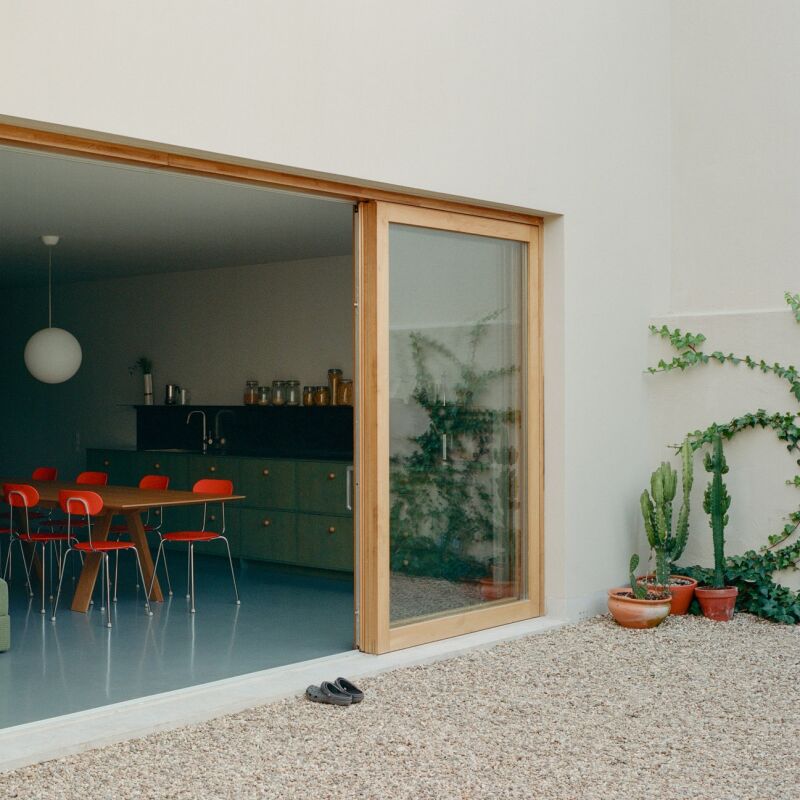
Above: Et voilà: Terver transformed the center of the structure into a roof-free courtyard that fills the rooms with light. The overhead support-beams are original. Pine plywood was put to use throughout, including as frames for all the new glazing. The courtyard is 387 square feet and the living space is 1,270 square feet. It took six months for Terver’s team to secure the necessary building permits.
all of the rooms are arrayed around the courtyard. in the warm months, the fami 20
Above: All of the rooms are arrayed around the courtyard. In the warm months, the family eat all their meals outside.
the living room is furnished with the ian sofa, steel and leather sue coffee ta 21
Above: The living room is furnished with the Ian Sofa, steel and leather Sue Coffee Table, and other pieces from the Delcourt Collection, a line designed by Christophe Delcourt, Terver’s partner at Le LAD.
&#8\2\20;the patio structure was the most difficult thing to design because 22
Above: “The patio structure was the most difficult thing to design because there were so many possibilities.” says Gilles. “We finally went with wood for the doors as a contrast to the concrete structure. We wanted to keep the original history of the place visible while twisting it in a contemporary and comfortable style.”
a canvas stretcher turned back to front echoes the plywood paneling throughout. 23
Above: A canvas stretcher turned back to front echoes the plywood paneling throughout. The desk is Christophe Delcourt’s TWI Table. It’s available in the States via Avenue Road. (Go to Modern in Miami to see Delcourt’s designs in Avenue Road founder Stephan Weishaupt’s home.)
the living area&#8\2\17;s plywood shelving extends the length of the long r 24
Above: The living area’s plywood shelving extends the length of the long room. Note the glass ceiling tiles, an original element that was preserved.
at the far end of the space the shelving morphs into an all wood kitchen. 25
Above: At the far end of the space the shelving morphs into an all-wood kitchen.

Admiring the salvaged lights? See Reborn in the USA.

the pine plywood is subtly paired with a marble counter and matte black faucet: 26
Above: The pine plywood is subtly paired with a marble counter and matte black faucet: “a contract between the raw and the refined,” says Gilles.
&#8\2\20;we left the pine natural and just used a very light finish that ne 27
Above: “We left the pine natural and just used a very light finish that needs to be renewed from time to time,” says Terver.
there&#8\2\17;s a dining area at the end of the room. 28
Above: There’s a dining area at the end of the room.
the space was entirely restructured, but traces of its past were preserved. pho 29
Above: The space was entirely restructured, but traces of its past were preserved. Photograph by Guillaume Terver.
&#8\2\20;we have a mix of aromatic plants, bamboo, and small trees,&#8\ 30
Above: “We have a mix of aromatic plants, bamboo, and small trees,” says Gilles. Read about the advantages of humble pea gravel in Hardscaping 101 and Everything You Need to Know About Gravel. Photograph by Guillaume Terver
the master bedroom. 31
Above: The master bedroom.
villeroy & bosch pro architectura classic square tiles line the black and w 32
Above: Villeroy & Bosch Pro Architectura classic square tiles line the black-and-white master bath, including the tub surround. The steel sink frame is a custom design and the black faucets and shower hardware are by Duravit.
the rooms flow around the new interior courtyard, including the side by side ki 33
Above: The rooms flow around the new interior courtyard, including the side-by-side kids’ rooms near the entry. Floor plan courtesy of Le LAD. For another project by the firm, go to Otonali, a Japanese-Inspired Restaurant in Brittany.

Before

the warehouse as it was. photograph by guillaume terver. 34
Above: The warehouse as it was. Photograph by Guillaume Terver.
it looked this way before demolition started. photograph by guillaume terv 35
Above: It looked this way before demolition started. Photograph by Guillaume Terver.
the warehouse roof when the courtyard was but a pipe dream. photograph by guill 36
Above: The warehouse roof when the courtyard was but a pipe dream. Photograph by Guillaume Terver.

In Progress

 the installation of the courtyard, post roof removal. gilles and marie re 37
Above: The installation of the courtyard, post-roof removal. Gilles and Marie report that the makeover took two years, “from the day we first visited to the day we moved in.” Photograph by Guillaume Terver.

N.B. This post is an update; the original story ran on September 16, 2019, and has been updated with new links.

More of our favorite living quarters with courtyards:

(Visited 3,504 times, 1 visits today)
You need to login or register to view and manage your bookmarks.

Have a Question or Comment About This Post?

Join the conversation

v5.0