Icon - Arrow LeftAn icon we use to indicate a rightwards action. Icon - Arrow RightAn icon we use to indicate a leftwards action. Icon - External LinkAn icon we use to indicate a button link is external. Icon - MessageThe icon we use to represent an email action. Icon - Down ChevronUsed to indicate a dropdown. Icon - CloseUsed to indicate a close action. Icon - Dropdown ArrowUsed to indicate a dropdown. Icon - Location PinUsed to showcase a location on a map. Icon - Zoom OutUsed to indicate a zoom out action on a map. Icon - Zoom InUsed to indicate a zoom in action on a map. Icon - SearchUsed to indicate a search action. Icon - EmailUsed to indicate an emai action. Icon - FacebookFacebooks brand mark for use in social sharing icons. flipboard Icon - InstagramInstagrams brand mark for use in social sharing icons. Icon - PinterestPinterests brand mark for use in social sharing icons. Icon - TwitterTwitters brand mark for use in social sharing icons. Icon - Check MarkA check mark for checkbox buttons.
You are reading

A Porthole Passage and a Moving Bookcase: An Apartment Remodel for a Writer in Paris

Search

A Porthole Passage and a Moving Bookcase: An Apartment Remodel for a Writer in Paris

September 9, 2022

Olivier, the incognito journalist-owner of this Paris apartment, describes his newly overhauled digs as “an unexpected synthesis of Oscar Niemeyer’s French Communist Party headquarters and my late grandparents’ house.” The 70-square meter (approximately 753-square-foot) space is situated on the top floor of a 19th-century two-story structure that had been a milking parlor.

Wanting to live in a Paris suburb that hadn’t been “conquered by gentrifying strollers,” Olivier said friends beckoned him to Saint-Denis and that his flat was the first he looked at. Long ago converted to living quarters, the apartment was last occupied by someone in the theater business who introduced its most prominent feature: a nearly six-foot wide porthole passageway. Other existing details blocked the natural light and “lacked common sense.” Architects Suleïma Ben Achour and Antoine Lallement of Studio Classico were hired to not only remedy the layout, but to find a place for Olivier’s books—”17 linear meters [55.7 feet] of them,” notes Suleïma—while lending the space an orderly, modern feel.

Join us for a look at the results, with nods throughout to Olivier’s wide-ranging design references. Scroll to the end for a glimpse of the historic structure and what the apartment looked like before.

Photography courtesy of Studio Classico (@studio_classico).

Living Area

the porthole divides the apartment&#8\2\17;s living area and the bedroom an 17
Above: The porthole divides the apartment’s living area and the bedroom and bath. Studio Classico’s solution was to introduce a sliding bookcase that glides open to provide a “secret passageway” into the private suite.
the public half of the apartment is u shaped with an open living room on one si 18
Above: The public half of the apartment is U-shaped with an open living room on one side, a compact kitchen on the other, and a dining table in the middle. The exposed rafters are original and along with the porthole are what sold Olivier on his place.
to lend the design softness and cohesion, the architects applied curved lines t 19
Above: To lend the design softness and cohesion, the architects applied curved lines that echo the porthole.
the kitchen has a plywood and formica counter with exposed wood edging and a wa 20
Above: The kitchen has a plywood and Formica counter with exposed wood edging and a washable canvas skirt. The tubular light is from Sammode Studio of Paris, which produces all of its designs in France.
suleïma describes the design as &#8\2\20;a \1970s, very simple kitchen 21
Above: Suleïma describes the design as “a 1970s, very simple kitchen that can resist trends and stains.” They tucked the fridge on the side of the nearby entry (see floor plan below) “in order to have a very clean and linear countertop.” There are more cabinets and a range opposite the sink.
the porthole is visible from just about everywhere in the apartment. 22
Above: The porthole is visible from just about everywhere in the apartment.
ab0ve: the architects designed a built in niche alongside the dining table with 23
Ab0ve: The architects designed a built-in niche alongside the dining table with “a closed cabinet with tempered glass to hide things, and shelves above to showcase beautiful daily objects. This cabinet is reminiscent a bit of Greek architecture where shelves are built into lime plaster walls.”

The orange Ra ceiling light is a 1969 Piet Hein design; the vintage Rey chairs by Bruno Rey are back in production from Hay.

the bookcases are made of stained pine plywood and easily slide to open. the ex 24
Above: The bookcases are made of stained pine plywood and easily slide to open. The existing floor was sanded and finished in “the color of tatami mats.”

Bedroom/Bath

the en suite bathroom is on the other side of the divide—with enough cle 25
Above: The en suite bathroom is on the other side of the divide—with enough clearance that, Suleïma assures, moisture is not an issue. “I have a very sentimental relationship with books, and am unable to part with them,” says Olivier. “Being  surrounded by books, whether novels, essays, photo books, or collections of poetry, stimulates my curiosity. It’s also a bit like living in a house where the furniture is alive. Some people do light therapy, I rely on the benefits of paper.”
the wall to wall carpeting in the en suite bath was inspired by olivier&#8\ 26
Above: The wall-to-wall carpeting in the en suite bath was inspired by Olivier’s grandparents’ 1970s bathroom and “adds to the sensation of having passed into the private sphere of the apartment,” says Suleïma.

“I wanted to break away from the standardized bathrooms found in most new buildings,” says Olivier, noting that early in the project Suleïma showed him Balineum’s line of tiles, and he fell in love with a checkerboard of Victorian-style Mottled Tiles and classic Hanley Tiles with a canvas skirt like the one used in the kitchen. The vintage yellow plastic towel holders by Makio Hasuike add to the 1970s undercurrent running through the apartment.

the balineum tiles were also applied to the shower floor. &#8\2\20;the bath 27
Above: The Balineum tiles were also applied to the shower floor. “The bathroom details are important because they’re the last thing I see at night and the first thing I see in the morning,” says Olivier.
the gold carpeting from balsan extends into the bedroom, which has its own buil 28
Above: The gold carpeting from Balsan extends into the bedroom, which has its own built-in niche for books.

Floor Plan

when we do interior renovations, we never have predefined styles or colors we w 29
Above: When we do interior renovations, we never have predefined styles or colors we want to apply,” says Suleïma. “We, of course, have references we love, but above all we want to highlight the nice things that are already there. In this case, it was the beautiful porthole and the timber frame—which led us to imagine the apartment as a cabin monastery from the seventies.”

Exterior

  the historic structure is on a cobblestone street in saint denis, one of 30
Above:  The historic structure is on a cobblestone street in Saint-Denis, one of Paris’s northern banlieues.  “After living my younger years in the middle of the action, my thirties have taught me that I feel better a little more out of it,” Olivier told us. “Saint-Denis has a bad reputation, but I’ve always loved its diversity and rich history.”

Before

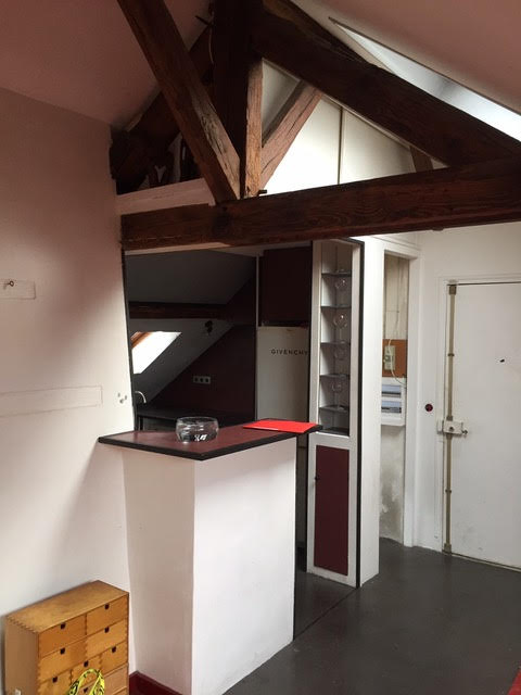
Above L: The existing kitchen was wedged next to the entry. Above R: “The porthole was already there in a non-aligned wall; we realigned it to enhance the geometry,” says Suleïma.
the kitchen, says olivier, &#8\2\20;had unnecessary angles and the light di 33
Above: The kitchen, says Olivier, “had unnecessary angles and the light didn’t circulate as it should.” He was introduced to Studio Classico, which is only two years old, through a friend: “I looked carefully at their first projects and each time I said to myself  ‘I could live here’—the colors, the materials, everything spoke to me.”

We have presented just about all of Studio Classico’s projects to date:

(Visited 1,632 times, 1 visits today)
You need to login or register to view and manage your bookmarks.

Frequently asked questions

Who did the Paris apartment remodel?

The Paris apartment remodel was done by Studio Classico.

What makes the Paris apartment remodel unique?

The remodel features moving bookshelves that can be used to divide the living space or create a hidden bedroom.

What was the inspiration behind the Paris apartment remodel?

The inspiration behind the Paris apartment remodel was to create a space that was both functional and beautiful, while incorporating elements of surprise and innovation.

What materials were used in the Paris apartment remodel?

The Paris apartment remodel used a variety of materials, including wood, glass, and metal.

How long did the Paris apartment remodel take?

The length of time it took to complete the Paris apartment remodel is not specified in the article.

How much did the Paris apartment remodel cost?

The cost of the Paris apartment remodel is not specified in the article.

Have a Question or Comment About This Post?

Join the conversation

v5.0