Icon - Arrow LeftAn icon we use to indicate a rightwards action. Icon - Arrow RightAn icon we use to indicate a leftwards action. Icon - External LinkAn icon we use to indicate a button link is external. Icon - MessageThe icon we use to represent an email action. Icon - Down ChevronUsed to indicate a dropdown. Icon - CloseUsed to indicate a close action. Icon - Dropdown ArrowUsed to indicate a dropdown. Icon - Location PinUsed to showcase a location on a map. Icon - Zoom OutUsed to indicate a zoom out action on a map. Icon - Zoom InUsed to indicate a zoom in action on a map. Icon - SearchUsed to indicate a search action. Icon - EmailUsed to indicate an emai action. Icon - FacebookFacebooks brand mark for use in social sharing icons. flipboard Icon - InstagramInstagrams brand mark for use in social sharing icons. Icon - PinterestPinterests brand mark for use in social sharing icons. Icon - TwitterTwitters brand mark for use in social sharing icons. Icon - Check MarkA check mark for checkbox buttons.
You are reading

Kitchen of the Week: Two Young Architects Think Pink in LA

Search

Kitchen of the Week: Two Young Architects Think Pink in LA

September 7, 2017

Last January, architects Annie Ritz and Daniel Rabin decided it was time to put their 1949 bungalow in LA’s Silver Lake on the market. But first, to add value to the property and “give life to some ideas we’d been wanting to experiment with,” says Ritz, they turned the house into a design project.

The two, who met in graduate school at the University of Toronto, had lived in their bungalow for three years and accumulated a familiar list of to-dos, from upgrading the baths to installing new windows. But more than anything, they wanted to remove the existing old Ikea kitchen and start anew. “And since we owned the house,” Ritz tells us, “we decided to create a kitchen no client would ever ask for.”

The gambit worked—the bungalow sold right away; the couple (whose individual résumés include working for Herzog de Meuron, XTEN Architecture, and Barbara Bestor) have recently opened their own firm, Studio Ritz Rabin; and the project was a finalist in the recent Remodelista Considered Design Awards 2017 in the Best Kitchen Space, Professional category. Come see why.

Photography by Lauren Moore, courtesy of Studio Ritz Rabin (@studioritzrabin).
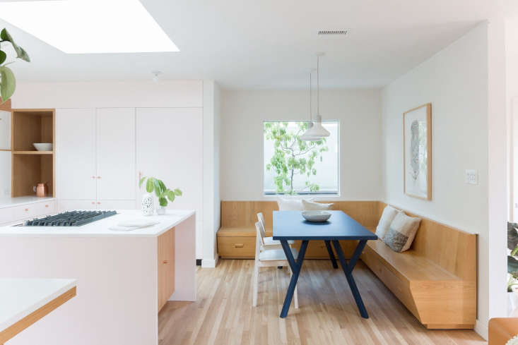
the architects introduced a minimalist, carefully crafted kitchen that remodeli 17
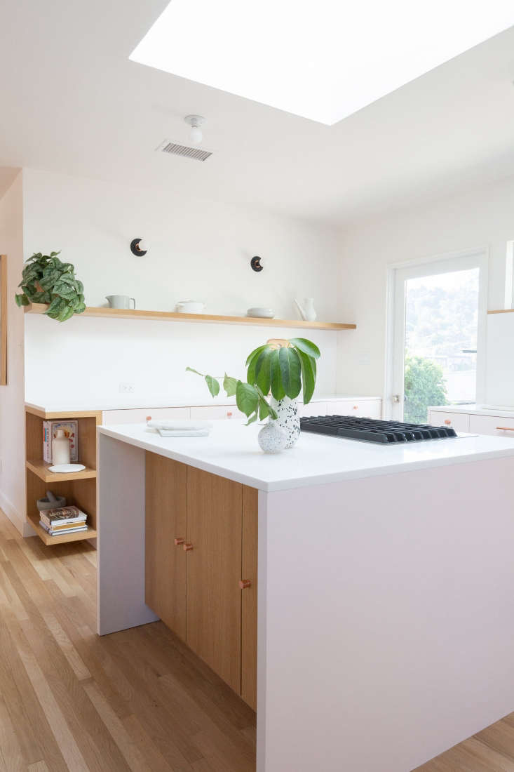
Above: The architects introduced a minimalist, carefully crafted kitchen that Remodelista awards judge Sam Hamilton describes as “both Swedish and Japanese in sensibility. Joyful.” The unexpected detail? The cabinets are blush pink. “It would have been lovely in a more typical color,” adds Hamilton, “but the pink gives the space immediate character.”

Working within the existing kitchen footprint, the architects introduced a prominent skylight over the island and anchored the breakfast nook with a large square window that overlooks a tree in a planter (lesson: create your own view). The built-in storage bench is the one existing element that they kept.

&#8\2\20;the windows and skylight were a big part of the design, so for us  18
Above: “The windows and skylight were a big part of the design, so for us the palette was: blush pink, copper, oak, and greenery brought in from the outside,” explains Ritz. “Each window frames a potted tree or a view to the backyard that we read in concert with the pink.”
 to keep the counters clear, the architects incorporated plenty of closed  19
Above: To keep the counters clear, the architects incorporated plenty of closed storage. The refrigerator is concealed behind a wall of flush cabinetry inset with an oak appliance nook.

How to find the perfect shade of pink? “Our first try looked like bubblegum and the second round was too light,” says Ritz. “Pink looks different throughout the day as the light shifts.” After settling on A Touch Of Pink from Benjamin Moore, they subtly diluted it by mixing in 20 percent Benjamin Moore Atrium White, one of our Architects’ White Paint Picks.

the metallic accents are provided by a jewel wall mount lavatory faucet in brus 20
Above: The metallic accents are provided by a Jewel Wall-Mount Lavatory Faucet in brushed copper, $375.79 from eFaucets, and Hamilton Bowes 1-Inch Satin Round Copper Round Cabinets Knobs, $4.49 on Etsy. The counters and backsplash are white Corian—read about it in Remodeling 101: Corian Countertops (and the New Corian Look-Alikes).
getting all the details right takes finessing. ritz selected the modern wall sc 21
Above: Getting all the details right takes finessing. Ritz selected the Modern Wall Sconces, $155 from Etsy seller Object & Light, in a copper-trimmed white finish. “Then I decided the kitchen needed more contrast and custom-painted them black at the last minute.”
The bird’s eye maple cutting board is an Edward Wohl.

the island is detailed with oak cabinets. original to the house, the floor is \ 22
Above: The island is detailed with oak cabinets. Original to the house, the floor is 2.5-inch red oak: “It was in great shape, but finished in a high gloss with orange hues,” says Ritz. “We had it sanded and refinished with Bona Naturale, which maintains the natural look without adding pigment or hues.”
the kitchen opens to the living room. the kitchen table, an old cb\2 piece 23
Above: The kitchen opens to the living room. The kitchen table, an old CB2 piece, was formerly lacquered white; to “breathe new life into it,” the couple had it painted matte blue.

Ritz and Rabin say they haven’t done any more pink kitchens—”you can never do the same project twice”—but they currently have a pink dining room with a black-and-white terrazzo table and are designing a pink powder room for a client. “Friends and visitors don’t always pick up on the color,” says Ritz, “but they’re drawn to these spaces. Pale pink just has a nice overall feel.”

Pink has made inroads in quite a few kitchens of late. Take a look at 9 Rosy-Hued Kitchens from the Remodelista Archives.

For help on choosing the right paint color, see Expert Advice: The 10 Best Pink Paints.

(Visited 527 times, 1 visits today)
You need to login or register to view and manage your bookmarks.

Frequently asked questions

Who designed the Pale Pink Kitchen in Los Angeles?

The Pale Pink Kitchen in Los Angeles was designed by Studio Ritz and Rabin.

What is the theme of the Pale Pink Kitchen?

The theme of the Pale Pink Kitchen is pink and white, with subtle touches of black, gold and gray.

What are the materials used in the Pale Pink Kitchen?

The materials used in the Pale Pink Kitchen are white marble countertops, pink cabinets, white oak floors, a black and gold hood, and gray cabinets in the pantry.

What is the layout of the Pale Pink Kitchen?

The Pale Pink Kitchen has an L-shaped layout with the sink and stove on one side and the refrigerator and pantry on the other side.

What inspired the design of the Pale Pink Kitchen?

The design of the Pale Pink Kitchen was inspired by the 1950s and 1960s, particularly mid-century modern design.

Is the Pale Pink Kitchen functional?

Yes, the Pale Pink Kitchen is functional, with ample storage space and high-end appliances.

Product summary  Item 6 157Item 7 158

Have a Question or Comment About This Post?

Join the conversation

v5.0