“You should totally come,” began the invitation. Mollie Cohen and Andrew Berman’s wedding was held in a historic brick warehouse in Red Hook, Brooklyn, on a freshly laid carpet of grass, where they celebrated by holding a giant picnic. They presented each guest with a pair of Vans, and for refreshments there was a fully constructed dive bar and cans of Bud in paper bags with the wedding monogram on them.
They asked architectural designer Oliver Freundlich to apply that same playful high brow/low brow spirit to their apartment, a Cobble Hill, Brooklyn, duplex in a converted mid-19th century church rectory that Freundlich describes as “a piece of developer crap set in a basement with major light challenges.” Not surprisingly, architecture (and some alchemy) comes next. Freundlich–who the couple discovered on Remodelista–runs his own New York firm, Oliver Freundlich Design; we are longstanding fans and unveiled the glamorous eat-in kitchen he designed for actress Julianne Moore, his sister-in-law, in the Remodelista book. During his first meeting with Mollie and Andrew, Freundlich says he flashed a red Vola faucet he thought they’d like and the deal was sealed.
“Meeting Oliver was like going on a good first date,” says Mollie. She grew up in New York and is a buyer for Madewell; Andrew is a carpenter turned furniture designer from Madison, Wisconsin (they met as freshmen at CU Boulder); the couple planned their remodel with Freundlich over takeout burrito design sessions. And nine months of construction later, Mollie and Andrew found themselves living in the apartment equivalent of a lavish picnic, with a teak-paneled bedroom ceiling, a his-and-hers trough sink, tinware-stocked custom kitchen cabinets, and a powder room with a telltale red spigot.
Photography by Matthew Williams for Remodelista.
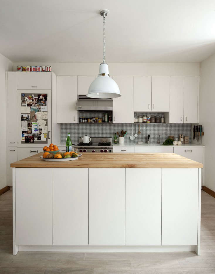
Above: The most striking transformation in the duplex is the kitchen, which was formerly a condo-style landlord special tucked into a corner. Now fresh and bright, it’s equipped with an island and cabinetry made of moisture-resistant MDF finished with a spray lacquer–and an overall pleasing geometry.

Above: The dining table came from the couple’s old apartment (they got it at Future Perfect six years ago) and the lights are remakes of the Dunlop factory pendant from UK firm Trainspotters. The painting, a wedding present, is part of Andrew and Mollie’s flag collection, which extends to flag-festooned belt buckles and sneakers. Explains Mollie, “Andrew is a grass-fed, free-range boy from the Midwest. He has always had a hankering for Americana and the freedom it represents.”
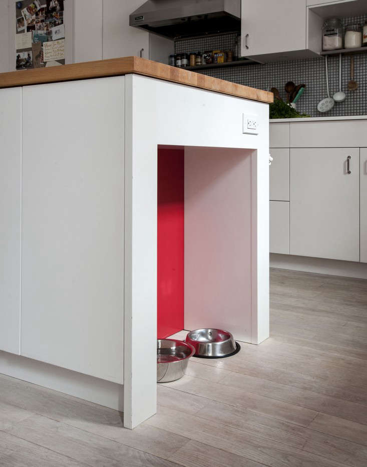
Above: For the couple’s dog, Cash, a pet bowl niche was incorporated into the island. Taking his cues from the flag collection, Freundlich applied a palette of white, black, and oak throughout the duplex with artful hits of red. The new floor is plain-sawn white oak lightened with wood bleach “in order to magnify the daylight as much as possible,” says Freundlich. It’s finished with Monocoat’s Natural Oil Finish in Cotton White. Take a closer look at the kitchen in Rehab Diary.
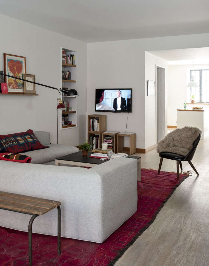
Above: “The apartment completely lacked character and detail,” says Freundlich. “On the main floor, we reduced a full bath to a half bath and relocated the laundry room, allowing us to create more openness between the living room and the kitchen/dining room. New baseboards, windows, and door trim were also added throughout to introduce clean lines and fresh materials in lieu of sheetrock corners and stock moldings.”
Cappellini’s Cuba 25 sectional sofa fills the room and is the equivalent of a one-dish meal: “It was one of our biggest splurges,” says Mollie, “but it’s the center of the whole apartment, so we felt it was the most important piece of furniture.” The rug is from Breuckelen Berber. The oak Nesting Boxes under the TV are Andrew’s own design, and can be used for storage and as stools (they come with Richlite or cushioned tops); they’re available from Andrew’s online shop, Dane Co.
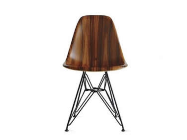
Above: At first designated for bike storage, the space under the stairs ended up becoming a home office. “In such an open plan, it’s critical that you have a place to store all of life’s junk,” says Freundlich. “I realized the underside of the remodeled stair was going to create a warm and inviting space.” The chair is an Eames Molded Wood classic.
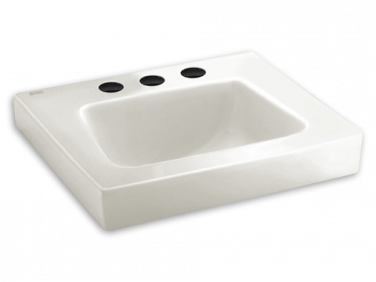
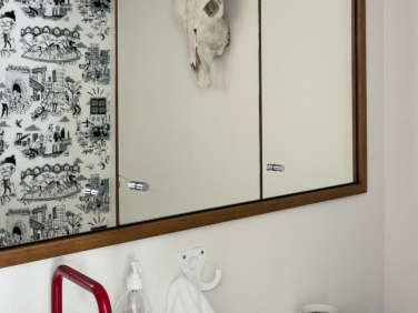
Above: The powder room has a custom medicine cabinet made of rift-sawn white oak (which matches the apartment’s new baseboards and other millwork). The wallpaper visible in the mirror is Flavor Paper’s Dia de Dumbo design–toile-style Day of the Dead scenes of Brooklyn. The Vola HV1 faucet is the very model Freundlich pulled out during his first meeting with Mollie and Andrew; it came from New York plumbing supplier AF Supply (see a rainbow of Volas here) and is paired with American Standard’s Roxalyn Wall Mounted Sink–”the ultimate high meets low moment in the house,” says Freundlich.
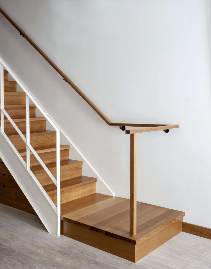
Above: The apartment’s existing stairs received a total makeover: The treads and risers were reclad with rift-sawn white oak and in place of a generic black metal railing, Freundlich installed two new railings, “one white-painted steel to match the stringer, and one in solid oak mounted to the wall. The idea was to clean up the composition of the stair, making it more of a feature within the open living area.”

Above: To draw light throughout the reconfigured upstairs, Freundlich introduced double-wide doors with stippled wired glass that lead to the bedroom: “Wire glass is a favorite of mine; it makes the doors feel less slick, more utilitarian.” The air vent came from Architectural Grille, a Brooklyn source for patterned metalwork. All the doorknobs are Rejuvenation’s Finley model in black porcelain.
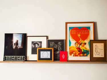
Above: A wooden Art Shelf runs along the hall; Andrew created it in collaboration with Matt Hogan of Brooklyn’s Reliquary Studio (who also built the kitchen cabinets and teak ceiling, among other things). The ledge hangs from a steel angle bolted to the wall. “Art has been a hard thing for us to decide on,” says Mollie. “What’s nice about the picture rail is that we can just keep piling on everything we collect. Instead of committing to one big piece, we’re constantly adding and changing the contents of the shelf. At this point, it has a lot of nice memories.”
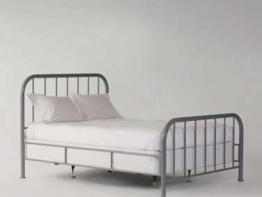
Above: “The idea was to keep the bedroom spare and the furnishings low to allow the wood ceiling to soar,” says Freundlich. “The pendants dropping from the ceiling add some drama to the height.” (There are dimmer switches next to each side for easy on and off.) The metal bed frame is School House Electric’s Hamilton Bed, an update of the classic iron bedstead, and the lights are Barn Light Electric’s Ivanhoe Dino Porcelain Cord Pendant Light. Andrew built the blackened ash bedside cubes: “We didn’t have side tables for a few months, so I’d put my glass of water on the floor. When I woke up, it would be empty, and then I realized our dog was drinking it,” says Mollie. “So I badgered Andrew for side tables. He took extra cutoffs from something else he made, and the wall-mounted shelves were his temporary turned permanent solution.” They’re the prototypes for his No Stand Nightstand; for kindred designs, see 5 Favorite: Bedside Shelves (in Lieu of Tables).
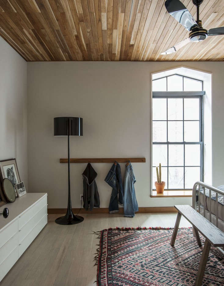
Above: The bedroom’s crowning glory is its new teak ceiling: “It makes our bedroom feel like a special retreat,” says Mollie. The tall, peaked window, a detail dating to the building’s origins as a rectory, was painted Benjamin Moore black in a satin finish, detailed with one-inch trim casing to trace its outline, and given a ledge of rift-sawn white oak. The Blackened Oak Bench and Rift-Saw Oak Peg Rack are both made by Andrew and available in custom sizes and finishes at Dane Co. “We wanted hooks to put our clothes on instead of the chair in the corner that collects your weekly wardrobe,” says Mollie. (For more on the subject, see Christine’s post How Shaker Peg Rails Saved My Sanity.) The credenza is from Cappellini and the standing lamp is the Flos Spun Floor Lamp.

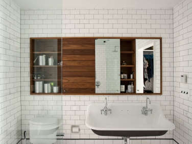
Above: Freundlich kitted out the master bath with one of the most enviable details in the duplex: a custom teak medicine cabinet that has solid wood shelves deep enough to hold rolls of toilet paper. (It was fabricated by Tony Visco of Ivory Build, who also built the desk under the stairs.) The enameled iron double sink is the Kohler Brockway paired with Chicago Faucets. The Subway Tiles are from reproduction specialists Subway Ceramics–”we used a traditional black liner, but located it an atypical height to try to loft the ceiling,” says Freundlich. “Subway Ceramics has great accessory tiles, including tile hooks, recessed toilet paper holders, and soap niches, all of which we put to use.”

Above: A dressing room stands between the master bedroom and bath. It’s wallpapered with doodles of things Mollie and Andrew like–bagels, bikes, high tops, their dog–that they used on their wedding invitation. The wallpaper is from Flavor Paper of Brooklyn, which specializes in custom orders: “We just sent them a PDF and selected a paper type,” says Mollie.

Above: Mollie and Andrew’s mandate for Freundlich: “Clean, simple, warm, functional, and lots of shoe storage.”

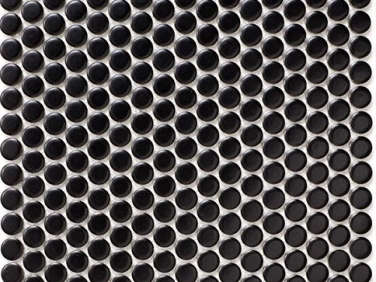
Above: The apartment’s entry originally had what Freundlich describes as “a telephone-booth-like closet facing you immediately when you walked in.” He replaced it with an open coat area at the far end of the living room defined by a “landing pad” of penny-round tiles in matte black from Nemo Tile. The yellow cabinet is a Cappellini design that moved with the couple from their first apartment.
Above: The foldout Arrow Hanger in powder-coated aluminum by Design House Stockholm.

Above: “Though the renovation includes some luxury items here and there, the overall tone is meant to be low-key and not take itself too seriously,” says Freundlich. Bikes are parked right by the front door under an antique framed flag that the couple brought on eBay. It’s no coincidence that even the bike colors work in the apartment–Andrew and Mollie always zero in on red and white.
Above: The final newlywed detail: Freundlich inset the entry with a doormat from Coco Mats ‘n More affordably customized with the couple’s wedding monogram.

Above: A plan of the first floor. Formerly dark and lacking coherence, it’s now loftlike, tightly unified, and filled with light.

Above: The fully redesigned second floor incorporates not only the master bedroom (with en suite dressing room and bathroom), but a guest room, guest bath, and laundry room.
For more of Oliver Freundlich’s work, see Behind the Scenes: 5 Design Lessons from Julianne Moore and Oliver Freundlich Design.
This post is an update. It originally ran on March 10, 2014, as part of our Kitchen Composition issue.










Have a Question or Comment About This Post?
Join the conversation (28)