Icon - Arrow LeftAn icon we use to indicate a rightwards action. Icon - Arrow RightAn icon we use to indicate a leftwards action. Icon - External LinkAn icon we use to indicate a button link is external. Icon - MessageThe icon we use to represent an email action. Icon - Down ChevronUsed to indicate a dropdown. Icon - CloseUsed to indicate a close action. Icon - Dropdown ArrowUsed to indicate a dropdown. Icon - Location PinUsed to showcase a location on a map. Icon - Zoom OutUsed to indicate a zoom out action on a map. Icon - Zoom InUsed to indicate a zoom in action on a map. Icon - SearchUsed to indicate a search action. Icon - EmailUsed to indicate an emai action. Icon - FacebookFacebooks brand mark for use in social sharing icons. flipboard Icon - InstagramInstagrams brand mark for use in social sharing icons. Icon - PinterestPinterests brand mark for use in social sharing icons. Icon - TwitterTwitters brand mark for use in social sharing icons. Icon - Check MarkA check mark for checkbox buttons.
You are reading

A Revived NYC Garret with a Space-Saving Bed in a Box, Before and After

Search

A Revived NYC Garret with a Space-Saving Bed in a Box, Before and After

February 5, 2024

It’s easy to see why Kay Lee and Jonathan Chong fell for their West 11th Street garret apartment. In addition to offering a living area with a 22-foot-tall ceiling and giant skylight, it bore the ghost marks of the previous occupants: for decades an artist couple had used the space as their studio/crash pad—and painted marble veining on the walls, a zebra-patterned faux rug on the wooden floor, and string-tied bouquet on the bathroom door.

Kay, a digital designer, and Jonathan who works in the restaurant business, had admired the thoughtfully succinct design work of BoND, the architecture and interiors firm run by Israeli ex-pats Noam Dvir and Daniel Rauchwerger—BoND stands for Bureau of Noam and Daniel—and asked if they’d shore up the apartment for full-time living. Daniel climbed the stairs to the fifth-floor walk-up and was charmed at first glance. “The original design thinking was to preserve as much as possible—it would be a classic Greenwich Village attic apartment with as-needed contemporary interventions.”

Then reality set in: the walls crumbled to the touch and pipes were leaking into the apartments below. The place was moldy and rotting. “There’s a gap between the romantic thought of wanting to keep it all,” says Daniel, “and actually living in a ruin.” A ruin, he adds, with barely a kitchen, not much of a bath, no bedroom, and daunting dimensions: the main ceiling may soar but the middle area is a mere 8 feet wide and the long, narrow whole only totals 550 square feet: scroll to the end to see the floor plan and Before shots.

All parties agreed a makeover was called for. And so the BoND crew began the work of hauling all tools and materials up five narrow flights. To maximize a sense of space, BoND opened up the living room by removing a nonstructural wall; performed some architectural jujitsu to fit in a full new kitchen and bath. As for the trickiest riddle: thanks to their adventurous clients, they put the bed into an entirely unexpected spot. Join us for a look.

Photography by Chris Mottalini, courtesy of BoND.

the apartment is set on the top floor of a residential building dating from \19 17
Above: The apartment is set on the top floor of a residential building dating from 1900 and was likely originally used as living quarters. “While having to renovate the space, an important goal was to keep the historic studio feel,” says Daniel, noting that the living area retains its original windows, fireplace, moldings, and pine floor, all newly repaired and refinished.

The walls are limewashed: Daniel and Kay consulted our post Everything You Need to Know about Limewash Paint and went with a pale gray from French line Ressource: “Latex would look too new. Lime paint has a lot of depth to it and the color shifts with the light,” says Daniel. The vintage chair next to the hearth opens into a step stool.

the original steel framed, north facing skylight was preserved, along with the  18
Above: The original steel-framed, north-facing skylight was preserved, along with the exposed rafters and small window.  As ceiling lights, the architects used inexpensive classic hardware store porcelain sockets, a Remodelista favorite.
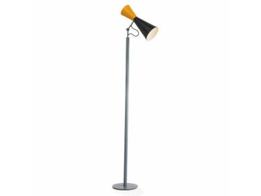
a le corbusier parliament lamp stands next to the floyd sectional, which can do 19
Above: A Le Corbusier Parliament Lamp stands next to the Floyd sectional, which can double as a guest bed. BoND designed the steel coffee table. The vintage lounge chair is one of two covered in a Kvadrat corduroy-like pressed velvet by Raf Simons. “Things can move around, nothing matches or is too precious,” notes Daniel.
the living room opens to the dining area parked alongside what the architects d 20
Above: The living room opens to the dining area parked alongside what the architects dubbed “the bedroom in a box.” Wanting to preserve the openness of the main space—and with a mere 8-foot-wide area to work in—BoND came up with this “sculpture like addition that’s a bit like a wooden Airstream trailer.” They collaborated on its design with Lesser Miracle, the Brooklyn carpentry workshop that built it.

Fabricating the box off-site would have been more efficient, but because five flights of stairs were involved, all materials had to be schlepped up, and it was cut and assembled on site over the course of six weeks. The exterior is a veneered in sapele wood. Note the notched drawers at the base—they fit under the bed and hold shoes and sheets.

a lariat pendant by apparatus hangs over kay and jonathan&#8\2\17;s table f 21
Above: A Lariat Pendant by Apparatus hangs over Kay and Jonathan’s table from their previous apartment. It’s paired with French farmhouse stools with backs.
&#8\2\20;every inch of the box had to count,&#8\2\2\1; says daniel. it  22
Above: “Every inch of the box had to count,” says Daniel. It just fits a queen-size bed and “feels like a cocoon.” The windows slide open and have wire-gridded glass for a bit of privacy. “The apartment is small enough that it can get by with an air conditioner installed in the living room side window in the summer It keeps the bedroom cool.”

Two holes in the ceiling also let the air out and lights on top of the box shine in: “It’s quite theatrical lit up. You’re inside a space within a space.”

the interior is also finished in sapale, and opposite the bed there are two bui 23
Above: The interior is also finished in sapale, and opposite the bed there are two built-in closets. Kay reports that they adore their wooden bedroom: “The extensive closet and drawer system keep things clutter-free, making it a practical retreat. Believe it or not, we still get a little excited to go to sleep.”
bond intentionally gave each room its own guise, creating a sense of discovery  24
Above: BoND intentionally gave each room its own guise, creating a sense of discovery within the small quarters. The kitchen—set in a “tricky small corner with a window”—is both tough and sleek: it has painted brick walls (a salute to its old NYC location), steel cabinets from Reform’s Jean Nouvel-designed Reflect line, and a deeply veined Violeta marble counter.

The marble was sourced from RGNY Tile on West 29th Street in Chelsea, a place that sells slab remnants. “They’re leftovers from other stock,” says Daniel. “Shopping there is a bit like going to a thrift store: you don’t know what you’ll find, but you usually come across something you like.”

the bath was designed to feel &#8\2\20;clean and fresh with a collage like  25
Above: The bath was designed to feel “clean and fresh with a collage-like use of materials,” Daniel tells us. Another dramatic slab of remnant marble from RGNY patterns the main wall. The ribbed glass divider echoes the fluted lines of the kitchen cabinets. The alcove tub—a request from Kay—is 60 inches long. The 2-by-2-inch Dal Tile ceramic squares are an affordable BoND favorite.

The New Floor Plan

the apartment is long and impossibly narrow in parts. &#8\2\20;we had to ta 26
Above: The apartment is long and impossibly narrow in parts. “We had to take a bite out of the bath to fit in the fridge,” says Daniel. But thanks to the maximized living room and careful space planning, it doesn’t feel cramped.

Before

&#8\2\20;it was endearing in its dilapidated state, but sadly not livable,& 27
Above: “It was endearing in its dilapidated state, but sadly not livable,” write the architects.
the names of the previous artist occupants are unknown, but their work came wit 28
Above: The names of the previous artist occupants are unknown, but their work came with the apartment.
the artists used the space as their studio for decades. the kitchen sink was ma 29
Above: The artists used the space as their studio for decades. The kitchen sink was mainly used for washing paint brushes.

Two more favorite projects by architects Noam Dvir and Daniel Rauchwerger of BoND:

(Visited 17,131 times, 1 visits today)
You need to login or register to view and manage your bookmarks.

Frequently asked questions

What is the article about?

The article is about a NYC garret apartment with a space-saving bedroom in a box design by Bond Design.

Who designed the space-saving bedroom in a box?

The space-saving bedroom in a box was designed by Bond Design.

Where is the apartment located?

The apartment is located in New York City (NYC).

What is a garret apartment?

A garret apartment refers to a small, often attic-like living space on the top floor of a building.

What are the features of the space-saving bedroom in a box?

The space-saving bedroom in a box design includes a bed, retractable desk, storage compartments, and built-in shelving.

How does the space-saving bedroom in a box work?

The design incorporates foldable components and hidden storage compartments to maximize space and functionality.

Who can benefit from space-saving designs like this?

Space-saving designs can benefit anyone living in small apartments or with limited living space.

Can the space-saving bedroom in a box be customized?

Yes, the space-saving bedroom in a box can be customized to fit individual preferences and needs.

Where can I learn more about Bond Design's projects?

You can learn more about Bond Design's projects on their website or by visiting their social media profiles.

Are there other space-saving furniture designs available?

Yes, there are many other space-saving furniture designs available in the market. It is advisable to explore different options to find the most suitable one for your needs.

Product summary  

Have a Question or Comment About This Post?

Join the conversation

v5.0