London designer Cassandra Ellis specializes in transforming houses that are seemingly beyond repair into homes of quiet repose before moving on to the next project. Renovation is a way of life for her.
When she took on a late Victorian Terrace house in Peckham Rye a while back, her intention was to create “a family home for my extended brood, which includes my partner, his children who join us on weekends and holidays, and our dogs, of course,” she says. “I think a lot about the container and the people. The decoration comes last.”
In furnishing the space, she was inspired to launch Cassandra Ellis, her own eponymous line of furniture and homewares, due to “the inferior quality of the High Street offerings,” as she says. (Of one upholstered chair, a High Street purchase, she says “I could move it with one hand, which is bad”). She now works with independent craftsmen across Britain who use “excellent materials and craftsmanship with an aim toward creating “quiet and thoughtful design, responsible production and quality that lasts.”
Join us for a tour.
Photography by Catherine Gratwicke.

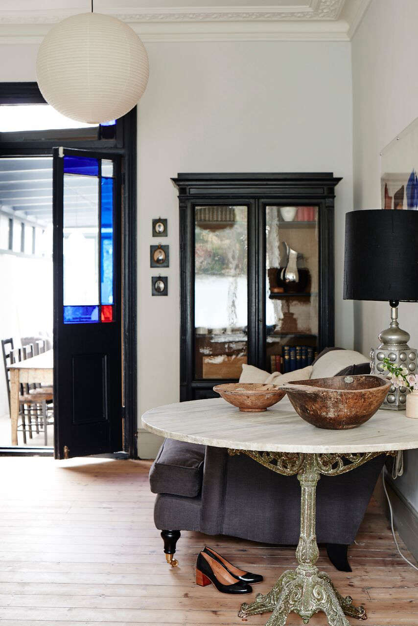
Above: Bringing the light in and creating generous flow of space are hallmarks of Ellis’s designs. “London terrace houses can be dark and obstructive,” she says. The walls of the front room are painted French Grey Pale by Little Greene. She maximizes the light without compromising privacy by using an opaque window film on the lower half of the windows. Midcentury paper Akari Light Pendants by Isamu Noguchi hang from original Victorian rosettes in the ceiling.

Above: In London terraced housing, the back half of the room is often a dead walk-through zone passed through on the way to the kitchen. Ellis solves this problem by anchoring the space with a furniture grouping. “This spot is the most popular place in the house,” she says. “It’s connected to the kitchen but separate at the same time.” The 36-inch-diameter Spanish marble guéridon is wide enough to be a dining or garden table, making it a generous side table.
Above: Ellis paired a midcentury Panthella Lamp by Verner Panton with an antique cast iron urn that she uncovered from a pile of refuse in the back garden of the house.

Above: The living area is visible but separate from the kitchen area.
Above: The stained glass doors between the living area and the kitchen are repurposed from the original exterior doors of the house. “I hate discarding anything original,” she says.”Once you have thrown a piece of history out, you can’t get it back.” Cassandra painted the doors in Railings by Farrow & Ball. The bibliothèque in the corner is from Ellis’s favorite haunt for antiques—Fontaine.
Above: Ellis rebuilt the existing kitchen extension with a simple glass and wood skylight, allowing for more daylight to come in. The side lights have an opaque film applied while the top lights are clear glass. The framing members have been painted Railings by Farrow & Ball. The Blown Glass Dome Pendants are from Baileys.

Above: Ellis likes her kitchens and bathrooms to feel like living spaces. “I found the rustic wall lights at a flea market; they provide the right amount of light to prep and cook with, and I think they look nicer than conventional kitchen lighting,” she says. The pine floorboards are painted in London Stone by Farrow & Ball; a Persian carpet adds to the “living room feel.”
Above: A short upturn of the wood counter provides wall protection without the look of the typical kitchen backsplash.
Above: Ellis restored and cleaned the 1930s cooker that has been in the house for almost 100 years. “We actually only use it to store wine,” she says.
Above: The kitchen is serviced by a large, traditionally styled double Belfast Sink by Rangemaster. “They’re easy to clean, versatile, robust, and both attractive and relaxed—sinks for people who use their kitchens,” Ellis says.
Above: In the kitchen, Ellis provides an extra seating area for casual conversations off to the side. The Indian cupboard on the wall was sourced from a dealer at the Ardingly Antiques and Collectors Fair. The radiator has been painted Railings by Farrow & Ball—”the best black” according to the designer.
Above: Ellis replaced every door in the house (most were installed in the 1980s) with original solid wood doors she sourced from dealers and markets. “As the vintage doors weren’t perfectly straight, it meant I went through three carpenters before I could find one who appreciated the beauty of old doors over new doors designed to look old,” she says.
Above: In the master bedroom, a Midsummer Pendant by Tord Boontje hangs above an elegant bed from MDF Italia. The quilt is designed by Ellis and is made from new and old fabric sourced from around the world.

Above: A mirror from India hangs below a Wall-Mounted Porcelain Light from Thomas Hook, adding an exotic touch to the bathroom.

Above: In a tiny bathroom, white ceramic tiles laid out in a subway tile pattern extend through the shower and give the feel of a larger space. The original window was given a new coat of paint—Railings by Farrow & Ball.
Above: In the guest bedroom, Ellis gives the French antique metal bed a faux bois (fake wood) finish. “It’s the perfect combination of plain and detailed,” she says. The chandelier adds a dash of sparkly color to the simple palette.
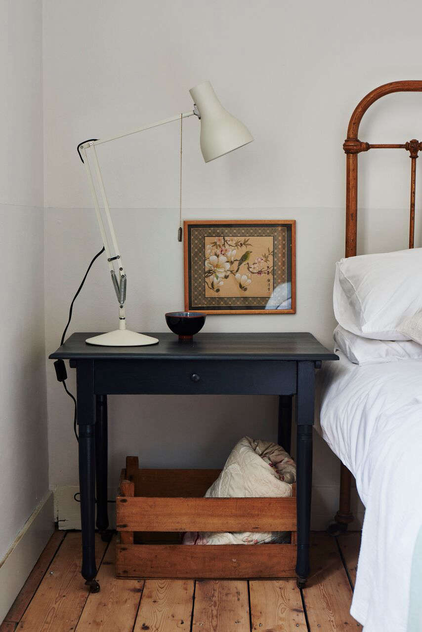
Above: In the same bedroom, Ellis updates a side table with a coat of paint- Railings by Farrow & Ball.
For more on Cassandra Ellis, see: Simple, Useful, Beautiful: A New Line of Furniture from Cassandra Ellis and On the Market: Cassandra Ellis’s London Flat.
Christine also writes Fabulous Fabsters, celebrating women who are FAB (Fifty and Beyond).







Have a Question or Comment About This Post?
Join the conversation (5)