Icon - Arrow LeftAn icon we use to indicate a rightwards action. Icon - Arrow RightAn icon we use to indicate a leftwards action. Icon - External LinkAn icon we use to indicate a button link is external. Icon - MessageThe icon we use to represent an email action. Icon - Down ChevronUsed to indicate a dropdown. Icon - CloseUsed to indicate a close action. Icon - Dropdown ArrowUsed to indicate a dropdown. Icon - Location PinUsed to showcase a location on a map. Icon - Zoom OutUsed to indicate a zoom out action on a map. Icon - Zoom InUsed to indicate a zoom in action on a map. Icon - SearchUsed to indicate a search action. Icon - EmailUsed to indicate an emai action. Icon - FacebookFacebooks brand mark for use in social sharing icons. flipboard Icon - InstagramInstagrams brand mark for use in social sharing icons. Icon - PinterestPinterests brand mark for use in social sharing icons. Icon - TwitterTwitters brand mark for use in social sharing icons. Icon - Check MarkA check mark for checkbox buttons.
You are reading

Kitchen of the Week: English Elegance Meets Southern Charm in Nashville

Search

Kitchen of the Week: English Elegance Meets Southern Charm in Nashville

July 11, 2024

Interior designer Rachel Halvorson had always admired Plain English, the U.K.-born cupboard maker, but it wasn’t until she found a Nashville client who shared her affection for traditional joinery and quaint scale that she was able to collaborate with the company. She worked with U.S. design director Imogen Pritchard as well as architect C. Brandon Ingram to update a 1966 Georgian Revival home with an open kitchen that blends the brand’s casual English elegance with Tennessee’s historic Southern charm. “It also has a little of Brooklyn grit because the homeowners met in New York,” Rachel adds.

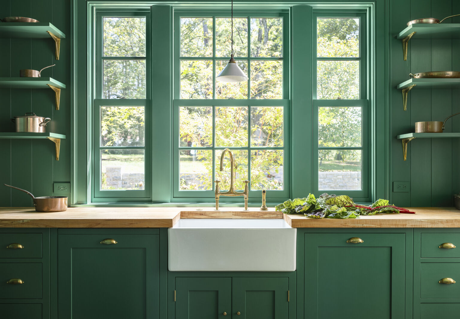
This trio of influences led to cabinetry with Shaker-style fronts and ornate cornices, aged brass hardware, and a color palette of creamy white, pale pink, and a dark brown aptly named Burnt Toast. Then there’s the unexpected shock of the cruciferous green larder, which can be seen through a doorway with transom windows. “We wanted to create a visual connection between the interior and the natural environment,” Imogen says.

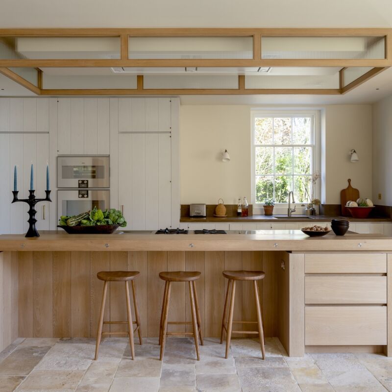
Let’s take a closer look.

Photography courtesy of Plain English.

the team opted for intricate moldings, transom windows, and red oak floors to m 17
Above: The team opted for intricate moldings, transom windows, and red oak floors to match the older part of the home, where original details had been preserved. They installed a wood paneled ceiling to bring a casual air to the kitchen.
a soapstone counter sits atop the blush toned island, which serves as the kitch 18
Above: A soapstone counter sits atop the blush-toned island, which serves as the kitchen’s centerpiece. “It was designed as a hardworking preparation space,” says Imogen. “Its chunky-yet-elevated design allows light to pass underneath, preventing it from dominating the room.” The fluted glass cabinet doors add texture and intrigue.
the hutch like countertop cupboards are finished with plain english&#8\2\17 19
Above: The hutch-like countertop cupboards are finished with Plain English’s Georgian cornice on top and stop short of the ceiling, making them feel like furniture. Brass knobs and bin pulls act as jewelry throughout.
the island&#8\2\17;s soft pink hue, which is titled silver polish, reappear 20
Above: The island’s soft pink hue, which is titled Silver Polish, reappears in the stone-floored mudroom.
barn red stools provide seating at the island. special features like the minima 21
Above: Barn red stools provide seating at the island. Special features like the minimal countertop overhang and built-in knife block drawer convinced the clients to splurge on Plain English. “They do a really good job of creating a kitchen that’s made for chefs and people that love to cook,” Rachel says. “Their attention to detail achieves beauty and function at the same time.”
integrated panels conceal the largest appliances, while the clients&#8\2\17 22
Above: Integrated panels conceal the largest appliances, while the clients’ cookbook collection is on display. “It worked out great to have the refrigerator and freezer on either side of the opening and we were left with 12 inches of space—what a perfect place to put cookbooks,” says Rachel.
a verdant color called sprouts envelops the larder. &#8\2\20;this small roo 23
Above: A verdant color called Sprouts envelops the larder. “This small room off of the kitchen is drenched in this vibrant green,” says Imogen. “The decision was influenced by the tree outside the window.”
ambrosia maple wood from the clients&#8\2\17; family farm was used to craft 24
Above: Ambrosia maple wood from the clients’ family farm was used to craft the pantry counter. “It adds such a unique element,” Rachel says. “It’s so nice to have something that’s personal to them in the design.”
large cabinets store dry goods, small appliances, and serving dishes. 25
Above: Large cabinets store dry goods, small appliances, and serving dishes.
a look back at the kitchen. 26
Above: A look back at the kitchen.

For more, head to Rachel Halvorson and Plain English.

And for more kitchens with unexpected color palettes, might we suggest:

(Visited 7,385 times, 1 visits today)
You need to login or register to view and manage your bookmarks.

Have a Question or Comment About This Post?

Join the conversation

v5.0