Icon - Arrow LeftAn icon we use to indicate a rightwards action. Icon - Arrow RightAn icon we use to indicate a leftwards action. Icon - External LinkAn icon we use to indicate a button link is external. Icon - MessageThe icon we use to represent an email action. Icon - Down ChevronUsed to indicate a dropdown. Icon - CloseUsed to indicate a close action. Icon - Dropdown ArrowUsed to indicate a dropdown. Icon - Location PinUsed to showcase a location on a map. Icon - Zoom OutUsed to indicate a zoom out action on a map. Icon - Zoom InUsed to indicate a zoom in action on a map. Icon - SearchUsed to indicate a search action. Icon - EmailUsed to indicate an emai action. Icon - FacebookFacebooks brand mark for use in social sharing icons. flipboard Icon - InstagramInstagrams brand mark for use in social sharing icons. Icon - PinterestPinterests brand mark for use in social sharing icons. Icon - TwitterTwitters brand mark for use in social sharing icons. Icon - Check MarkA check mark for checkbox buttons.
You are reading

Nabila’s: 8 Ideas to Borrow from a New Lebanese Spot in Brooklyn

Search

Nabila’s: 8 Ideas to Borrow from a New Lebanese Spot in Brooklyn

July 6, 2022

What we’ll call refined maximalism is making comeback—with a welcome dose of pattern and color seeping its way into interiors

Just take it from Nabila’s, a newly opened Lebanese restaurant in Cobble Hill, Brooklyn, designed by Frederick Tang Architecture in collaboration with the restaurant’s owners: Mike Farah, who left a career in finance to start the restaurant with his mother, Nabila, who was born in Lebanon and runs a catering company in D.C. The interiors take cues from Lebanese decorative arts and are designed to be a site for lively neighborhood dinner parties—and there are ample lessons in pattern mixing, color, and play throughout, too.

Let Nabila’s show you how it’s done:

Photography by Gieves Anderson, courtesy of Frederick Tang Architecture.

a cobble hill location was important to mike and nabila: it&#8\2\17;s where 17
Above: A Cobble Hill location was important to Mike and Nabila: It’s where Mike lives with his family, and the two wanted to create a neighborhood gathering space for its diverse community. The mother and son toured 20 locations before finding the right spot, situated on the ground floor of a Queen Anne-style building that dates to 1886. More recently, it was a dark tavern.

1. Add some florals and vines.

in the sunny front room of the restaurant, archways create small dining nooks.  18
Above: In the sunny front room of the restaurant, archways create small dining nooks. “We were influenced by the intricate details and use of color in traditional Middle Eastern decorative arts and wanted to play with mixing textures and patterns,” said Barbara Reyes, director of interior design and branding at Frederick Tang. Case in point: The team opted for built-in banquette cushions entwined, subtly, in vines: It’s Hella Jongerius’s Eden fabric for Maharam.

2. Play with geometry.

the interiors are a mix of geometric patterns that somehow never clash. the flo 19
Above: The interiors are a mix of geometric patterns that somehow never clash. The floor is tiled in Cement Floor Tiles designed by Iranian/French architect India Mahdavi for Bisazza (in the Petriolio and Latte colorway).

3. Play up curves.

there&#8\2\17;s hardly a right angle in sight at nabila&#8\2\17;s. a cu 20
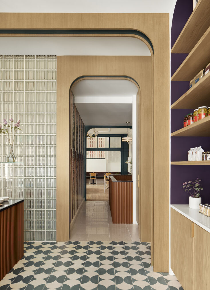
Above: There’s hardly a right angle in sight at Nabila’s. A curved Caesarstone counter and white oak arches—one behind the counter, the other across from it—act as centerpieces in the space and display the day’s offerings. Note how the team emphasized the shape of the arched dividers by painting the undersides green.

4. For palette inspiration, look to the menu.
why not consider what&#8\2\17;s on the plate when looking for paint ideas?  21
Above: Why not consider what’s on the plate when looking for paint ideas? The team drew their palette of eggplant purple and dark leafy green from vegetables used often in the kitchen. (The paint colors are Black Raspberry and Pacific Sea Teal, both by Benjamin Moore.)

The Frederick Tang team also reorganized the space’s layout, moving the kitchen in question to the center of the space. Now, it’s concealed behind a glass-block wall, which adds to the material mix.

5. Rethink wallpaper.

in the back dining room, the team used wallpaper on the ceilings and top portio 22
Above: In the back dining room, the team used wallpaper on the ceilings and top portions of the walls as a nod to Lebanese decorative arts, where geometric-patterned papers can sometimes wrap rooms. Here, Muted Wallpaper from Flat Vernacular covers half of the walls.

6. Think communally.

an antique bench was redesigned to wrap around the back of the room, a nod to t 23
Above: An antique bench was redesigned to wrap around the back of the room, a nod to the co-owners’ priority on making Nabila’s a space for the community. The bench adds a rustic element to the other seating throughout: Hay’s Petit Standard Chair in Oak and Pearl.

7. Keep what you can.

the frederick tang team redesigned and rehabbed an existing six foot wide brass 24
Above: The Frederick Tang team redesigned and rehabbed an existing six-foot-wide brass chandelier; now it hangs above the back dining room. The ceiling moulding is papered in Palais by Graham & Brown.

8. Make it a dinner party.

the restaurant is made to feel like a dinner party thrown by nabila, with sumpt 25
Above: The restaurant is made to feel like a dinner party thrown by Nabila, with sumptuous bowls and platters of food. The menu, too, is welcoming (the most expensive item is $21; the least expensive, a slice of baked farina cake with almond, is $1.50).

For much more, head to Nabila’s.

And for more ideas to borrow from restaurants, see:

(Visited 884 times, 1 visits today)
You need to login or register to view and manage your bookmarks.

Have a Question or Comment About This Post?

Join the conversation

v5.0