Icon - Arrow LeftAn icon we use to indicate a rightwards action. Icon - Arrow RightAn icon we use to indicate a leftwards action. Icon - External LinkAn icon we use to indicate a button link is external. Icon - MessageThe icon we use to represent an email action. Icon - Down ChevronUsed to indicate a dropdown. Icon - CloseUsed to indicate a close action. Icon - Dropdown ArrowUsed to indicate a dropdown. Icon - Location PinUsed to showcase a location on a map. Icon - Zoom OutUsed to indicate a zoom out action on a map. Icon - Zoom InUsed to indicate a zoom in action on a map. Icon - SearchUsed to indicate a search action. Icon - EmailUsed to indicate an emai action. Icon - FacebookFacebooks brand mark for use in social sharing icons. flipboard Icon - InstagramInstagrams brand mark for use in social sharing icons. Icon - PinterestPinterests brand mark for use in social sharing icons. Icon - TwitterTwitters brand mark for use in social sharing icons. Icon - Check MarkA check mark for checkbox buttons.
You are reading

Kitchen of the Week: Designer Georgia Ezra’s Modern-Rustic Star Kitchen in Melbourne

Search

Kitchen of the Week: Designer Georgia Ezra’s Modern-Rustic Star Kitchen in Melbourne

July 15, 2021

Every November for the last 21 years, Australian House & Garden unveils its Top 50 Rooms. A celebration of national talent, the latest list is filled with names we’re familiar with. But the space that most caught our eye, the all-wood Kitchen of the Year, is by a relative newcomer, Melbourne interior designer Georgia Ezra of Studio Ezra. We asked Georgia to fill us in on her star kitchen, and she explained that she designed it for herself and her young family. Conveniently, her husband, Richie Morris, is a builder and they both like to keep busy: this is the second house overhaul they’ve undertaken for themselves in the last three years during which their two kids were born.

Georgia says a real estate broker knowing of her fondness for Mediterranean style —her sideline business, Tiles of Ezra, specializes in Moroccan zellige—tipped her off about this house: “I happened to be at Dashing Nails getting my mani-pedi for a trip the next day to the US. We got back and inspected it right away; we could both feel it in our bones,” she says.

The historic structure had been lovingly maintained but untouched for decades and Georgia was excited to usher the interior into the 21st century, especially the kitchen. Taking inspiration from her travels, she introduced a pale timber and tiled design that’s both tailored and rustic, simple and carefully detailed: “My look is bohemian and natural. I’m deeply inspired by Morocco and Spain not only for their aesthetics but cultures, too,” she tells us. Her work, she adds, is also practical, noting that she did not stint on storage—overhead cabinets, this could be your comeback. Every element was custom made and selected with longevity in mind.

Photography by Amelia Stanwix, courtesy of Studio Ezra.

&#8\2\20;it has a the charm of an old space and the benefits of modern livi 17
Above: “It has a the charm of an old space and the benefits of modern living,” says Georgia of the U-shaped design anchored by a solid oak work island and floor of Studio Ezra zellige. The minimalist cabinets are inlaid with a subtle grasscloth to add a tactile element. “One hundred percent handmade earthy tones,” is how Georgia describes the pale palette.
dish washing with a view: the wood framed window overlooks a lush garden and ma 18
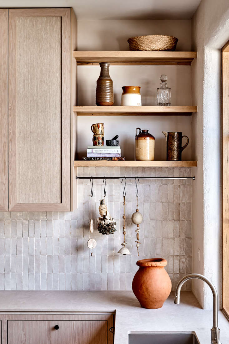
Above: Dish washing with a view: the wood-framed window overlooks a lush garden and mandarin tree. The counters are Topus Concrete by Caesarstone. For nuance and depth, the walls are finished with limewash paint from Bauwerk Colour of Germany. Note the contrasting graining on the cabinets and island.
the backsplash is composed of snow bejmat zellige from tiles of ezra. georgia s 19
Above: The backsplash is composed of Snow Bejmat zellige from Tiles of Ezra. Georgia says one of the most challenging aspects of the construction was getting her crew to add a lived-in look. “Our tradesmen really struggled to create edges that weren’t square. It was a language and a confidence I had to push on them.”
the cabinets are faced with a wood veneer from new age veneers&#8\2\17;s na 20
Above: The cabinets are faced with a wood veneer from New Age Veneers’s Navlam Sandblasted line and inset with Hemp Burlap from Twenty2 of Litchfield, Connecticut, which describes its product as “earth friendly throughout all phases of its lifecycle.”
many walls were removed over the course of this remodel: the kitchen is wide op 21
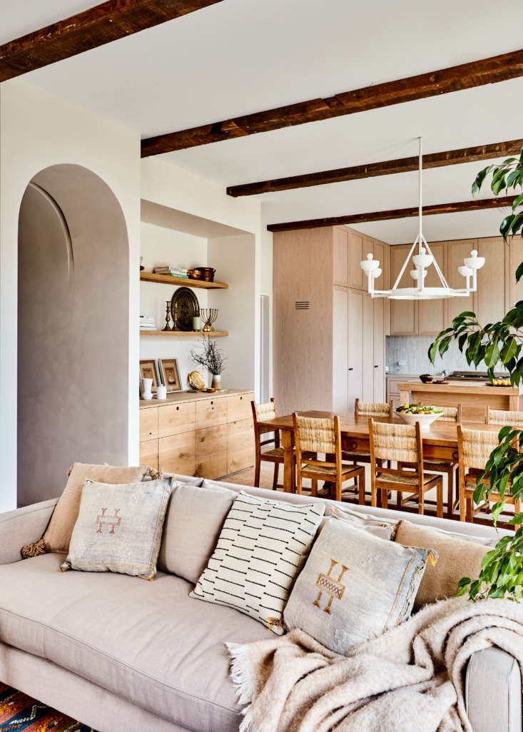
Above: Many walls were removed over the course of this remodel: the kitchen is wide open to the living-dining area. Georgia designed the plasterwork light over the table—she has a line of plaster lights coming next year. The archway is one of several she introduced to the house: “When we first put this one in, it looked like a Conehead,” she says. “I may have made James, our builder, rip it out twice. Let’s just say being a perfectionist comes with baggage.”

See more at Studio Ezra (and at Georgia Ezra you can watch the couple’s goofy renovation videos). Go to Homes to Love to see the rest of Australian House & Garden’s Top 50 Room winners 2019.

More modern-rustic kitchens:

(Visited 3,880 times, 1 visits today)
You need to login or register to view and manage your bookmarks.

Have a Question or Comment About This Post?

Join the conversation

v5.0