Icon - Arrow LeftAn icon we use to indicate a rightwards action. Icon - Arrow RightAn icon we use to indicate a leftwards action. Icon - External LinkAn icon we use to indicate a button link is external. Icon - MessageThe icon we use to represent an email action. Icon - Down ChevronUsed to indicate a dropdown. Icon - CloseUsed to indicate a close action. Icon - Dropdown ArrowUsed to indicate a dropdown. Icon - Location PinUsed to showcase a location on a map. Icon - Zoom OutUsed to indicate a zoom out action on a map. Icon - Zoom InUsed to indicate a zoom in action on a map. Icon - SearchUsed to indicate a search action. Icon - EmailUsed to indicate an emai action. Icon - FacebookFacebooks brand mark for use in social sharing icons. flipboard Icon - InstagramInstagrams brand mark for use in social sharing icons. Icon - PinterestPinterests brand mark for use in social sharing icons. Icon - TwitterTwitters brand mark for use in social sharing icons. Icon - Check MarkA check mark for checkbox buttons.
You are reading

Modern Design Meets the Center-Hall Colonial: A Washington D.C. House Gets a Bright New Guise

Search

Modern Design Meets the Center-Hall Colonial: A Washington D.C. House Gets a Bright New Guise

February 12, 2024

It was a case of strange bedfellows: an Italian couple based in Washington D.C. approached local architecture firm Fowlkes Studio with a 1980s brick Colonial and an impressive collection of pedigreed European modernist furniture. How to combine the two into a family home?

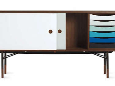
Fowlkes, which is run by husband-and-wife team, VW and Catherine Fowlkes (they studied architecture separately—he at Harvard, she at MIT—while living together), rose to the challenge by deftly streamlining both exterior and interior. Out went the window shutters and the center hall. In came the Poul Henningsen front door light, the Finn Juhl sideboard, and the  custom cabinetry in place of partitions.

It’s a makeover that transformed the house from the kid next door to international sophisticate. Let’s take a tour.

Photography by Jenn Verrier, courtesy of Fowlkes Studio (@fowlkesstudio).

the new looks begins at the entry. the italian owners—she&#8\2\17;s  17
Above: The new looks begins at the entry. The Italian owners—she’s works for an international organization; he’s in tech—are confirmed modernists, hence the painted brick (it’s Blackened from Farrow & Ball at 50 percent tint), new Marvin casement windows, orange steel stair rail, and aforementioned Poul Henningsen copper sconce. “On a block of buttoned-up red brick [it’s in Spring Valley], these details help the house stand out,” says Catherine. (Scroll to the end for a look at it Before.)
&#8\2\20;the furniture is almost all well known pieces from a mix of italia 18
Above: “The furniture is almost all well-known pieces from a mix of Italian, French, and Danish modern designers and architects. Every home our clients have lived in has incorporated these pieces, even their parents’ house,” says Catherine. The Vico Magistretti Chesterfield-style Raffles sofas and circular Sen tables are available from De Padova, a Milan-based company with a showroom in downtown NYC.

Note the new linear moldings that the architects introduced throughout—each room in a different design that’s a translation of the traditional. “Rather than create wood paneling on walls we applied square-cut wood (sticking) to the drywall and also created a custom crown,” explains Catherine. “It provides an elegant backdrop for the more contemporary, and in some cases, colorful furnishings.”

a finn juhl sideboard, a \1955 design still in production, stands in the den, w 19
Above: A Finn Juhl sideboard, a 1955 design still in production, stands in the den, which has a newly wide open to the living room. The circular hanging light is the Sorry Giotto from Catellani & Smith, an Italian company that supplied the majority of the lighting—the owner is an old friend of the family. The living room and den are painted Farrow & Ball’s Ammonite.
a ligne roset&#8\2\17;s prado sofa and saarinen womb chairs add primary col 20
Above: A Ligne Roset’s Prado Sofa and Saarinen Womb chairs add primary color to the den, which, the architects describe as “oriented around a custom monumental fireplace surround clad in honed Super White marble flanked by metal bookshelves.” Note the new crown molding and “sticking” on the ceiling. The wooden  floor is the existing white oak refinished.
in lieu of the center hall, custom cabinets two feet short of the ceiling serve 21
Above: In lieu of the center hall, custom cabinets two feet short of the ceiling serve in several spots as partitions and provide ample storage. (Scroll to the end to see Before and After floor plans.) The island, topped with honed Saffron White marble, is the only division between the kitchen and dining room. The cabinets, fabricated by Mersoa Woodwork, are wire-brushed white oak with stained walnut pulls, knobs, and toe kicks—the two-toned wood on George Nakashima’s Straight-Back Chair inspired the color combination (see the stool version in the pantry below).
&#8\2\20;the copious storage provided by the partition allowed the homeowne 22
Above: “The copious storage provided by the partition allowed the homeowners to forego upper cabinets in the main part of the kitchen, opting instead for a large picture window in front of the range,” write the architects. “The header over the window bulges out in a gentle curve to accommodate the exhaust fan, leaving the large window unobstructed.” Of the adjacent butler’s pantry they say: “Because the kitchen is on full display to the dining area, some real estate was culled from the existing  garage to create a second, adjacent kitchen area where dishes could be piled out of sight.”
the fridge and a second sink and dishwasher are tucked out of sight in the pant 23
Above: The fridge and a second sink and dishwasher are tucked out of sight in the pantry.
the pantry and island sinks both have grohe essence single handle faucets in di 24
Above: The pantry and island sinks both have Grohe Essence Single-Handle Faucets in different colors. The Lucenera sconce is from Catellani & Smith, an Italian company that supplied the majority of the lighting—the owner is an old friend of the family.
the dining room cabinets are inset with a textured fabric as a way to distingui 25
Above: The dining room cabinets are inset with a textured fabric as a way to distinguish them from the kitchen millwork.
a david x. levine painting hangs in the dining room, where tomato red wishbone  26
Above: A David X. Levine painting hangs in the dining room, where tomato-red Wishbone chairs surround &Tradition’s Drip table. The oak cabinets are shorter than the ceiling, says Catherine, to “allow light to bleed throughout the first floor and blur the distinction between furniture and architecture.”
two bedrooms and a bath were combined to create the primary suite: &#8\2\20 27
Above: Two bedrooms and a bath were combined to create the primary suite: “The space is organized around an oak bed wall that recalls the downstairs millwork and separates the bed chamber from the closets which, in turn, lead into the bathroom,” write the architects. The bedside String Cone and String Sphere lights are Michael Anastassiade’s designs from Flos.
the bath has venetian plaster walls and a white oak vanity topped with honed pe 28
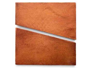
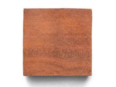
Above: The bath has Venetian plaster walls and a white oak vanity topped with honed Petite Blue limestone. The burnished nickel faucet is from Phylrich’s Transition linethe bath has venetian plaster walls and a white oak vanity topped with honed pe 29Above: Zia’s Cotto Tiles (Toltec Red Clay and Red Clay 4 x 4) step up to a Victoria + Albert soaking tub.

Before

the brick colonial was built in the \1980s. 30
Above: The brick Colonial was built in the 1980s.
a view from the dining room of the center hall entry: the plan was traditional  31
Above: A view from the dining room of the center-hall entry: The plan was traditional down to the wainscoting. The white oak floors were preserved but refinished with the dark stain removed.
the kitchen was white on beige. 32
Above: The kitchen was white on beige.

Floor Plan: BEFORE

the downstairs was formally divided with the two living rooms to the left of th 33
Above: The downstairs was formally divided with the two living rooms to the left of the hall, and a dining room and kitchen on the right. That’s the garage on the far right.

Floor Plan: AFTER

fowlkes studio introduced a more organic flow between the rooms. &#8\2\20;t 34
Above: Fowlkes Studio introduced a more organic flow between the rooms. “The hallway wall that divided the front hall from the dining room was entirely demolished and replaced with a continuous run of millwork: the first stretch houses the coat closet and is accessed from the hall.  The second run, adjacent to the dining room table, accommodates the family’s china and glassware. The cabinet then stretches into the kitchen where flipper doors expose a coffee station. These oak cabinets then take a left turn at the end of the hall where they offer a broom closet and other storage around a portal to the powder room.” A back section of the garage became the butler’s pantry.

Also by Fowlkes Studio:

Outbuilding of the Week: A Guest Cabana in Washington D.C.

(Visited 15,639 times, 3 visits today)
You need to login or register to view and manage your bookmarks.

Frequently asked questions

Who designed the modern update for the Washington DC brick colonial house?

The modern update for the Washington DC brick colonial house was designed by Fowlkes Studio.

What is the style of the brick colonial house's modern update?

The style of the brick colonial house's modern update is contemporary.

Where is the Washington DC brick colonial house located?

The Washington DC brick colonial house is located in Washington DC.

Is the modern update compatible with the original colonial architecture?

Yes, the modern update for the brick colonial house is designed to be compatible with the original colonial architecture.

What are some notable features of the modern update?

Some notable features of the modern update for the brick colonial house include open floor plan, large windows, and minimalist design elements.

Are there any before and after photos available for the modern update?

Yes, you can find before and after photos of the Washington DC brick colonial house's modern update on the Remodelista website.

Can I hire Fowlkes Studio for a similar modern update project?

Yes, you can contact Fowlkes Studio through their website for inquiries about similar modern update projects.

Is the modern update energy-efficient?

Yes, the modern update for the brick colonial house incorporates energy-efficient features such as insulation and efficient appliances.

Product summary  Item 6 164Item 7 165

w dwr 2582 516396 oak f
Carl Hansen & Son

Wishbone Chair

$985.00 USD from Design Within Reach
Modern Design Meets the CenterHall Colonial A Washington DC House Gets a Bright New Guise portrait 11
Sofas & Couches

Prado Sofa

£4,581.00 GBP from Chaplins
Modern Design Meets the CenterHall Colonial A Washington DC House Gets a Bright New Guise portrait 15
Ceramic Tile & Porcelain Tile

Red Clay

$160.79 USD from Zia Tile

Have a Question or Comment About This Post?

Join the conversation

v5.0