The ancient principles of wabi-sabi (loose translation: the acceptance of transience and imperfection) find a home in a contemporary Tokyo apartment designed by Naruse Inokuma Architects in collaboration with Karibe Hiroko Architects. Says Naruse: “By using new materials to create a sense of the old, we created a dynamic interior; the existing space adapts to the new, yet the age-old beauty remains.”
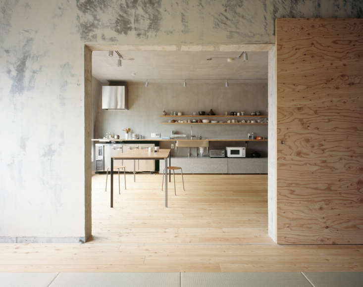
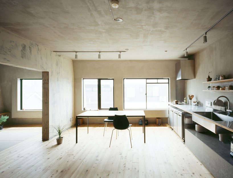
Nowhere is this more apparent than in the kitchen, which relies on a limited materials palette of concrete, larch plywood, and stainless steel and whose walls showcase found patina that the architects chose to celebrate instead of covering up.
Join us for a closer look.
Photographs by Masao Nishikawa.

Throughout the rest of the house, the architects emulated the kitchen’s patinated walls using cement rendering (a thin coat of sand, cement, and lime plaster) and putty to recreate the look.

The architects chose understated appliances and fixtures—a flat cooktop, undercounter refrigerators, an undermount sink—to complement the streamlined architecture. The architects sourced the appliances from a restaurant supply store. (The source is somewhat unexpected for a residential project, but we’ve found many household objects in restaurant supply stores. See a few picks in The Cull: 10 Affordable Storage Products from a Restaurant Supply Store.)

In contrast to the minimalist ethos of the architecture, the eclectic assortment of Japanese ceramics displayed on the open shelving add warmth and character. Curious about the striped vessel on the top shelf? See Donabe: The Ultimate Rice Cooker (Plus a Recipe) for more.

Love the look? See Steal This Look: A Restaurant Supply Kitchen in Tokyo for a breakdown of the design elements.
More Kitchens of the Week:
- Kitchen of the Week: A Laid-Back Courtyard Kitchen Where ‘Family Life Unfolds’
- Kitchen of the Week: Aya Brackett’s Hippie House Update in Oakland
- Kitchen of the Week: A Maine Farmhouse Kitchen That Doesn’t Play by the Rules


Have a Question or Comment About This Post?
Join the conversation (0)