Icon - Arrow LeftAn icon we use to indicate a rightwards action. Icon - Arrow RightAn icon we use to indicate a leftwards action. Icon - External LinkAn icon we use to indicate a button link is external. Icon - MessageThe icon we use to represent an email action. Icon - Down ChevronUsed to indicate a dropdown. Icon - CloseUsed to indicate a close action. Icon - Dropdown ArrowUsed to indicate a dropdown. Icon - Location PinUsed to showcase a location on a map. Icon - Zoom OutUsed to indicate a zoom out action on a map. Icon - Zoom InUsed to indicate a zoom in action on a map. Icon - SearchUsed to indicate a search action. Icon - EmailUsed to indicate an emai action. Icon - FacebookFacebooks brand mark for use in social sharing icons. flipboard Icon - InstagramInstagrams brand mark for use in social sharing icons. Icon - PinterestPinterests brand mark for use in social sharing icons. Icon - TwitterTwitters brand mark for use in social sharing icons. Icon - Check MarkA check mark for checkbox buttons.
You are reading

French Glam on a Budget: 15 Ideas to Steal from Mimi, New York’s Sexiest Bistro

Search

French Glam on a Budget: 15 Ideas to Steal from Mimi, New York’s Sexiest Bistro

July 14, 2017

A few weeks back, we discovered Mimi in New York City’s West Village. Alexa was the earlier adopter; then Julie wandered in for dinner with Janet (a Remodelista founding editor), and shortly after, Christine, our London editor, stopped in.

Opened by a young team of French and American owners, including model/designer Camilla Deterre, the space in an old Greenwich Village building was, surprisingly, transformed on a tight budget, with handwritten signs, clever use of marble, and vintage details. “Lots of the design came from the Art Deco period and then the resurgence of that in the 1970s,” says owner Daniel Bennett. “We knew it would be French, so we all went to Paris and went to the flea markets to pick out fixtures. The colors are all the same as the French flag, and the lines are all straight, with lots of mirrors, marble, and steel. We were all very interested in creating a jewel box—something that looks like nothing from the outside but is beautiful on the inside.”

We recently stopped by to uncover, in the light of day, just what makes the space so sultry at night. Here are 15 ideas to steal for maximum sex appeal on a budget.

Photography by Alison Engstrom for Remodelista.

1. One statement-making splurge goes a long way.

deterre, who designed the space in partnership with architect francesco ga 17
Above: Deterre, who designed the space in partnership with architect Francesco Galetto, splurged on just one design element: the dramatic marble wall behind the bar. “For me, it made most sense to have one expensive piece, and everything else could fall into place around that,” she says. “I’ve always loved marble—maybe in awe of it more than anything else. Looking at that wall is kind of like being by the ocean.” One carefully-chosen splurge serves as a focal point and makes the whole space feel more glamorous in turn.

2. Embrace curves.

a curved bar, custom built for mimi, is a welcome contrast to the str 18
Above: A curved bar, custom-built for Mimi, is a welcome contrast to the straight lines—shelves, chair legs, and marble borders—throughout the space. “The space is really very rectilinear, so giving the bar a nice wide curve really added a certain softness,” Deterre says. It also maximizes seating in a tight corner.

3. Handwrite for maximum charm.

 add a sense of offhand intimacy with handwritten notes and signs, li 19
Above: Add a sense of offhand intimacy with handwritten notes and signs, like place cards. The block-print signs above the bar were written out of necessity—”I wrote them the day before opening ’cause we needed them to pass inspection,” Deterre says— but were kept for their charm. Menus are also handwritten.

4. Add authenticity with vintage lights and fixtures.

deterre sourced all of the light fixtures from vintage shops throughout europe. 20
Above: Deterre sourced all of the light fixtures from vintage shops throughout Europe. Taking the time to seek out original details automatically adds atmosphere, according to Bennett: “My grandmother, Mimi [the restaurant’s namesake], always had nice things: The weight of them, the smell of them, the touch. It’s just something you can’t fake to someone who’s paying close attention. I truly believe this adds to energy in a room that people can subconsciously feel.” Or customize vintage finds: The Art Deco–style fixtures above the banquettes are vintage, from Paris; originally white, the team spray-painted them a dramatic black.

5. Take inspiration from the tricolour.

to create drama, pick a color palette and stick to it. at mimi, nearly everythi 21
Above: To create drama, pick a color palette and stick to it. At Mimi, nearly everything is blue, white, and red, inspired by the French flag: reupholstered blue velvet banquettes, blue and red painted shelves, and the legs and backs of chairs and barstools. Avoid kitsch by keeping materials simple and finding antiques that fit the scheme: Chairs were sourced from Amsterdam Modern in LA; the team painted the legs of stools in red and blue to “keep the space light and not too serious.”

6. Get the luxe look for less: Use marble as a border.

 take inspiration from high budget and adjust it for your space. & 22
Above: Take inspiration from high-budget and adjust it for your space. “We wanted to use a lot more marble in the design of Mimi. In almost all the ‘mood’ photos we were referencing there was marble,” Bennett says. Instead of maxing out the budget, they used it as an accent: “We found a lot of images from Vienna and France where marble was used instead of wood. This gave the us the general concept of using marble as an outline, because we couldn’t afford to have the entire bar or floor be marble.” Black marble borders the banquettes; spare pieces appear as plates for certain dishes “to tie the experience of dining in and aesthetics together in a subconscious way.”

7. Encourage intimacy.

embrace small dining areas with intimate seating and (not  d) a u shaped banque 23
Above: Embrace small dining areas with intimate seating and (not pictured) a U-shaped banquette. Keep it uncluttered with clean lines and symmetry.

8. Be bold: Add drama with a painted floor.

a concrete slab that had supported a pizza oven in an earlier life posed a desi 24
Above: A concrete slab that had supported a pizza oven in an earlier life posed a design and budget problem. To transform it, the team painted the floor in a bold red boat paint, which alerts visitors to the step up and creates the feeling of a separate “room” in the back. Consider painting a section of floor for a big impact with little effort.

9. Save money with simple vases and market flowers.

rather than extravagant arrangements, the mimi team sourced simple glass vases  25
Above: Rather than extravagant arrangements, the Mimi team sourced simple glass vases in New York’s flower district and fills them with bunches of market flowers, like the gladiolas shown here.

10. Keep dividers transparent.

keep small spaces from feeling closed in by using clever, partly transparent, d 26
Above: Keep small spaces from feeling closed-in by using clever, partly transparent, dividers. A shelving unit, rather than a solid wall, separates the back dining area from the stairwell and doubles as a stair rail. “The language of the wood divider was meant to match the back bar shelving,” Deterre says but, left unpainted, it’s a nod to the team of Japanese carpenters that worked on Mimi.

11. Make an impact with small details.
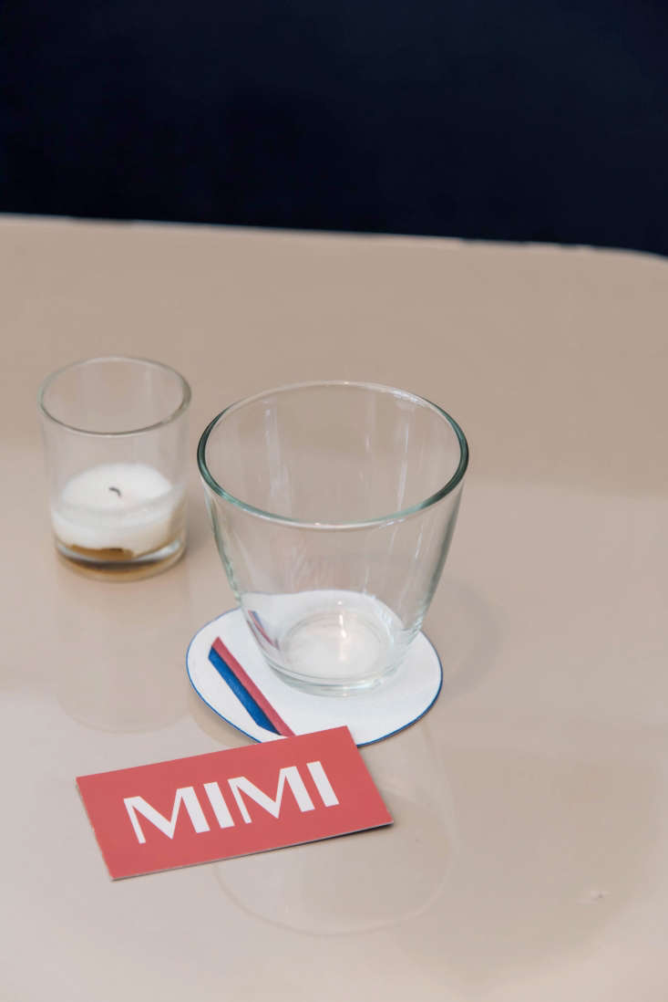
details on the table and bar are simple and classic: wax paper coasters, s 27
Above: Details on the table and bar are simple and classic: wax-paper coasters, simple drinking glasses, and print materials, designed by Deterre, that echo the Art Deco vibe. For a dinner party or a weeknight meal, don’t overlook small details like place cards and tea lights.

12. Find the glamour in the well-worn.

for a space that feels glamorous but not too glossy, embrace patina: half spent 28
Above: For a space that feels glamorous but not too glossy, embrace patina: half-spent candles and well-worn wood floors next to marble.

13. Be provocative in the bath.

Above: Small bathrooms are for bold choices. At Mimi, a stairwell leads to two small WCs with black accents, nude line drawings by artist Alba Hodsoll, and provocative “no smoking” signs by a New Yorker cartoonist.

14. Make a French getaway.

by the door: hooks for easy coat storage and a motorcycle helmet (courtesy of f 31
Above: By the door: hooks for easy coat storage and a motorcycle helmet (courtesy of French owner Luis Levy).

15. Even the simplest outdoor space can become a Parisian-style terrace.

outside, a manhattan sidewalk is transformed into a charming dining area thanks 32
Above: Outside, a Manhattan sidewalk is transformed into a charming dining area thanks to red and blue cafe chairs and tables, unfolded each evening before service.

More French style this way:

(Visited 1,095 times, 1 visits today)
You need to login or register to view and manage your bookmarks.

Have a Question or Comment About This Post?

Join the conversation

v5.0