You are reading

Architects’ 12 Favorite Blush Pink Paints

SearchJoinLogin
Icon - Arrow LeftAn icon we use to indicate a rightwards action. Icon - Arrow RightAn icon we use to indicate a leftwards action. Icon - External LinkAn icon we use to indicate a button link is external. Icon - MessageThe icon we use to represent an email action. Icon - Down ChevronUsed to indicate a dropdown. Icon - CloseUsed to indicate a close action. Icon - Dropdown ArrowUsed to indicate a dropdown. Icon - Location PinUsed to showcase a location on a map. Icon - Zoom OutUsed to indicate a zoom out action on a map. Icon - Zoom InUsed to indicate a zoom in action on a map. Icon - SearchUsed to indicate a search action. Icon - EmailUsed to indicate an emai action. Icon - FacebookFacebooks brand mark for use in social sharing icons. flipboard Icon - InstagramInstagrams brand mark for use in social sharing icons. Icon - PinterestPinterests brand mark for use in social sharing icons. Icon - TwitterTwitters brand mark for use in social sharing icons. Icon - Check MarkA check mark for checkbox buttons.
You are reading

Architects’ 12 Favorite Blush Pink Paints

SearchJoinLogin
Advertisement

Architects’ 12 Favorite Blush Pink Paints

by Published: February 13, 2020

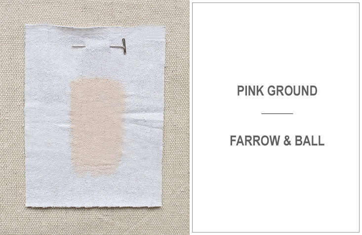
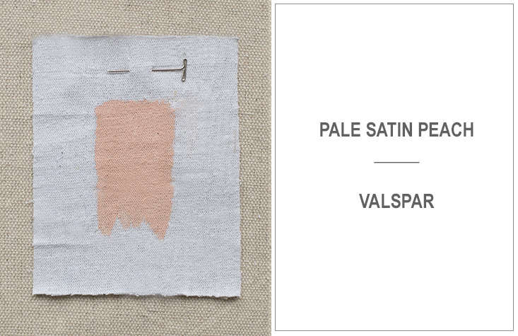
One the eve of Valentine’s Day, we asked our experts from the Remodelista Architect and Designer Directory for their go-to “millennial pink” paints. Their picks range from sweet and subtle to downright seductive, and neutral enough to look at year-round. Here are their favorites.

Photography by Mel Walbridge.

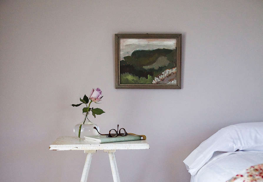
(N.B.: Featured photograph, above, by Justine Hand for Remodelista, from Cape Cod Summer Bedrooms Refreshed with Farrow & Ball Paint.)

the full range of pinks. 17
Above: The full range of pinks.
 kriste michelini of california firm kriste michelini interiors recommends 18
Above: Kriste Michelini of California firm Kriste Michelini Interiors recommends Benjamin Moore’s Bridal Pink, with peachy tones.
for pink in &#8\2\20;subtle tones,&#8\2\2\1; san francisco–based 19
Above: For pink in “subtle tones,” San Francisco–based Medium Plenty chooses Farrow & Ball’s Peignoir. (It’s also the color that Justine chose for her daughter’s bedroom; see picture at top.)
santa monica based mlk studio opts for calamine from farrow & ball. 20
Above: Santa Monica-based MLK Studio opts for Calamine from Farrow & Ball.

also recommended by kriste michelini: soft touch of pink by benjamin moore. 21
Above: Also recommended by Kriste Michelini: soft Touch of Pink by Benjamin Moore.
Architects 12 Favorite Blush Pink Paints portrait 15
Above: Ellen Hamilton of Hamilton Design Associates prefers Wild Aster from Benjamin Moore.
 both la based nickey kehoe and lauren geremia of bay area–based ge 23
Above: Both LA-based Nickey Kehoe and Lauren Geremia of Bay Area–based Geremia Design named Farrow & Ball’s Pink Ground as their favorite go-to “millennial pink.”
jayne michaels of new york city–based firm \2 michaels opts for farrow & 24
Above: Jayne Michaels of New York City–based firm 2 Michaels opts for Farrow & Ball’s Setting Plaster: “The pigments are earthy, smudgy, and warm, without a hint of sweetness,” she says.
 brooklyn firm made has devised a favorite custom pink: a coat o 25
Above: Brooklyn firm Made has devised a favorite custom pink: a coat of Seashell low-sheen paint by Australian company Sydney Harbour, topped with a coat of their French Wash, which creates a mottled patina look.
another, more rosy, choice from medium plenty: cinder rose by farrow  26
Above: Another, more rosy, choice from Medium PlentyCinder Rose by Farrow & Ball.

jon call of mr. call designs in new york city likes valspar’s pale satin 27
Above: Jon Call of Mr. Call Designs in New York City likes Valspar’s Pale Satin Peach, adding, “Fresh pinks like this bring a flush to the face and warmth to a room.”
marysia rybock of scavullo design recommends benjamin moore&#8\2\ 28
Above: Marysia Rybock of Scavullo Design recommends Benjamin Moore’s Southern Charm. “I actually used this in my own bedroom several years ago,” she says. “Soft pink with a beige undertone. Very classic looking.”

and finally, the brightest of the picks: michael howell of howells archite 29
Above: And finally, the brightest of the picks: Michael Howell of Howells Architecture & Design in Portland, Oregon, suggests Benjamin Moore’s Coral Reef. A little bit of this shade goes a long way; consider using it as an unexpected accent, rather than a full wall.
Not pictured: Marie Fisher Interior Design uses Rose Pále from Les Couleurs’ Le Corbusier collection of pigments.

For more on our top paint picks, head to our Palette & Paints tag page. And for more pink palettes, see:

(Visited 2,152 times, 1 visits today)
You need to login or register to view and manage your bookmarks.

Frequently asked questions

The article is about the favorite pink paint colors of architects.

Product summary 1-4 of 8 1-4 of 8

Have a Question or Comment About This Post?

Join the conversation (4)