Icon - Arrow LeftAn icon we use to indicate a rightwards action. Icon - Arrow RightAn icon we use to indicate a leftwards action. Icon - External LinkAn icon we use to indicate a button link is external. Icon - MessageThe icon we use to represent an email action. Icon - Down ChevronUsed to indicate a dropdown. Icon - CloseUsed to indicate a close action. Icon - Dropdown ArrowUsed to indicate a dropdown. Icon - Location PinUsed to showcase a location on a map. Icon - Zoom OutUsed to indicate a zoom out action on a map. Icon - Zoom InUsed to indicate a zoom in action on a map. Icon - SearchUsed to indicate a search action. Icon - EmailUsed to indicate an emai action. Icon - FacebookFacebooks brand mark for use in social sharing icons. flipboard Icon - InstagramInstagrams brand mark for use in social sharing icons. Icon - PinterestPinterests brand mark for use in social sharing icons. Icon - TwitterTwitters brand mark for use in social sharing icons. Icon - Check MarkA check mark for checkbox buttons.
You are reading

Suburb Staid No More: A California-French Family Remake a Bay Area House

Search

Suburb Staid No More: A California-French Family Remake a Bay Area House

March 15, 2019

When we first met Stéphanie Ross several years ago, she had a hint of plaster dust in her hair. That was at Remodelista’s San Francisco Market, where she was showing her children’s clothing line, Les Petits Carreaux (now available at Anthropologie and in some women’s sizes, too). At the time, she had just about finished resuscitating her family’s apartment near the Champs-Élysées—we took a tour and immediately featured it: see A Grand but Understated Flat in Paris. And she was also getting started on their main base, a 1949 house in the manicured Oakland suburb of Piedmont. Every time we’ve crossed paths since then, we caught updates: what started as a rear deck addition had snowballed into a complete rethink of the interior.

Stéphanie and her lawyer husband, Aaron Ross—he’s from Piedmont, she grew up in a small farming village near Dunkirk, France, and they have a 10-year-old son, Joseph—had given their place a test drive by living in it for three years. “Everything was vintage suburban—aluminum frame windows, tile countertops,” she tells us. “The house is built into a hillside and the downstairs, half the footprint of the main floor, was covered in lime green shag carpet.” And so, as they began working with Kristen Sidell of Sidell Pakravan Architects, they decided to keep going.

The dark, conventional house was not them: “The Rosses are consummate entertainers who love gathering friends for everything from Beatles singalongs to raclette parties,” says Kristen, who, in close collaboration with Stéphanie (the two met as parents in their kids’ school), ended up rethinking just about every inch.  Together they introduced a new kitchen and bathrooms, new windows, updated finishes, and a new stair to an expanded first floor. The overall idea, in Kristen’s words, was “to create a much more open, expansive home that integrates the family’s French aesthetic with their California lifestyle.”  Now hoping to take on interior design projects for others, Stéphanie summoned us to see the results.

Photographs by Jean Bai unless noted, courtesy of Sidell Pakravan Architects.
the red brick exterior—with its original slate roof—was given a f 17
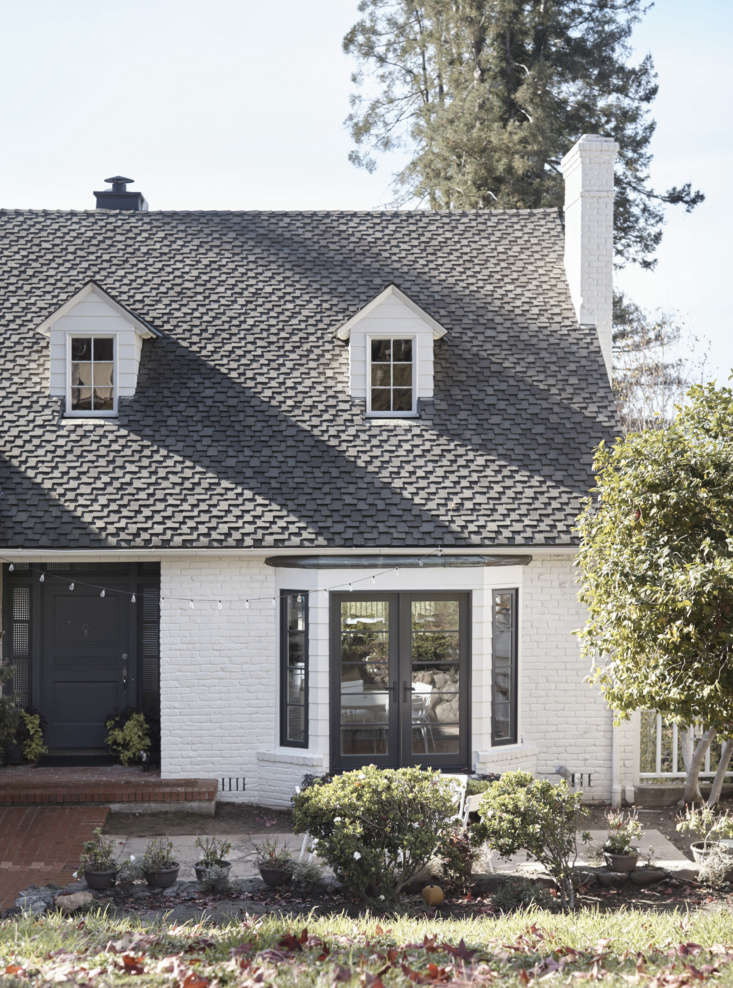
Above: The red brick exterior—with its original slate roof—was given a fresh guise courtesy of white paint and black-framed windows, including new French doors in the bay window. “My inspiration for the cottage-style look was from the North of France, where I grew up,” says Stéphanie.

The windows throughout are by Sierra Pacific. The house color is Shaded White and the front door and windows are Railings, both from Farrow & Ball.

 stéphanie&#8\2\17;s crucial requirement was that all of the orig 18
Above: Stéphanie’s crucial requirement was that all of the original moldings around the ceilings and partitions be removed for a seamless modern look. (Scroll below to see the space as it was.)  The combination living room and dining area/kitchen were connected to the front and backyards through glass doors. The existing mantelpiece was replaced with a “minimalist protrusion” that disappears into the wall, all painted in Farrow & Ball’s Railings.

“Nothing is too proper or formal,” says Stéphanie of her mix of antique and contemporary pieces, the boldly patterned and the clean white. “It’s Paris and San Francisco united.” The geometric rug is from The Rug Company. Of her lighting choices, Stéphanie says: “Instead of having only sconces and ceiling lights, I wanted table lamps everywhere—they’re mood warmers and nice accents.”

thanks to the french doors in the front and new folding glass doors in the back 19
Above: Thanks to the French doors in the front and new folding glass doors in the back, there’s “a completely open line of living from the front garden to the outdoor deck,” says Stéphanie. “The house went from feeling super constrained to light and connected with the landscape,” adds Kristen. “The Frenchness is revealed through the subtle yet rich materials and colors.”

Suzanne Rasic, an interior designer friend of Stéphanie’s, helped with the furniture placement. The pair of white leather sofas are the Como from DWR.

the dining area is set off by a feature wall and nanawall doors, an accord 20
Above: The dining area is set off by a feature wall and NanaWall doors, an accordion design that Kirsten says “allows a 14-foot opening.” It leads to a cantilevered deck. Stéphanie came across the Closet Stripe wallpaper while picking paint colors at Farrow  & Ball.

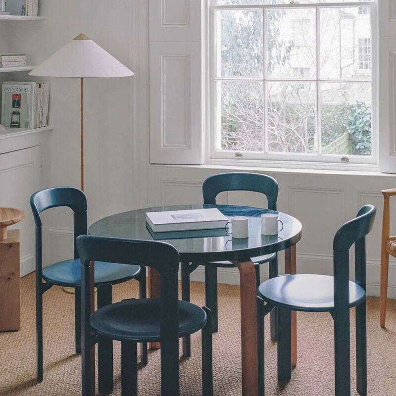
To fully open up the space during at-home trunk shows and other big gatherings, the dining table gets moved against a wall and the Laclasica Chairs can be stacked.

the existing midcentury kitchen was replaced by a minimalist u shaped design in 21
Above: The existing midcentury kitchen was replaced by a minimalist U-shaped design in ash by Henrybuilt, which Stéphanie selected for its clean-lined workmanship and “because it’s American made.” (At a time when so many boutique European kitchen companies are setting up shop in the States, it’s nice to remember that Henrybuilt has been here since 2001.) The wide oak flooring is original. Photograph courtesy of Henrybuilt.
each room is defined by one attention grabbing detail; here, it&#8\2\17;s t 22
Above: Each room is defined by one attention-grabbing detail; here, it’s the locally made Heath Bowtie and Diamond-shaped dimensional tiles in a glaze called Frost that allows the clay to subtly show through. “I wanted a wall with no upper cabinets, just a dramatic backsplash that you can see from the living room,” says Stéphanie.

The oven, cooktop, and hood are by Miele. The ash cabinets have a slight white stain and are detailed with Henrybuilt’s integrated metal pulls; the durable—and nearly invisible—are Corian-style solid surface. Photograph courtesy of Henrybuilt.

as a &#8\2\20;rustic contrast,&#8\2\2\1; stéphanie chose a wooden  23
Above: As a “rustic contrast,” Stéphanie chose a wooden table and metal chairs from The Gardener in Berkeley. Photograph courtesy of Henrybuilt.
the powder room&#8\2\17;s slim, wall mounted sink with towel bar is an alap 24
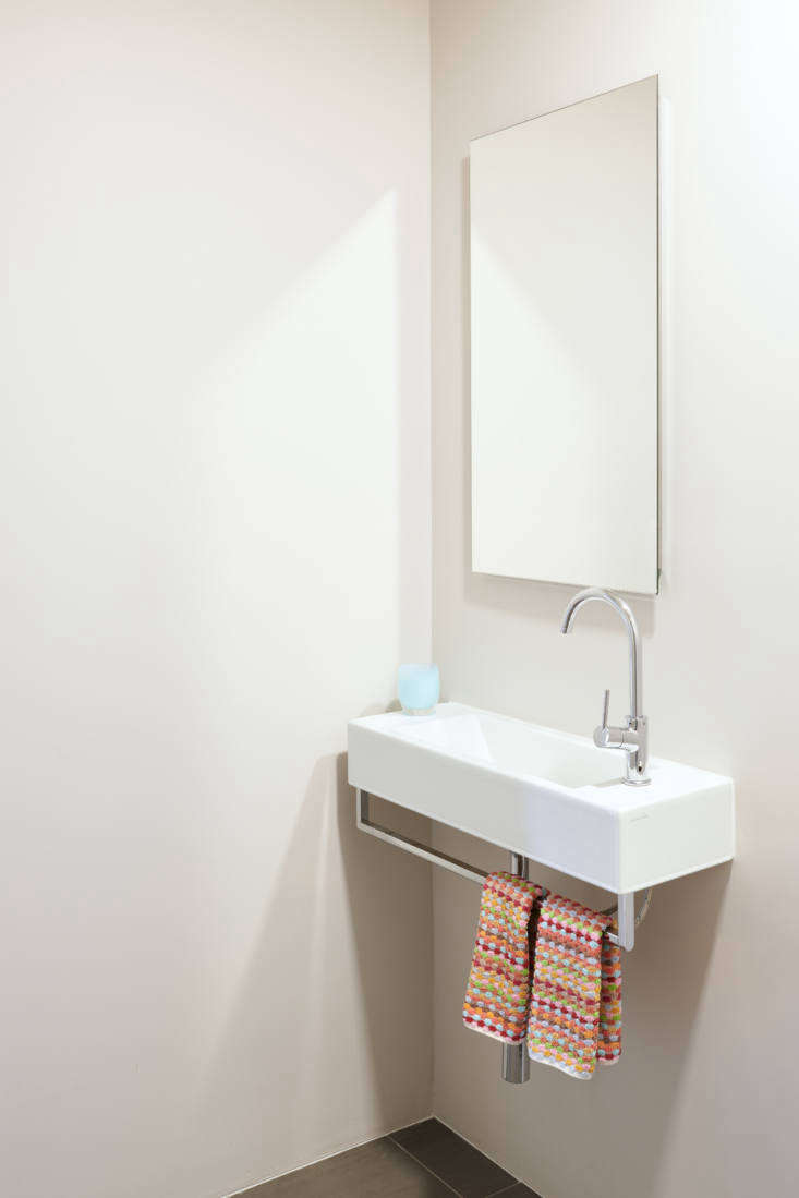
Above: The powder room’s slim, wall-mounted sink with towel bar is an Alape design and the faucet is by Fantini, both sourced from Jack London.
 kristen replaced a central cluster of closets with an architectural stair 25
Above: Kristen replaced a central cluster of closets with an architectural stair to the lower level. “The openness of the design allows light to extend between the spaces,” she says, “and the enclosing low walls are painted white to increase the luminosity.”

The space right off the stair is used as a music/rec room—”drums, piano, and guitar are all present, as is a ping-pong table.”

Above L: Joseph’s bathroom has an integrated sink and vanity from Blu Bath Works’s 51 Collection. The mirror is from DWR. Above R: “My son wanted a red bath, so I decided to tile everything white other than the shower,” says Stéphanie, “I didn’t want anything to compete with that.” The tiles are from Heath’s Classic Field collection in Stone White and Paprika.
the black and white master bath is dressed up with michael anastasiades&#8\ 28
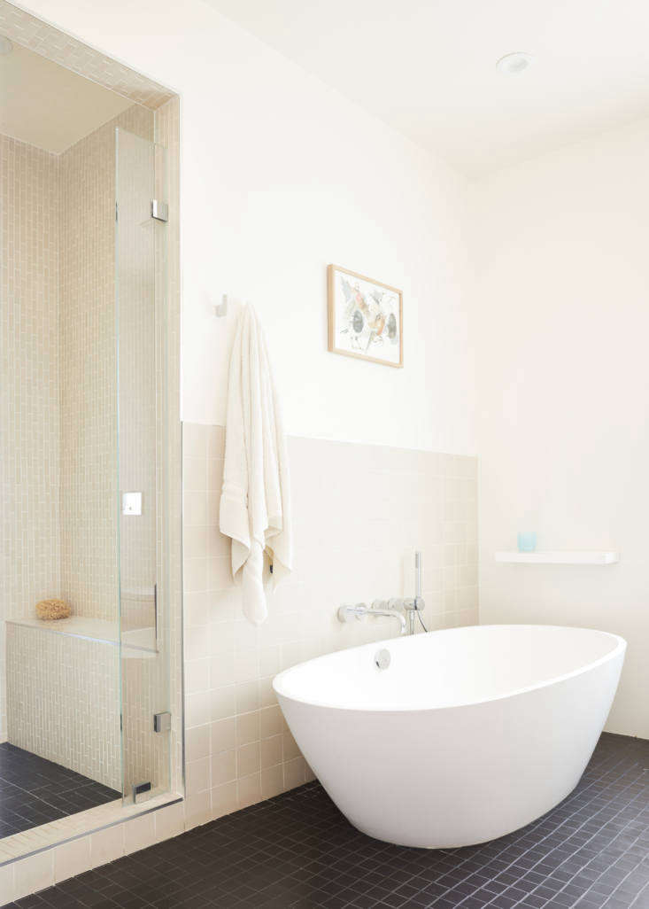
Above: The black-and-white master bath is dressed up with Michael Anastasiades’s IC Lights S2 for Flos. The sink vanity and wall-hung toilet are from Blu Bath Works (“suspended toilets were a must for a light and airy line, and the minimalist cabinets and countertops echo the kitchen design,” says Stéphanie). The unglazed white backsplash tiles and square black floor tiles are from Heath. The mirror is by Egg Collective.
the organically shaped freestanding tub is the allisa from mti. 29
Above: The organically-shaped freestanding tub is the Allisa from MTI.
sidell pakravan architects created an open plan living room and kitchen with di 30
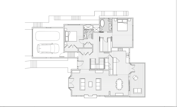
Above: Sidell Pakravan Architects created an open-plan living room and kitchen with direct links to the outdoors. “The biggest challenge was bringing a modern aesthetic to a very staid, traditional home,” says Kristen Sidell.
linked to the main floor by a new stair, the lower level was expanded to includ 31
Above: Linked to the main floor by a new stair, the lower level was expanded to include a family room and bedrooms.

Before

the living room as it looked in the real estate listing when the rosses bought  32
Above: The living room as it looked in the real estate listing when the Rosses bought the house. Note the traditional mantel and moldings, now all gone. The room’s new windows were modeled after the existing multi-light, aluminum-framed designs.
not only the shag carpeting but the small, enclosed stair were nixed. 33
Above: Not only the shag carpeting but the small, enclosed stair were nixed.
joseph&#8\2\17;s bathroom as it was. &#8\2\20;a lot of people liked the 34
Above: Joseph’s bathroom as it was. “A lot of people liked the midcentury details in the baths and kitchen,” says Stéphanie, “but we wanted a clean, contemporary look.”

More by Henrybuilt:

(Visited 1,241 times, 1 visits today)
You need to login or register to view and manage your bookmarks.

Have a Question or Comment About This Post?

Join the conversation

v5.0