Icon - Arrow LeftAn icon we use to indicate a rightwards action. Icon - Arrow RightAn icon we use to indicate a leftwards action. Icon - External LinkAn icon we use to indicate a button link is external. Icon - MessageThe icon we use to represent an email action. Icon - Down ChevronUsed to indicate a dropdown. Icon - CloseUsed to indicate a close action. Icon - Dropdown ArrowUsed to indicate a dropdown. Icon - Location PinUsed to showcase a location on a map. Icon - Zoom OutUsed to indicate a zoom out action on a map. Icon - Zoom InUsed to indicate a zoom in action on a map. Icon - SearchUsed to indicate a search action. Icon - EmailUsed to indicate an emai action. Icon - FacebookFacebooks brand mark for use in social sharing icons. flipboard Icon - InstagramInstagrams brand mark for use in social sharing icons. Icon - PinterestPinterests brand mark for use in social sharing icons. Icon - TwitterTwitters brand mark for use in social sharing icons. Icon - Check MarkA check mark for checkbox buttons.
You are reading

An Architect’s Narrow Townhouse in Montreal, Design Studio Included

Search

An Architect’s Narrow Townhouse in Montreal, Design Studio Included

May 17, 2021

The ask was formidable: update the Victorian-era townhouse; restore some of the period details that had been removed in an ill-conceived 1980s renovation; bring more light into the building, which had just two exposures (at the front and back); carve out a functional, client-ready office space that would feel separate from the rest of the home. And P.S., the building has a footprint of just 10 by 50 feet.

Fortunately, the architect, Michael Godmer, was more than up for the challenge. It was his house, after all. Michael shares the sliver of a home—three stories tall but skinny as can be—with his partner Mathieu Turgeon. The two had originally planned on overhauling only the kitchen, but then, in Michael’s words, “we began to scrap everything including the exterior.”

Good thing they did, because the results are transformative. Let’s take a tour of Maison Boutique Coloniale, their name for the project, and see how they turned their small and dreary townhouse in Montreal into a clean, well-lighted space suitable for work and home.

Photography by Maxime Brouillette, courtesy of Michael Godmer.

michael and mathieu&#8\2\17;s house, located in montreal&#8\2\17;s plat 17
Above: Michael and Mathieu’s house, located in Montreal’s Plateau Mont-Royal neighborhood, is sandwiched between two larger buildings.
the front door leads to the ground floor, which michael has turned into his ded 18
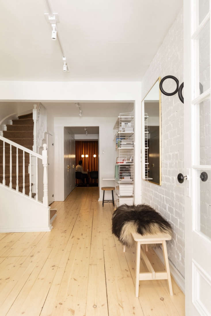
Above: The front door leads to the ground floor, which Michael has turned into his dedicated design studio. “We didn’t want to have the feeling of living in an office, and we also we didn’t want the client to have the impression of being in our home,” he explains of their decision to silo the office to this floor. Two black Gym Hooks by Hay hang at the ready for coat storage.
the staircase is original to the \1885 house. the couple added a tretford carpe 19
Above: The staircase is original to the 1885 house. The couple added a Tretford carpet runner in lambswool. The main work area is to the left. The String shelving and desk unit on the right is additional work space for colleagues that occasionally drop in to collaborate.
michael in front of simple built in desks and a display of tile samples. under  20
Above: Michael in front of simple built-in desks and a display of tile samples. Under the desk are two Alex Drawer Units from Ikea.
another ikea find: the sinnerlig cork stool designed by ilse crawford, now disc 21
Above: Another Ikea find: the Sinnerlig cork stool designed by Ilse Crawford, now discontinued. Michael decided to turn the middle, window-less portion of the floor over to storage and utility closets and a powder room.
on the other end of the floor is a conference room for visiting clients. michae 22
Above: On the other end of the floor is a conference room for visiting clients. Michael added orange velvet drapery for a “speakeasy atmosphere.”
the terrazzo powder room, featuring a sink from porcelanosa. 23
Above: The terrazzo powder room, featuring a sink from Porcelanosa.
the kitchen, dining, and living rooms comprise the second floor. the terracotta 24
Above: The kitchen, dining, and living rooms comprise the second floor. The terracotta tiled floors are new but replicate the original flooring in the kitchen.
just off the kitchen is the couple&#8\2\17;s lush courtyard. calacatta arab 25
Above: Just off the kitchen is the couple’s lush courtyard. Calacatta arabescato marble was chosen for its dramatic dark gray veining. The suspension light is by Lambert & Fils; the stools are from Hay.
the custom oak cabinetry is by Éco Ébénisterie saint dominique.  26
Above: The custom oak cabinetry is by Éco-Ébénisterie Saint-Dominique. A slim shelf rests above the backsplash.
the couple furnished their home with a mix of vintage finds, new modern pieces, 27
Above: The couple furnished their home with a mix of vintage finds, new modern pieces, and family heirlooms, including the dining table and the rake, both from Mathieu’s side of the family. “His mother and father where living in Iraq for a time. They used it to scrape the sand,” says Michael of the rake.
the long view, from the living room, toward the dining room, into the kitchen. 28
Above: The long view, from the living room, toward the dining room, into the kitchen.
the simple living room, with a serif tv by the bouroullec brothers for samsung. 29
Above: The simple living room, with a Serif TV by the Bouroullec brothers for Samsung. The couple chose Sherwin Williams’ High Reflective White for the walls throughout the home. The wood floors are original; they were simply sanded and treated with a matte varnish.
the third floor has two bedrooms. here, simplicity abounds. a nelson bubble lam 30
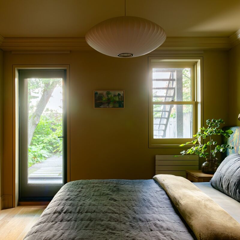
Above: The third floor has two bedrooms. Here, simplicity abounds. A Nelson bubble lamp hangs above a platform bed from Floyd. The mirror is from Ikea.
&#8\2\20;the pink side table is custom made for our small collection of fur 31
Above: “The pink side table is custom-made for our small collection of furniture that we sell,” says Michael. A Carrie Portable LED Lamp by Norm Architects is cleverly used as a sconce here.

For more narrow homes, see:

(Visited 2,182 times, 1 visits today)
You need to login or register to view and manage your bookmarks.

Have a Question or Comment About This Post?

Join the conversation

v5.0