Icon - Arrow LeftAn icon we use to indicate a rightwards action. Icon - Arrow RightAn icon we use to indicate a leftwards action. Icon - External LinkAn icon we use to indicate a button link is external. Icon - MessageThe icon we use to represent an email action. Icon - Down ChevronUsed to indicate a dropdown. Icon - CloseUsed to indicate a close action. Icon - Dropdown ArrowUsed to indicate a dropdown. Icon - Location PinUsed to showcase a location on a map. Icon - Zoom OutUsed to indicate a zoom out action on a map. Icon - Zoom InUsed to indicate a zoom in action on a map. Icon - SearchUsed to indicate a search action. Icon - EmailUsed to indicate an emai action. Icon - FacebookFacebooks brand mark for use in social sharing icons. flipboard Icon - InstagramInstagrams brand mark for use in social sharing icons. Icon - PinterestPinterests brand mark for use in social sharing icons. Icon - TwitterTwitters brand mark for use in social sharing icons. Icon - Check MarkA check mark for checkbox buttons.
You are reading

Open House: A Small Mid-Century Home Revives Its Original Spirit

Search

Open House: A Small Mid-Century Home Revives Its Original Spirit

July 15, 2024

The problem with the mid-century split-level home in Hoeilaart, Belgium, wasn’t that it had been neglected over the years. The problem was that it had been subjected to too much attention—all ill-conceived interventions that turned the once-elegant and simple structure, designed by architect Y. Loze and built in 1962, into a Frankenstein.

“The place was messy, with a lot of parasitic elements such as cheap verandas, added walls, separations, concrete slab,” says Sébastien Dachy, cofounder of Brussels-based architectural studio Mamout. (For proof, scroll to the end for the frightening “before” shot.) Working in collaboration with architect Stéphanie Willocx, he and his team cleaned up the extraneous and the heinous, returning the home to its minimalist roots and continuing the conversation between the indoors and outdoors.

The new owners, a cook and a seamstress, had another request, too: a second bedroom. The house was designed as a one-bedroom, but with two children, the couple needed at least one more. Rather than compromising the original design and adding an extension, the team decided to convert an underused underground garage into a large shared kids’ bedroom and create a new “stair tunnel” that connects it to the main house above.

Join us as Sébastien walks us through the sensitive restoration.

Photography by Séverin Malaud, courtesy of Mamout.

from the street, just the upper portion of the split level home is visible. 17
Above: From the street, just the upper portion of the split-level home is visible.
the original garage, nestled into the side of a hill, is now the kids&#8\2\ 18
Above: The original garage, nestled into the side of a hill, is now the kids’ bedroom. Its roof has been turned into a patio garden that connects to the dining area in the main house.
a portrait of &#8\2\20;the owner’s great great great great great gra 19
Above: A portrait of “the owner’s great great great great great grandmother,” says Sébastien, welcomes visitors in the entry to the home. (A powder room is behind this door. The doorway to the rest of the home is across from the bench.)
the home is small but feels airy and spacious thanks to a wall of glass in the  20
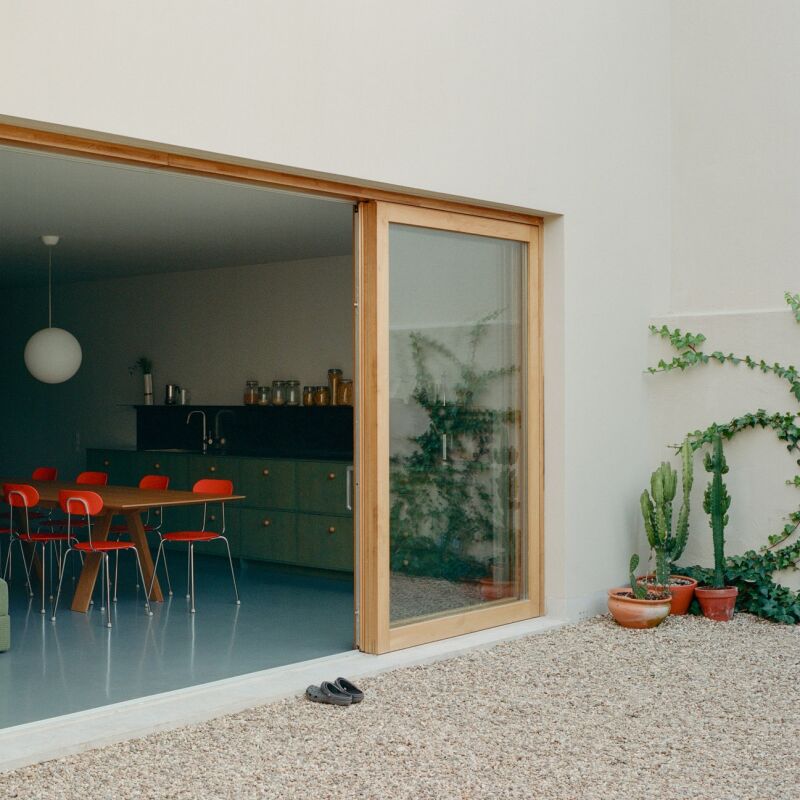
Above: The home is small but feels airy and spacious thanks to a wall of glass in the main living/dining area.
sliding glass doors lead to a &#8\2\20;naturalist punk&#8\2\2\1; garden 21
Above: Sliding glass doors lead to a “naturalist punk” garden (the roof of the kids’ bedroom). The garden design was influenced by French landscape architect Eric Lenoir’s book Petit Traité du Jardin Punk. “The main idea is to work with what already exists, keep your garden low-tech, natural, wild and free—a nice place for bees and butterflies,” says Sébastien. The floating deck is made from Robinia, “the only European wood than can be used outdoor without treatment.”
pellet stoves are the sole source of heating in the home. hovering over the din 22
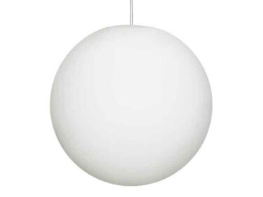
Above: Pellet stoves are the sole source of heating in the home. Hovering over the dining table is a mid-century classic—the Luna pendant light.
the stainless steel cabinets were made by local fabricators. the flooring is li 23
Above: The stainless steel cabinets were made by local fabricators. The flooring is linoleum.
a lofted living room and office is just off the dining room. 24
Above: A lofted living room and office is just off the dining room.
behind the usm haller console is the &#8\2\20;stair tunnel&#8\2\2\1; th 25
Above: Behind the USM Haller console is the “stair tunnel” that goes down to the main bedroom (on a mezzanine) and the kids’ bedroom (on the bottom floor). “We dug a tunnel under the original house to reach the former garage,” explains Sébastien.
the view from the loft to the dining area. 26
Above: The view from the loft to the dining area.
the loft is used for &#8\2\20;chilling, playing, listening to music, readin 27
Above: The loft is used for “chilling, playing, listening to music, reading, and looking towards the garden from an upper point of view,” says Sébastien. “The sheep is originally a bar stool designed by Hans Peter Krafft in the ’70s.”
the main bedroom, with a cutout window into the ensuite bath. 28
Above: The main bedroom, with a cutout window into the ensuite bath.
the couple&#8\2\17;s two children share this large bedroom on the bottom fl 29
Above: The couple’s two children share this large bedroom on the bottom floor (formerly the garage). The plywood structure houses both their beds. When they are older, the space can be converted into two separate bedrooms. Behind the curtains are a bathroom and laundry area.
the driveway turned patio is just outside the kids&#8\2\17; bedroom. that v 30
Above: The driveway-turned-patio is just outside the kids’ bedroom. That V-shaped metal object jutting out from the top of the building is the world’s most stylish gutter.

Before

a photo of the house in \200\2, concealed behind layers of bad remodels. 31
Above: A photo of the house in 2002, concealed behind layers of bad remodels.

For more before and after transformations, see:

N.B. This story originally ran on October 23, 2023 and has been updated.

(Visited 31,371 times, 2 visits today)
You need to login or register to view and manage your bookmarks.

Product summary  

Have a Question or Comment About This Post?

Join the conversation

v5.0