The latest kitchen on our radar: a young architect/designer couple’s own remodel in the Los Feliz neighborhood of Los Angeles. “The attached photos are of a recently renovated kitchen in a 1938 colonial cottage,” designer Shana Sherwood wrote to us. “We were looking for more of a family home because I was pregnant, although we were not in a rush because we wanted to hold out for something special. Our criteria was a house with interesting architecture that had not been renovated, and this house exactly fit the bill.”
The historic house had good bones and plenty of charm, but was badly in need of an update—the perfect combination for Sherwood and her husband and partner, architect George Kypreos, who were eager to make it their own. “The previous owner had lived here since the 1940s and maintained the house well but never renovated. The house was a little dark and dingy, but charming. We loved all of the architectural details and knew that we could make the house really come alive with a little work,” says Sherwood.
Together, the couple designed a bright, charming kitchen with the house’s original quirks—vaulted ceilings, paneling, a tall brick fireplace—intact. Join us for a look inside.
Photography by Shade Degges, courtesy of Sherwood Kypreos.

“We wanted the house to reflect our aesthetic, but we also wanted all the renovations to still feel like they belonged in the colonial farmhouse architecture,” Sherwood explains. Before they started work, she says, “every wall that wasn’t paneled was covered in wallpaper that had been painted over. You could see each decade the house had been through expressed by the layers of wallpaper.”
For an update, the couple opted for a neutral palette that feels original. “One day I looked at my husband/business partner and said, ‘khaki-colored cabinets and black countertops,’ and that was that,” says Sherwood. The kitchen walls and ceiling are painted in Portola’s Crisp, the cabinetry in Farrow & Ball’s Stony Ground, and the base of the center island in Portola’s Obey Grey.
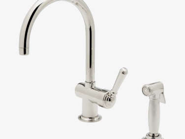
The couple wanted to preserve the kitchen’s lofty ceiling, but it also added a challenge: lighting. “There is no added ceiling at all in most of the house, so recessed lights were out of the question,” Sherwood says. They opted for black pendant lights from Rejuvenation, installed on an exposed conduit. The sink is Kohler and the faucet is from Waterworks (the Orleans style is similar). The linen top down/bottom up shade was custom-made by a drapery fabricator. (“It’s great if you want light but also want privacy,” Sherwood says.)

The couple opted for two types of countertop: soapstone for the main portion of the countertop and the backsplash behind the range, and maple butcher block for the island (which just needs oiling every so often, they say).


When sourcing potentially big-ticket items, the couple called on their professional connections: “The range top and ovens were salvaged by an electrician we know from a huge spec house in Orange County,” Sherwood says. “They were only very slightly used, but the whole kitchen was being redone,” allowing them to score like-new appliances for less. The cabinets above the ovens and fridge store extra cookware and “a large collection of novelty mugs.”

The wood oven is original, with some tweaks: “It was originally designed to be an indoor barbecue, but I’ve spoken to some people who had these in their homes growing up and they all said that the house would smell like barbecue for days after using them,” Sherwood explains. “We decided to take advantage of the gas line and use it as a counter-height fireplace instead.” They admit they were hesitant about a high fireplace bu remembered one they’d seen and loved at a restaurant in St. Helena, and they haven’t had any issues.


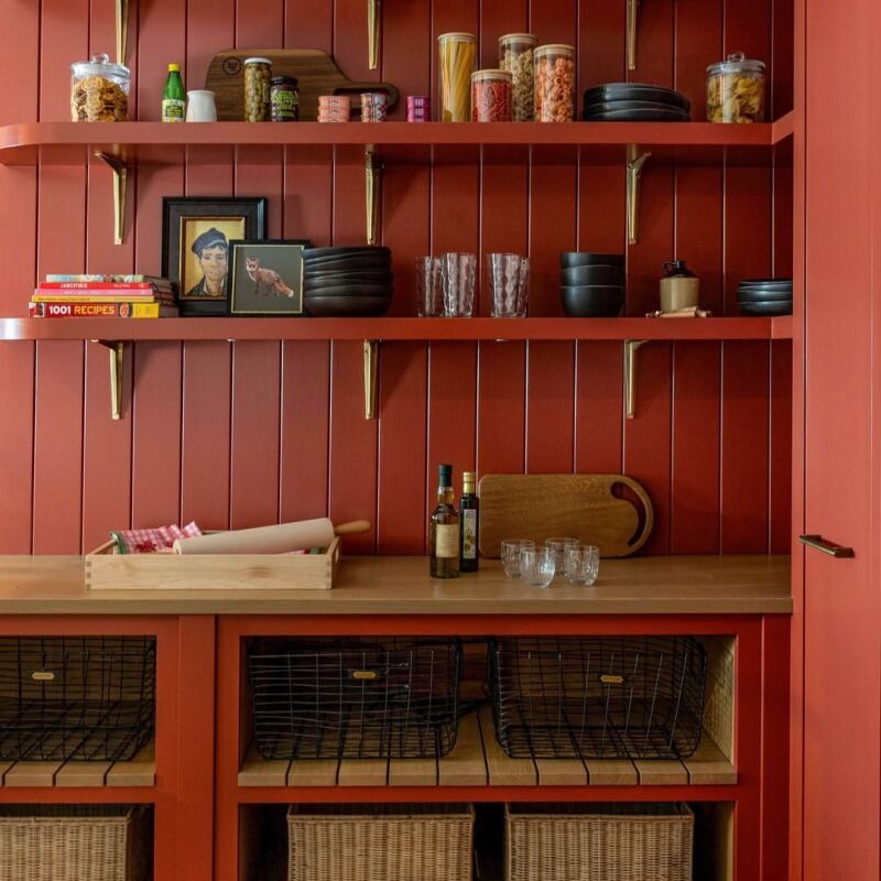
Like the cottage-y cladding in this kitchen? See these variations on the theme:



Have a Question or Comment About This Post?
Join the conversation (1)