How do a pair of designers please a client who doesn’t yet exist? For Sam Gnatovich and Alexi Rennalls, who tackled this midcentury remodel as an investment project, even a phantom client’s desires commanded diligent legwork. Says Sam, “We worked very hard to try to understand and predict who would buy the house and what they would want.” Envisioning the likes and dislikes of a young couple or a single man from the East Coast, they designed accordingly.
Sam, an architect, and Alexi, an interior designer, comprise Los Angeles-based Simo Design–members of the Remodelista Architect/Designer Directory. They took the original structure down to the studs, keeping only the original architectural frame and the house’s most dramatic feature: “ridiculous” (according to Sam) panoramic views of LA. They also completely reorganized the floor plan–”It just did not make sense for today’s buyers”–and created a masculine and light-filled, midcentury-inspired space.

Above: The kitchen proved to be the most challenging room in the house. Says Sam, “We always find that the simpler the look, the harder we have to plan to make it perfect.”
The two were sticklers about the detailing: the back wall is bookmatched Calacatta Crema Delicato marble, and the maple cabinetry was custom built and stained. “Our woodworker makes all of his own stains, which we love,” says Sam, “but he probably loves it less since we found out, because we know that all of his samples can be tweaked to get the exact color we want.”
The ceiling lights are from Schoolhouse Electric–”a great alternative to vintage since they always work”–and the kitchen island is covered in Absolute Black granite with a leather-like brushed finish.

Above: As is common in midcentury houses, the floor plan was open and light on discrete spaces. The designers created this built-in bench and storage area to function as a sort of mud room.

Above: In the living room, the designers doubly defined space by layering rugs: the top rug is vintage from West Hollywood retailer Woven Accents, and the bottom is from World Market. The claro walnut slab coffee table is a custom Simo design, and the two stools are vintage Paul McCobb designs newly reupholstered.

Above: The house lacked a true master bedroom, so the pair converted a second living room. The new bedroom epitomizes the look the designers were after: trim, slightly masculine, and, thanks to new sliding glass doors to a balcony, filled with abundant natural light.
The designers had to drop the ceiling to accommodate new kitchen plumbing; the beams they inserted are decorative but placed exactly beneath the original, now hidden, ceiling beams.
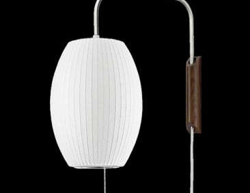
Above: The wall-to-wall red oak headboard conceals a concrete beam that runs diagonally to the bottom of the house. The designers considered leaving the beam exposed, “but it just wasn’t the right look,” says Sam. The Nelson Cigar Wall Sconces were sourced from YLighting.

Above: The master bathroom is tucked in what had been a dark corner. The designers remedied the setup by adding a frosted glass window and inserting partial walls that allow in light from the bedroom. The cabinets are natural maple, and the countertop is Bella Créme limestone.

Above: Sam and Alexi don’t usually tackle the painting themselves, but Alexi created the wall graphic in the guest bedroom. (“We put her art degree to good use,” says Sam.) They applied the geometric pattern in lieu of a headboard, and used a layer of brown velvet pillows at the back of the bed delineate the space.

Above: The front doors and hardware are original and newly refinished.

Above: A tongue-and-groove privacy fence and garage door are additions to the otherwise well-preserved exterior.
Before

Above: One of the original bedrooms–with its wall-to-wall plush carpeting and textured walls, the house was ready to be refreshed.

Above: The kitchen had been remodeled over the years and the designers decided to entirely rethink it.
For more by Simo Design, see The Designers Are In: Expert Tips from Remodeling Pros and Rehab Diary: LA Living, Venice Style.
Go to Midcentury to tour other houses of the period. For landscaping ideas, see Gardenista’s Landscape Architect Visit posts.


Have a Question or Comment About This Post?
Join the conversation (17)