Icon - Arrow LeftAn icon we use to indicate a rightwards action. Icon - Arrow RightAn icon we use to indicate a leftwards action. Icon - External LinkAn icon we use to indicate a button link is external. Icon - MessageThe icon we use to represent an email action. Icon - Down ChevronUsed to indicate a dropdown. Icon - CloseUsed to indicate a close action. Icon - Dropdown ArrowUsed to indicate a dropdown. Icon - Location PinUsed to showcase a location on a map. Icon - Zoom OutUsed to indicate a zoom out action on a map. Icon - Zoom InUsed to indicate a zoom in action on a map. Icon - SearchUsed to indicate a search action. Icon - EmailUsed to indicate an emai action. Icon - FacebookFacebooks brand mark for use in social sharing icons. flipboard Icon - InstagramInstagrams brand mark for use in social sharing icons. Icon - PinterestPinterests brand mark for use in social sharing icons. Icon - TwitterTwitters brand mark for use in social sharing icons. Icon - Check MarkA check mark for checkbox buttons.
You are reading

Raw Materials: A Minimalist Longhouse on Denmark’s Fanø Island, Starring Plywood and Clay

Search

Raw Materials: A Minimalist Longhouse on Denmark’s Fanø Island, Starring Plywood and Clay

November 1, 2021

Not long ago, we spotted an intriguing house on Leibal, a website devoted to minimalist design. Unlike many of the sleek, modern projects featured on the site, this one, while high-design, has a pleasingly rural and humble look to it.

Dubbed the “House on Fanø” by its architects, Copenhagen-based practice Lenschow & Pihlmann, the project is located on Denmark’s Fanø Island. It’s inspired by Scandiavian Viking-era long houses, elongated homes in which everything (including the barn) is under one continuous roof. “The house can be seen as a new interpretation of the traditional long house typology,” say the architects. “The intent of the project is to form a strong relationship with the local context and facilitate the everyday patterns of life within a rich and varied plan.”

While the shape and scale of the house mimics architecture from a bygone time, the palette of materials they chose—a preponderance of plywood, clay, and cement—feels fresh and of-the-moment. “Throughout, robust, inexpensive materials form a strong, expressive narrative. Each constituent part is exposed and elevated through careful arrangement to make a coherent whole,” they say.

Let’s take a tour.

Photography by Hampus Berndtson, courtesy of Leschow & Pihlmann.

the exterior was painted a terracotta color to coordinate with the steeply pitc 17
Above: The exterior was painted a terracotta color to coordinate with the steeply pitched, red clay-tiled roof. The house is protected from strong winds by a sand and soil dune planted with small pines, marram grass, heather and crowberry.
the exterior&#8\2\17;s deep terracotta hue transitions to a softer shade in 18
Above: The exterior’s deep terracotta hue transitions to a softer shade inside. Exposed wiring and non-flush sockets were chosen for an industrial vibe.
the open living, dining, and kitchen space. insulating textured clay blocks for 19
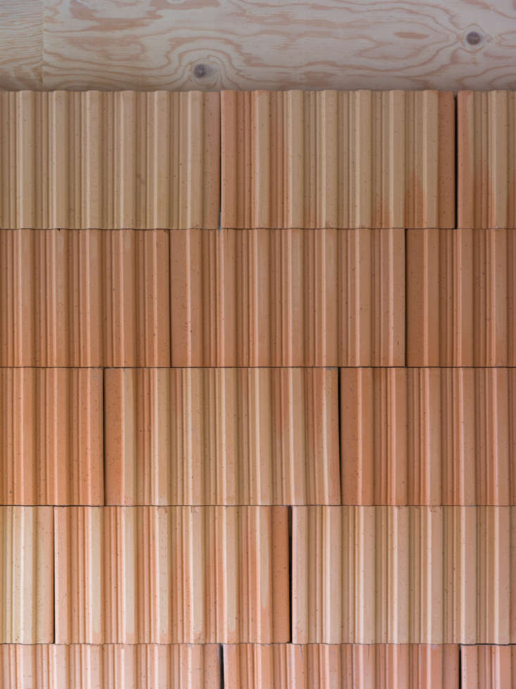
Above: The open living, dining, and kitchen space. Insulating textured clay blocks form the wallss; the floor is sand-colored cement screed.
Above: The textures of the materials chosen serve as the only art and decoration.
&#8\2\20;the kitchen consists of two components, a fixed framed element con 22
Above: “The kitchen consists of two components, a fixed framed element containing the stove and sink painted in iron oxide red with a steel plate work surface. Moveable cabinets in plate steel rest beneath allowing the arrangement to be reconfigured.” Above, a lofted TV room.
sliding doors made of red mdf boards were chosen in lieu of standard hinged doo 23
Above: Sliding doors made of red MDF boards were chosen in lieu of standard hinged doors.
the house was designed as essentially two separate living quarters under one ro 24
Above: The house was designed as essentially two separate living quarters under one roof so that overnight guests can have their own wing. This room acts as the transition to the guest quarters. (See layout toward the end of the post for details.)
a sleep loft offers additional accommodations. 25
Above: A sleep loft offers additional accommodations.
the ground floor layout. 26
Above: The ground floor layout.
the lofted areas. 27
Above: The lofted areas.

For more Danish design, see:

(Visited 1,415 times, 1 visits today)
You need to login or register to view and manage your bookmarks.

v5.0