One of my pet peeves is a historic building that’s been carved up (dare I say hacked?) in the name of function and efficiency with little respect for the building’s original features. Such was the case with this apartment in a Victorian house in Kensington, London. The first-floor, originally devoted to a drawing room with 13-foot, six-inch high ceilings and a trio of tall French doors, had been awkwardly converted into a side-by-side living room and galley kitchen that divided the windows. The apartment’s new owners–an extended South East Asian family of several generations, who plan to put it to use for everything from single-person business trips to large family gatherings–needed to have it updated. Enter London-based VW + BS Architecture and Design, who reinstated the front room as a gracious three-window living and dining area, while also gaining space. They did this by taking advantage of the soaring ceilings and inserting a mezzanine in the back of the room; it serves as an overflow bedroom and the kitchen is tucked below it. Design riddle solved.
Photography by Michael Franke via Arch Daily.
Above L: The updated drawing-room floor is accessed via a narrow set of oak stairs with a wide, full-height pivot door at the top.

Above R: When the pivot door is open, the space flows freely. (See why a pivot door to an architect is like a gull-wing door to a car enthusiast in our Round-up of Pivot Doors.)
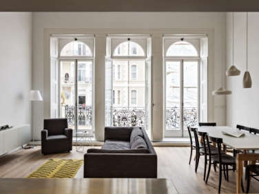
Above: VW and BS Architecture and Design corrected a previous conversion by reopening up the front half of the room as a living and dining space. “There were no original Victorian features left in the flat when we started work,” the architects say. “The sense of an elegant Victorian drawing room has been partly restored by the careful refurbishment of the windows and shutters along the full width of the front.” The Ultimate Architect-Designed Sofa, the Charles Sofa from B&B Italia, anchors the living area.
Above: Making use of the room’s tall ceiling, the architects relocated the kitchen to the back of the space, and inserted a mezzanine for a bedroom/study above it. The mezzanine can be closed off by a translucent polycarbonate folding screen.
Above: The oak floors, millwork, and white-painted plaster walls are simple, contemporary, and warm–designed to suit the far-ranging tastes and needs of the apartment’s guests.
Above: The underside of the mezzanine level provides overhead lighting in the kitchen.
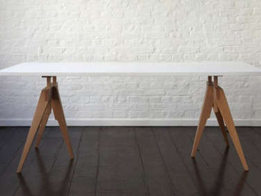
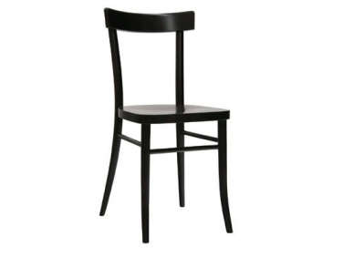
Above: A trio of white Pleat Box Pendant Lights from Marset defines the dining area within the overall space. Black Thonet Chairs surround a Compass Table by Matthew Hilton.
Above: The kitchen is sectioned off by a stainless-steel-covered work island. Overhead, the mezzanine’s folding screens slide on a ceiling track.
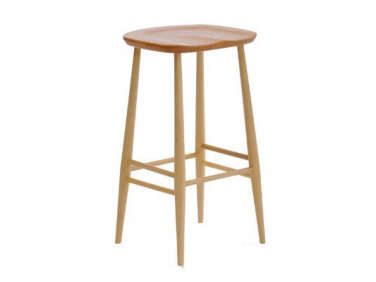
Above: The pale wood kitchen is all of a piece. Ercol Bar Stools sit under the island.
Above: A view from the back of the room of the living area and mezzanine. Another translucent folding screen closes off the mezzanine as required.
Above: The mezzanine level is outfitted with a twin bed and small desk. It serves as overflow space for the apartment.
Above: The mezzanine’s translucent polycarbonate folding screens allow in sunlight.
Above: The mezzanine offers a double view of the reclaimed drawing room and the Victorian streets of Kensington.
Above: Built-in closets in one of the back bedrooms maximize storage space.
Above Top: The Before floor plan shows how the front space was divided by a wall. Above Bottom: The After floor plan shows how the architects moved the kitchen away from the front three windows, allowing them to reinstate the proportions of the original space.
London’s streets are lined with Victorian houses that have been converted into apartments whose awkward spaces can have minimal daylight. Jennifer Beningfield from Openstudio Architects talks to us about creating a light-filled space in a Victorian remodel without moving any interior walls. See how she does it in The Architect Is In: Loft Living In a Victorian.


Have a Question or Comment About This Post?
Join the conversation