Icon - Arrow LeftAn icon we use to indicate a rightwards action. Icon - Arrow RightAn icon we use to indicate a leftwards action. Icon - External LinkAn icon we use to indicate a button link is external. Icon - MessageThe icon we use to represent an email action. Icon - Down ChevronUsed to indicate a dropdown. Icon - CloseUsed to indicate a close action. Icon - Dropdown ArrowUsed to indicate a dropdown. Icon - Location PinUsed to showcase a location on a map. Icon - Zoom OutUsed to indicate a zoom out action on a map. Icon - Zoom InUsed to indicate a zoom in action on a map. Icon - SearchUsed to indicate a search action. Icon - EmailUsed to indicate an emai action. Icon - FacebookFacebooks brand mark for use in social sharing icons. flipboard Icon - InstagramInstagrams brand mark for use in social sharing icons. Icon - PinterestPinterests brand mark for use in social sharing icons. Icon - TwitterTwitters brand mark for use in social sharing icons. Icon - Check MarkA check mark for checkbox buttons.
You are reading

Lodge at Marconi: 10 Ideas to Steal from a Coastal California Retreat in Former State Park Buildings

Search

Lodge at Marconi: 10 Ideas to Steal from a Coastal California Retreat in Former State Park Buildings

Brian W. Ferry February 7, 2024

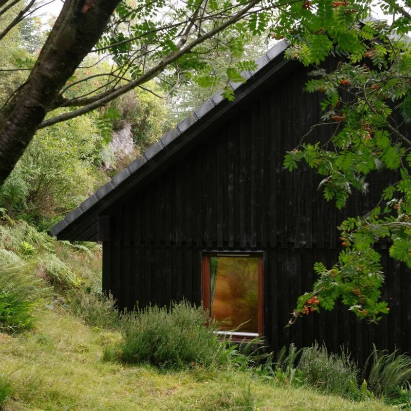
Situated among the sprawling wooded hills that overlook Tomales Bay, the Lodge at Marconi is a new Northern California retreat that occupies a series of former State Park buildings. The modernist Sea Ranch-style structures, which blend into the wild terrain thanks to olive green cladding and sloped roofs, were recently transformed into a 45-room hotel by Brooklyn-based design firm Home Studios.

The property’s tranquil interiors, with their abundance of wood and earthy textiles, were informed by the rugged destination. “We took a lot of inspiration from the tones of the natural landscape,” says Home Studios founder Oliver Haslegrave. “I think, given that the hotel is on 62 acres, that was inevitable.”

Oliver also infused the lobby, restaurant, and guest rooms with a playful summer-camp aesthetic. Everything, from arts-and-crafts-y furniture to accessible materials like canvas and brick, is left intentionally informal and rustic. “Generally speaking, camp is back to basics,” he says. “It’s stripped down—at least my camp experience was.”

That’s not to say Lodge at Marconi is spare; it’s most certainly not. There’s nothing superfluous, but nothing is amiss either. It’s simultaneously attainable and elevated.

Here are 12 design ideas to steal to strike a similar balance.

Photography by Brian W. Ferry.

1. Green is the new black.

since the angular buildings were in solid condition, oliver didn&#8\2\17;t  17
Above: Since the angular buildings were in solid condition, Oliver didn’t make many updates to their exteriors. The one thing he did do was paint them all a deep olive green that acts as camouflage in the verdant environment. “It made a dramatic difference,” he says.

2. Mix materials, but keep the same tone.

for the reception desk, oliver paired glazed brick tiles from heath ceramics wi 18
Above: For the reception desk, Oliver paired glazed brick tiles from Heath Ceramics with mahogany-colored wood for a rich tone-on-tone look. “Because it’s inspired by the natural landscape, there isn’t a lot of high contrast,” Oliver explains. “But I didn’t want to only use one material, so we created interest by mixing materials without changing the palette.”

3. Accentuate height with stripes.

oliver designed a wood framed sofa with red and white striped upholstery to acc 19
Above: Oliver designed a wood-framed sofa with red-and-white striped upholstery to accentuate the height of the airy lobby. “This room has a lot of verticality to it, so the stripes felt in sync,” he says. “The couch is definitely the focal point, so had it been a solid color, it might not have had as much energy as we wanted it to, whereas a striped textile in a smaller room may have felt a little busy.”

4. Add playful window trim.

in the concession area, oliver framed a tall window with square dentil trim for 20
Above: In the concession area, Oliver framed a tall window with square dentil trim for a playful punch. That tooth-like geometry can be found in details throughout Lodge at Marconi, but it makes the biggest splash here.
the adjacent lounge combines dark stained oak millwork and built in sofas with  21
Above: The adjacent lounge combines dark-stained oak millwork and built-in sofas with light, natural oak floors and coffee tables for added depth.

5. Incorporate canvas.

as a nod to the camp narrative, oliver incorporated canvas into the on site res 22
Above: As a nod to the camp narrative, Oliver incorporated canvas into the on-site restaurant—twice. He commissioned a custom, four-panel painting by the artist Lukas Geronimas Giniotis and, most notably, designed an oversized tent-like pendant to hang over the long dining table. “The materials are fairly accessible, but the scale of it is ambitious,” he says of the light fixture. (We’re longtime fans of adding inexpensive canvas to interiors; see 8 Low-Cost, Low-Commitment DIY Projects with Painter’s Drop Cloths for a few ideas.)

6. Create a DIY art installation.

lukas geronimas giniotis also created the installation of painted wood cubes ab 23
Above: Lukas Geronimas Giniotis also created the installation of painted wood cubes above the scarlet velvet banquette. A similar artwork could be replicated at home using blocks from the hardware or art supply store.

7. Try cropped curtains.

the guest rooms feel like well appointed cabins. in lieu of long curtains, oliv 24
Above: The guest rooms feel like well-appointed cabins. In lieu of long curtains, Oliver went for cropped versions on custom wooden rods.

8. Build a corner headboard.

oliver built clever wrap around corner headboards for the twin beds, which make 25
Above: Oliver built clever wrap-around corner headboards for the twin beds, which makes them feel like an intentional part of the design.

9. Consider overlay cabinets.

though inset, flush cabinetry has been more desirable of late, oliver opted for 26
Above: Though inset, flush cabinetry has been more desirable of late, Oliver opted for overlay drawers instead. “Overlay doesn’t have to be perfect,” he explains. “It’s an easier way of building. Your measurements can be a little off. It can be more handmade. And those pulls are not integrated. You don’t need to route anything out. You can make this with simpler tools, like a hand saw.”

10. Add an under-sink shelf.

floating vanities have their allure but can be challenging for their lack of st 27
Above: Floating vanities have their allure but can be challenging for their lack of storage. Oliver solved this problem by creating low shelves that he placed beneath the sinks for storing towels and other bathroom essentials.

For more, head to Lodge at Marconi.

And for more design ideas to borrow, camp edition:

(Visited 16,238 times, 1 visits today)
You need to login or register to view and manage your bookmarks.

Have a Question or Comment About This Post?

Join the conversation

v5.0