Icon - Arrow LeftAn icon we use to indicate a rightwards action. Icon - Arrow RightAn icon we use to indicate a leftwards action. Icon - External LinkAn icon we use to indicate a button link is external. Icon - MessageThe icon we use to represent an email action. Icon - Down ChevronUsed to indicate a dropdown. Icon - CloseUsed to indicate a close action. Icon - Dropdown ArrowUsed to indicate a dropdown. Icon - Location PinUsed to showcase a location on a map. Icon - Zoom OutUsed to indicate a zoom out action on a map. Icon - Zoom InUsed to indicate a zoom in action on a map. Icon - SearchUsed to indicate a search action. Icon - EmailUsed to indicate an emai action. Icon - FacebookFacebooks brand mark for use in social sharing icons. flipboard Icon - InstagramInstagrams brand mark for use in social sharing icons. Icon - PinterestPinterests brand mark for use in social sharing icons. Icon - TwitterTwitters brand mark for use in social sharing icons. Icon - Check MarkA check mark for checkbox buttons.
You are reading

“This Is the House I’d Leave Amsterdam For”: A Family’s Airy, Springy 1893 Quarters in Haarlem

Search

“This Is the House I’d Leave Amsterdam For”: A Family’s Airy, Springy 1893 Quarters in Haarlem

April 14, 2023

It was a Sunday and as usual Arianne Bonthuis was perusing the Dutch real estate sites. Arianne and her husband, Derk, and their four young kids had long ago outgrown their Amsterdam apartment when a banner ad on Fonda.NL caught her eye. “After a few clicks on the pictures, I turned to my husband and said, ‘This is the house I’d leave Amsterdam for.'” An extensive tour later, Derk, too, was ready to commit, and the project, which had been on the market a long time, was soon theirs.

The appeal of the 1893 grote mensen woning—”big people house” or mansion—was its size and original detailing. Plus its location in Haarlem, just 20 minutes west of Amsterdam. Derk is a policy advisor at the Dutch Ministry of Finance and Arianne is a tax lawyer, and even with four kids and the Covid curveball of homeschooling, they enthusiastically took on a major remodel. Getting it ready required eight months of heavy lifting, from roof and window replacements to floor plan adjustments, the installation of a new kitchen, and plasterwork restoration, among other things.

The couple worked with a very capable contractor: “Derk and I both think in images,” says Arianne. “We looked through the house and immediately envisioned what it could be. We didn’t hire an architect because we both love to think about design problems. Our style might be described as vintage-Scandinavian: we like a light house with some color for coziness.”

Now fully moved in, the family manage to keep their main quarters uncluttered enough that, to help defray costs, they rent rooms for photo and film shoots via location agency House of Bullet. Join us for a tour.

Photography courtesy of House of Bullet.

the front door was emblematic of the place as a whole: the original was mostly  17
Above: The front door was emblematic of the place as a whole: the original was mostly in place but in need of work. The door, formerly white, received several layers of paint, broken yellow glass was swapped with wavy glass, the mail box’s missing handle was replaced, and the stained glass is now sandwiched between insulating glass.
a monumental beech tree, shown here in autumn, screens the house from the stree 18
Above: A monumental beech tree, shown here in autumn, screens the house from the street. “We don’t know much about the former habitants, but at some point our place was probably used as an office judging from the flooring and the amount of cables in every room,” says Arianne. “We’ve met people who considered buying it but were scared by the amount of work it needed.” Scroll to the end to see a series of Before shots.
the garden room, with new french doors, opens to a large backyard. the upholste 19
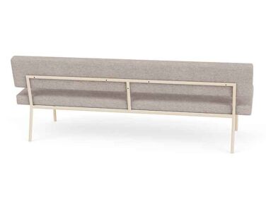
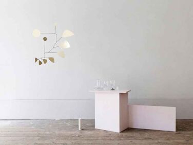
Above: The garden room, with new French doors, opens to a large backyard. The upholstered bench is the Monday Sofa from Fést of Amsterdam. The Calderesque Brass Leaves Mobile is by Lappalainen: read about the workshop in our post Living Above the Studio.
the rooms retained their tall ceilings, moldings, and fireplaces; the tall wind 20
Above: The rooms retained their tall ceilings, moldings, and fireplaces; the tall windows and baseboards are new. Herringbone parquet floors were introduced upstairs and down. (Read our Remodeling 101: The Difference Between Herrington and Chevron Patterns). The pink sofa is from the Sofa Company and soon to be replaced: “It got ruined by our kids and professional cleaning no longer helps.”

Arianne loves online vintage shopping on Marktplaats.NL and Instagram (@tidjperk_interior, @sprinkelhop, @tonysgaragesale) and says a lot of the furnishings came from late-night browsing.

a newly widened entry opens the living room to the library, the family&#8\2 21
Above: A newly widened entry opens the living room to the library, the family’s homework and crafts room. Note the restored marble mantel: see its earlier state below. Curious about the wicker box above the braided money tree? Arianne and Derk made it to cover a Sonos speaker.
there&#8\2\17;s a reading chair and classic french jieldé lights in th 22
Above: There’s a reading chair and classic French Jieldé lights in the adjacent dining room. The table is surrounded by a mismatched ensemble of chairs—for similar brightly colored Windsors, consider the Salt Chair .
the formerly closed off ground floor rooms now flow into each other. 23
Above: The formerly closed-off ground floor rooms now flow into each other.
the family&#8\2\17;s new kitchen, bigger and brighter than what was there,  24
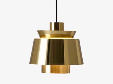
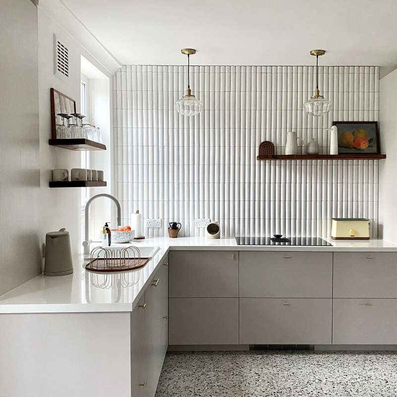
Above: The family’s new kitchen, bigger and brighter than what was there, is an Ikea hack. The brass pendant lights are &Tradition’s Utzon JU1 design from 1947.
ikea metod cabinet bases are finished with classic style doors, drawers, and br 25
Above: Ikea Metod cabinet bases are finished with Classic Style doors, drawers, and brass hardware from Noremax. “They’re clean but not boring,” says Arianne of the cabinet fronts. “And we could choose from all the Farrow and Ball colors—we went with Studio Green.” Thinking about your own Ikea hack? Here are 11 Companies that Offer Ikea Kitchen Upgrades.
the pink subway tiles in a diagonal stack are azulejos detroit rose from dutch  26
Above: The pink subway tiles in a diagonal stack are Azulejos Detroit Rose from Dutch online source the Tegel Store. The countertop marble came from a local stone shop. The mixer faucet is by Meir.
arianne and derk found and painted the vintage countertop cabinet. 27
Above: Arianne and Derk found and painted the vintage countertop cabinet.
a normann copenhagen phantom lamp hangs in the upstairs hall, which formerly ha 28
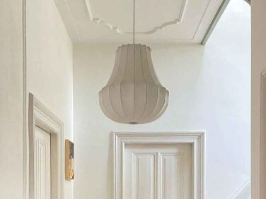
Above: A Normann Copenhagen Phantom Lamp hangs in the upstairs hall, which formerly had blue linoleum flooring and stair treads.
in the upstairs home office: a wallpaper mural from swedish source photowall ov 29
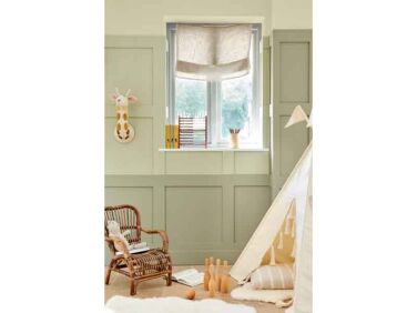
Above: In the upstairs home office: a wallpaper mural from Swedish source Photowall over an Ikea Ivar cabinet hack painted Willow II from the Paint & Paper Library. The pale green on the walls is Green Stone from Little Greene.
arianne and derk&#8\2\17;s room has an en suite bath and floral wallpaper f 30
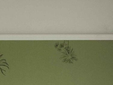
Above: Arianne and Derk’s room has an en suite bath and floral wallpaper from Boråstapeter, Sweden’s Oldest Wallpaper Company.
the wall behind the tub is painted pink peach from vestingh. 31
Above: The wall behind the tub is painted Pink Peach from Vestingh.
the reconfigured attic is now divided into three kids&#8\2\17; bedrooms, ea 32
Above: The reconfigured attic is now divided into three kids’ bedrooms, each with painted antique furniture and accent walls papered with Boråstapeter botanical designs.
the attic beams were not only stripped of paint but repositioned. the bed is fr 33
Above: The attic beams were not only stripped of paint but repositioned. The bed is from Dutch auction site Vintage.nl.

Before

the garden room had a porthole window that felt out of place. 34
Above: The garden room had a porthole window that felt out of place.
doors closed off the living room and there were next to no baseboards. 35
Above: Doors closed off the living room and there were next to no baseboards.
the library&#8\2\17;s marble mantel was damaged and the missing pieces were 36
Above: The library’s marble mantel was damaged and the missing pieces were nowhere to be found. The couple tracked down another period mantel that was in pieces and its parts were used to restore this one.
blue linoleum covered the second floor. the wc got converted into a laundry roo 37
Above: Blue linoleum covered the second floor. The WC got converted into a laundry room.
the garret was garish. 38
Above: The garret was garish.

See more of the house on Instagram @haarlemsegrotemenenwoning.

Here are three more favorite historic house remodels:

(Visited 7,229 times, 10 visits today)
You need to login or register to view and manage your bookmarks.

Frequently asked questions

What is Remodelista?

Remodelista is a website that provides advice and inspiration for home design and remodeling projects.

What is the Light-Bright Dutch Historic House Remodel?

The Light-Bright Dutch Historic House Remodel is a featured project on Remodelista that showcases the renovation of a historic home in the Netherlands. The renovation transformed the dark, cluttered interior into a bright, airy space.

What were the goals of the remodel?

The remodel aimed to create a bright, open living space that preserved the historic features of the home. The designers also sought to maximize natural light and create a sense of flow throughout the house.

What changes were made to the house?

The remodel involved a complete gut renovation of the interior. Walls were removed to create an open floor plan, and new windows and skylights were installed to bring in natural light. In addition, the designers updated the kitchen and bathrooms, and added a new floating staircase.

What design elements were used in the remodel?

The design incorporates a neutral color palette with natural wood accents and black accents. The historic features of the home, such as the original exposed beams, were preserved and enhanced with the use of modern lighting fixtures.

Who designed and carried out the remodel?

The Light-Bright Dutch Historic House Remodel was designed by i29 interior architects and carried out by contractor Chris Collaris.

What was the budget for the remodel?

The budget for the remodel is not specified in the article.

Product summary  Item 6 169Item 7 170

design within reach salt chair black paint
Design Within Reach

Salt Chair

$375.00 USD from Design Within Reach
so mo 3 na
Sofas & Couches

Monday Sofa

€1,489.00 EUR from Fest Amsterdam
utzon brass
Jørn Utzon

Utzon JU1

More Info from &Tradition
upstairs hall haarlem
Pendant Lights

Phantom Lamp

$970.00 USD from Normann Copenhagen
532 willow ii featured
Paint

Willow II

£5.50 GBP from Paint & Paper Library

Have a Question or Comment About This Post?

Join the conversation

v5.0