We’ve long been fans of LA fashion designer Jenni Kayne; she was a Guest Judge in our 2014 Considered Design Awards contest and we’re followers of her lifestyle blog Rip & Tan (see The Healthful Apartment for a NYC home she shared with us earlier this year). So this past fall, on the occasion of the launch of her homewares brand—Jenni Kayne Home—we stopped in at the home of Jenni Kayne company president Julia Hunter to have a closer look at the new line and Hunter’s own 1959 remodel.
When Hunter and her husband, Ray, first toured their home-to-be back in 2015, it was love at first sight—despite some obvious problems. The style was a mashup: part midcentury modern (it has a pitched roof with beamed ceilings and an open floor plan) and part Art Deco (with teal-and-peach bathrooms and a too-fancy kitchen backsplash). So they made judicious upgrades as their budget allowed, tackling the bathrooms and outdoor space while making some simple—but impactful—updates in the kitchen.
The couple are big fans of the house’s open floor plan, which meets their dictate for “one central area for living, dining, and kitchen,” said Hunter. “We’re pretty casual at home, and like to talk and watch TV while we cook and eat together all in the same place.” They also like the atypical layout, which puts the master bedroom downstairs: “It’s unusual,” said Hunter, “but we love the configuration because the bedroom feels private and tucked away.”
Join us for a tour (and learn a few insider design tips Hunter has gleaned from Kayne herself over the years).
Photography by Lauren Moore for Remodelista.

Both Hunter, who has a background in finance, and her husband work a lot, and wanted their home to feel like a respite from the city. “The house feels like a getaway, which is just what we wanted,” she says. Hunter credits Kayne as her aesthetic role model: “There are a few lessons from Jenni that have actually been quite transformative to the way I style my home and, ultimately, the way I live my life,” she says.

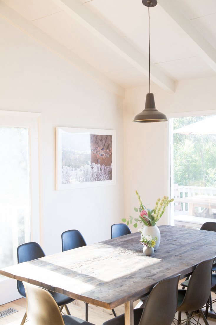
Hunter takes informal lessons in the more creatives sides of life (such as entertaining, styling, and decorating) from her friend Kayne. “I used to order pizza when we had friends over and mix a bag of lettuce with the Caesar dressing packet it came with just to make part of the meal ‘homemade’,” she says. “Now I feel confident pulling together a nice, memorable dinner just by setting the table beautifully, incorporating some greens from the yard, and cooking a few simple dishes.”


Another key lesson from Kayne: Turn to nature for styling inspiration. “Relying on nature-inspired design elements establishes a sense of calm and beauty” in the home, says Hunter, “but it is also timeless—so you don’t have to constantly reinvent.”
Hunter offers some examples: incorporating lavender or olive branches in your tablescape, using natural fibers such as linen or alpaca for all the bedding and blankets in your house, and hanging artwork of beautiful landscapes in your hallways.

To make her own powder room feel “luxe and special,” Hunter opted for Carrara marble tile, sconces from Schoolhouse Electric, and a chrome undermount sink with marble top from Signature Hardware.
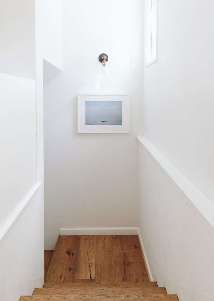

“The master bedroom is, hands down, our favorite part of the house,” said Hunter. “It is spacious and has beautiful windows surrounded by trees with a gorgeous view. We love to spend weekend mornings reading in bed with the windows open, while Bebe watches squirrels in the trees.”


For more in Los Angeles, see:
- Kitchen of the Week: In Los Feliz, A Moody, Romantic Spanish Modern Update
- At Home with an LA Costume Designer, Summer Remodel Edition
- Shopper’s Diary: Lost & Found Home in Los Angeles

Have a Question or Comment About This Post?
Join the conversation (7)