“Mere colour can speak to the soul in a thousand different ways,” Oscar Wilde once wrote.
Stylist Gillian Lawlee referenced the quote in a post on her popular Instagram account, my.life.in.colour, and if you’re a follower, as I am, then you know exactly why she chose it. Gillian is a lover of color and a believer in its power to shift and soothe moods, and her account documents her joyfully saturated home and other similarly ebullient interiors.
She is also, like the famous writer, Irish by birth (“Cork Girl Living in LA” is how she describes herself in her bio). And so while the exterior of the small home she shares with her husband and two kids hews classic California bungalow, complete with a red-tiled roof and arched doors and windows, the interior has the distinctive, lived-in look of a rustic cottage on a coastal cliff. (You can almost hear the wind howling outside.)
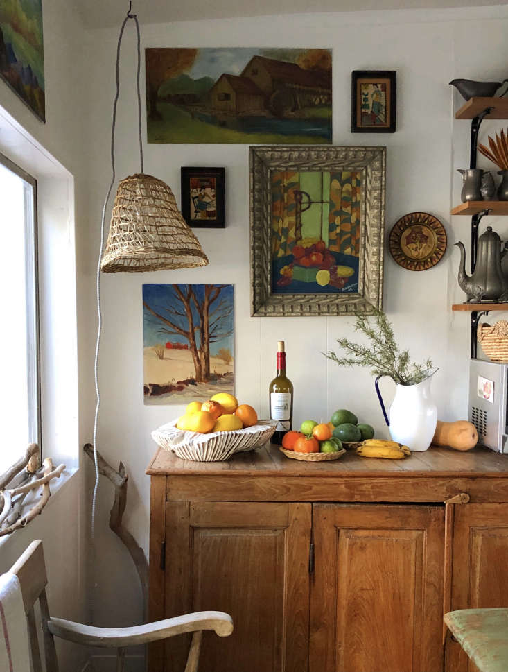
A whiz at styling (her work experience includes home stager for 1000xbetter and visual manager for Anthropologie and Nicky Kehoe), Gillian has the rare refined sensibility that isn’t color-shy. But what I particularly admire is her anti-trendiness. Often times I can scan a room and “source” at least a few pieces. In Gillian’s home, nearly everything is vintage and almost nothing is immediately recognizable.
“I think that there is beauty to be found in almost any aesthetic. But the thing that I don’t love about ‘popular’ trends in general is the sense of a manufactured aesthetic. With social media, Pinterest, and big brand stores that have gotten so much savvier, it’s very easy to pull together a space that looks good on the surface but lacks soul,” she says. “I am all about the feeling of a space and the point of view of its owner, but if a home is a catalog of top 20 trends from the last few years, it’s kind of a turn-off for me.”
Last December, we asked Gillian for her expert tips on how to craft a home that uses color in meaningful, trend-proof ways. Here’s what she had to say:
Photography by Gillian Lawlee, courtesy of my.life.in.colour.
Update: Since we posted on Gillian’s LA house, she relocated to Cork, Ireland, with her husband and children. Stay tuned: we’re looking looking forward to catching a glimpse of her next project.
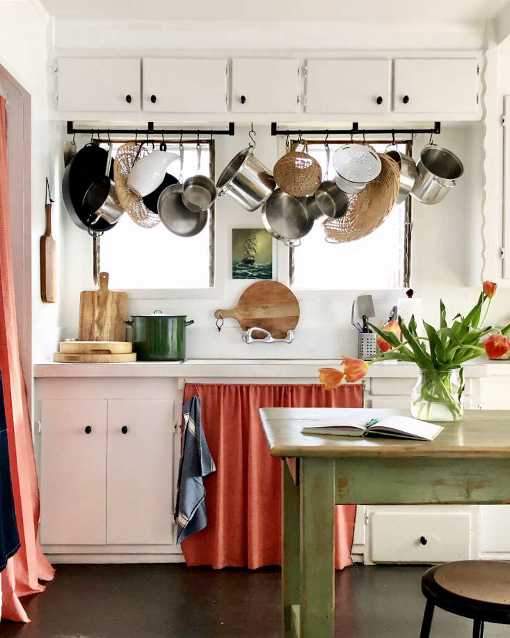
1. Activate the sink skirt.

Americans tend to see the kitchen as a workspace instead of a living space and, thus, often neglect to decorate it. A sink skirt is an easy way to add warmth and color, not to mention personality, to the room. That said, “a skirt works when it makes sense in the space, and they are silly when out of context,” notes Gillian.
2. Let white walls be a canvas for color.

Say “colorful home” and most people envision interiors with walls painted in various colors. But don’t discount white walls in your journey to a color-rich home. “There is a strong case for white walls and they work for me in a number of ways,” shares Gillian, who as a renter has had to stick with neutral walls. “I like to switch things up a lot; not being married to a wall color allows me to do that. I am constantly moving art around, textiles, and furniture.” Go for white walls and color in with textiles, painted furniture, artwork, etc.
3. Don’t be afraid to make color mistakes.

Remember: you can always paint over your mistakes. “I happen to have grown up close to a grandparent that had an extravagantly painted cottage that was ever changing. I definitely internalized both a love of color as well as a complete lack of trepidation when it came to working with it. There’s no surface safe from paint for me,” says Gillian, who claims she’s made more than her share of color miscalculations. “That’s how you learn. In 2007, I painted a blood-red accent wall in the living room. Heinous! In general, I just say ‘oops’ and repaint. C’est la vie.”
4. Frame your vignettes.

Gillian’s signature design move: painting frames that aren’t architecturally there. Curvy, Moroccan-inspired arches painted around doorways and built-ins can be found throughout her home. “I like to paint arches and frame portals. A lot. It’s playful, adds interest and can add architectural weight in spaces where there is none, or enhance it in areas that already have it. It also helps add deliberate punctuation into a space that draws the eye in.”
5. Layer in patterns.

Her home isn’t just full of color; it’s also full of patterns. Her preferred vehicles for pattern? Vintage pillows and kantha quilts, many of which she finds on Etsy.
6. Be mindful of room transitions.

“Always keep in mind what is happening in adjacent spaces. There should be flow and transition that makes sense. I think of every project I do as a story with a narrative, and every part of that story should make sense to the whole. Even when I am staging houses, there is a core color story or common thread that connects it all.”
7. Paint the trim.

“It’s a detail that seems bold but is very common in lots of places,” says Gillian. “Window and door detail painting is something you see a lot of in old houses in Ireland and in so many cultures around the world. In one sense it’s just decoration. In another way, the definition of the space and the deliberate punctuation of both color and of the portal itself can impose a feeling of significance in a space. They can feel grand or whimsical, but they always make you want to walk through or look through that space. I have always been obsessed with portals and spaces that draw you in.”
8. Let your windows shine.

Most of us who aren’t fortunate enough to have real stained glass windows just make do with regular clear glass windows. Not Gillian, who figured out how to DIY them in three easy steps (for instructions, go here). “I had tried to DIY it years ago with zero success, buying rolls of window tint for cars online. When we moved into this house, I decided to search for it again and came across an A4 sized multi pack of colored film that was more robust and less flimsy and made the project so much more manageable. The casement windows in this house felt like such an apropos canvas that I just decided to try it again, and it worked!” The best part, particularly for renters: The pieces are completely removable.
N.B.: This post is an update; the original ran on February 17, 2021.
For more homes that aren’t color-shy, see:
- A Rising Star’s Spirited London Home: ‘Every Room Should Sing’
- Kitchen of the Week: ‘SMILF’ Creator Frankie Shaw’s Newfangled Old-Fashioned Remodel by Reath Design
- True Colors: Historical Paint Expert Pedro da Costa Felgueiras’ Beautifully Idiosyncratic London Home


Have a Question or Comment About This Post?
Join the conversation (4)