Icon - Arrow LeftAn icon we use to indicate a rightwards action. Icon - Arrow RightAn icon we use to indicate a leftwards action. Icon - External LinkAn icon we use to indicate a button link is external. Icon - MessageThe icon we use to represent an email action. Icon - Down ChevronUsed to indicate a dropdown. Icon - CloseUsed to indicate a close action. Icon - Dropdown ArrowUsed to indicate a dropdown. Icon - Location PinUsed to showcase a location on a map. Icon - Zoom OutUsed to indicate a zoom out action on a map. Icon - Zoom InUsed to indicate a zoom in action on a map. Icon - SearchUsed to indicate a search action. Icon - EmailUsed to indicate an emai action. Icon - FacebookFacebooks brand mark for use in social sharing icons. flipboard Icon - InstagramInstagrams brand mark for use in social sharing icons. Icon - PinterestPinterests brand mark for use in social sharing icons. Icon - TwitterTwitters brand mark for use in social sharing icons. Icon - Check MarkA check mark for checkbox buttons.
You are reading

Before & After: A 1924 Spanish-Style Villa in Laurel Canyon Gets an Update, 99 Years On

Search

Before & After: A 1924 Spanish-Style Villa in Laurel Canyon Gets an Update, 99 Years On

Rennie Solis September 15, 2023

For one Los Angeles couple, the allure of Laurel Canyon was impossible to resist. Its insular community, its music industry legacy, and its lush, sloped landscape called. So when they found a 1924 Spanish-style villa on a secluded hillside in the area, not even a rundown interior could deter them from scooping it up.

With dated finishes and a closed-off layout, the historic house required a complete renovation. The couple enlisted interior designer Sarah Solis for the job, who saw the same potential in the place that they did. “The home is 100 years old and needed a lot of serious work, but as the homeowners describe, the light of the canyon was ‘intoxicating’, and they knew they found a hidden gem,” Sarah says. “They saw love and emotion in this home.”

The couple’s primary goals were to honor the age of the structure and lean into its Spanish architecture with a rustic Mediterranean-inspired aesthetic. They also sought to optimize the floor plan for modern living, which meant opening it up. “We wanted to reveal long lines of sight that create a better ease of movement and flood light into the space, blending the inside and outside,” explains Sarah. “The couple loves to host dinners and wanted a home that felt comfortable and flowing with life.”

To deliver on all these asks, Sarah employed a neutral color palette and textural, earthy materials. She knocked down walls, exposed original wood beams, and moved the formal dining area outdoors. The result, according to Sarah, is “something that looks and feels romantic—like you’re on vacation on a remote beach in Europe.” Let’s check out the transformation.

Photography by Rennie Solis.

After

one of the biggest structural updates sarah made was tearing down the wall that 17
Above: One of the biggest structural updates Sarah made was tearing down the wall that separated the once-small entryway and the living room, creating a dramatic atrium and allowing the natural light to illuminate the now-joined spaces. “It created this magical, energizing moment that greets the homeowners every morning,” she says.
throughout the ground level, sarah covered the floors in spanish cotto tiles wi 18
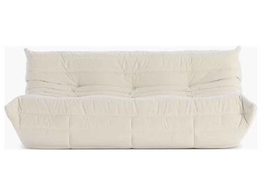
Above: Throughout the ground level, Sarah covered the floors in Spanish Cotto tiles with a custom stained wax finish to make them appear original to the home. In the living room, pictured here, she paired the terracotta with an inviting Togo sofa (which, we’ve noticed, is making a comeback), built-in shelves filled with books, and a landscape painting by a family member of the homeowners.
a built in bench is nestled between bookshelves, in case the homeowners want to 19
Above: A built-in bench is nestled between bookshelves, in case the homeowners want to curl up with a novel. “We designed this reading nook with an oversized plush cushion to create a spot that’s cozy enough for all-day lounging but still fits just right into the home’s historical architecture,” Sarah says.
sarah gutted the old kitchen but maintained its open storage concept to allow f 20
Above: Sarah gutted the old kitchen but maintained its open storage concept to allow for easy access to everyday dishes and collected pottery. Then she re-infused the space with a sense of age with deVol brass hardware, vintage copper pendants, and a reclaimed white oak island.
the solid walnut slab cabinetry is entirely new. &#8\2\20;we wanted to add  21
Above: The solid walnut slab cabinetry is entirely new. “We wanted to add a refined touch,” Sarah says of the sleek cupboards. “This kitchen brings together balance, form, and function for a couple that loves to cook.”
the moody primary bedroom encourages relaxation with midnight blue cultiver lin 22
Above: The moody primary bedroom encourages relaxation with midnight blue Cultiver linens, plinth-like nightstands, and a fiddle-leaf fig.
the same reclaimed white oak from the kitchen island reappears in the en suite  23
Above: The same reclaimed white oak from the kitchen island reappears in the en-suite vanity, which features a double sink.
sarah designed the massive standing shower, with its roomy bench and trio of ni 24
Above: Sarah designed the massive standing shower, with its roomy bench and trio of niches, around a special existing element: “We did everything possible to keep the window under the showerhead so the couple could bathe in the sun and moonlight,” she says.
in the guest room, sarah carved out an arched sleeping nook to maximize square  25
Above: In the guest room, Sarah carved out an arched sleeping nook to maximize square footage. “The rooms are very intimate and there isn’t a lot of open space, so creating these impactful architectural moments gave them new life,” she explains. “Their guests love it so much that the homeowners tried it out, and now they sleep there some nights!”
the powder room might be the most charming part of the house, with its small ro 26
Above: The powder room might be the most charming part of the house, with its small rounded basin sink and tiny tile backsplash. (See: DIY Idea: Tiny Tiled Backsplashes That Pack a Punch.)

Before

a dividing wall once stood between the entryway and the living room, blocking o 27
Above: A dividing wall once stood between the entryway and the living room, blocking out the light. The two areas also had different flooring, distinguishing them further.
a strange red wallpaper concealed the beams in the kitchen, which had ratty, ye 28
Above: A strange red wallpaper concealed the beams in the kitchen, which had ratty, yellowed cabinets and a retro tile backsplash.
the compact bathroom had a teal ceiling, square terracotta floor tiles, and tir 29
Above: The compact bathroom had a teal ceiling, square terracotta floor tiles, and tired fixtures.

For more on the project, head to Sarah Solis. And for more dramatic transformations? We suggest:

(Visited 17,501 times, 1 visits today)
You need to login or register to view and manage your bookmarks.

Frequently asked questions

Can you provide some information about the Laurel Canyon Spanish Villa remodel?

The Laurel Canyon Spanish Villa is a renovation project by Sarah Solis. It showcases a before and after transformation of a vintage Spanish-style house.

What were some of the notable changes made during the remodel?

The remodel involved various significant changes, including updating the kitchen with custom cabinetry, installing new windows for enhanced natural light, remodeling the bathrooms, refinishing the hardwood floors, and creating a new outdoor patio area.

Who is Sarah Solis?

Sarah Solis is the designer and architect behind the Laurel Canyon Spanish Villa remodel. She is known for her expertise in preserving the character of older homes while incorporating modern updates.

What were the design inspirations for this renovation project?

The design inspiration for the Laurel Canyon Spanish Villa remodel was drawn from the classic Spanish-style architecture found in Southern California. It aimed to retain the original charm while adding contemporary elements.

Was the landscaping of the property changed as well?

Yes, the landscaping was part of the remodel. The exterior of the house now features a beautiful patio area with lush greenery and a seating space, showcasing a tranquil outdoor living area.

Did the remodel involve any sustainable or eco-friendly features?

While specific details about sustainable features are not mentioned in the article, Sarah Solis is known for incorporating energy-efficient solutions and sustainable materials in her projects whenever possible.

Can I find more images of the Laurel Canyon Spanish Villa remodel?

Yes, the article on Remodelista provides a gallery of before and after photos, showcasing the transformation of the Laurel Canyon Spanish Villa. You can find it by following the link: https://www.remodelista.com/posts/laurel-canyon-spanish-villa-before-after-remodel-sarah-solis/

Are there any other notable projects by Sarah Solis?

Yes, Sarah Solis has worked on numerous renovation projects, highlighting her expertise in preserving and updating historic homes. Additional information and examples of her work can be found on Sarah Solis Design website.

Product summary  

w dwr
Sofas & Couches

Togo Sofa

$9,995.00 USD from Design Within Reach

Have a Question or Comment About This Post?

Join the conversation

v5.0