Icon - Arrow LeftAn icon we use to indicate a rightwards action. Icon - Arrow RightAn icon we use to indicate a leftwards action. Icon - External LinkAn icon we use to indicate a button link is external. Icon - MessageThe icon we use to represent an email action. Icon - Down ChevronUsed to indicate a dropdown. Icon - CloseUsed to indicate a close action. Icon - Dropdown ArrowUsed to indicate a dropdown. Icon - Location PinUsed to showcase a location on a map. Icon - Zoom OutUsed to indicate a zoom out action on a map. Icon - Zoom InUsed to indicate a zoom in action on a map. Icon - SearchUsed to indicate a search action. Icon - EmailUsed to indicate an emai action. Icon - FacebookFacebooks brand mark for use in social sharing icons. flipboard Icon - InstagramInstagrams brand mark for use in social sharing icons. Icon - PinterestPinterests brand mark for use in social sharing icons. Icon - TwitterTwitters brand mark for use in social sharing icons. Icon - Check MarkA check mark for checkbox buttons.
You are reading

Found Space: An Architect Couple’s Laundry Closet, Under Stair Storage, and More

Search

Found Space: An Architect Couple’s Laundry Closet, Under Stair Storage, and More

May 10, 2023

Ruth Mandl and Bobby Johnston’s Brooklyn architecture firm, CO Adaptive, specializes in environmentally responsible, future-resilient retrofits, including their own 1889 Bed-Stuy brownstone that they converted into a passive house. The gut renovation followed a set of building standards for ultra-energy efficiency—their power bills are literally zero and their indoor temperature never fluctuates.

The project enabled the two to reinvent the historic setting as a bright oasis tailored to their needs: the pegboard rising over their kitchen sink is the cover image of Remodelista: The Low-Impact Home, and in the book, we detail the couple’s kitchen solutions. Today, we’re exploring three ways the architects were able to incorporate additional hardworking elements just off the kitchen: a laundry nook, utility closets, and a powder room. Scroll to the end for a Before shot and a floor plan that shows how they origamied it all into a very tight space.

Photography by Matthew Williams for Remodelista, unless noted.

the architects reinvented the look of the interior while preserving key histori 17
Above: The architects reinvented the look of the interior while preserving key historic elements, such as the stair newel and the ornate plaster archway between what’s now the kitchen and living room. The kitchen and hall cabinets are Ikea basics fronted with painted oak doors and drawers from Reform’s Basis line. Photograph by Peter Dressel, courtesy of CO-Adaptive.

“What we did to fortify the building goes way beyond the finishes that you see,” note the architects. “One-hundred-plus -year-old houses like ours need a lot of attention in areas that aren’t visible post-renovation—the structure is often sagging, joists are cracking or have been cut into over the years, masonry needs repointing, plumbing is leaking, electrical is often still cloth wire. We see our work as addressing the infrastructure of these buildings to fortify them for another century or more, making them resilient and sturdy. We take them off natural gas and insulate and air seal them, making them use 80 to 90 percent less energy.”

ruth, bobby, and their daughter can go barefoot in the house without picking up 18
Above: Ruth, Bobby, and their daughter can go barefoot in the house without picking up dirt—the air is purified and, though the windows and doors, of course, open and shut, little from the outdoors encroaches inside the airtight house.

The Laundry Nook

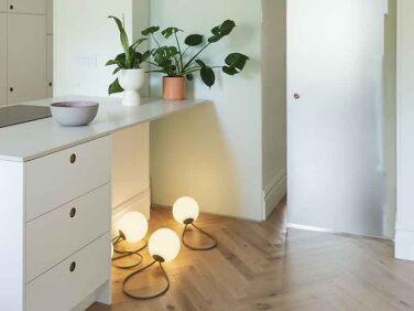
a frosted glass sliding door partitions off the laundry area. the adjacent inte 19
Above: A frosted glass sliding door partitions off the laundry area. The adjacent interior window draws light into the powder room. The lights on the floor are cordless, rechargeable Fat Boy Bolleke LED Indoor/Outdoor Lanterns that hang in the backyard.
the architects fit the laundry and powder room into &#8\2\20;what was previ 20
Above: The architects fit the laundry and powder room into “what was previously an interstitial space with small closets between the living and dining room. It had pocket doors to the living room and the plaster archway to the dining room side, both of which we kept.”

The front-loader washing machine is by Miele and highly recommended by the couple. They opted not to have a dryer: “I grew up without one,” explains Ruth, who spent her childhood in Vienna. “I’m very used to hanging all our laundry outside most of the year. Not having a dryer saves significantly on our energy use and air drying is much better for the clothes: they last longer.”

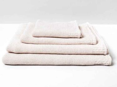
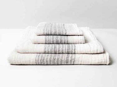
in lieu of a dryer, there&#8\2\17;s ample overhead storage. the solid color 21
Above: In lieu of a dryer, there’s ample overhead storage. The solid-colored Re.Lana towels by Kontex are composed of 50 percent recycled cotton and 50 percent organic cotton. The striped towels are Flax Line Organics from Rikumo.
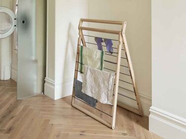
skagerak&#8\2\17;s portable oak dryp drying rack folds flat when not in use 22
Above: Skagerak’s portable oak Dryp drying rack folds flat when not in use. The outdoor laundry line is right off their kitchen.

Under-Stair Storage

closets occupy what had been a stair down to the garden level, which the archit 23
Above: Closets occupy what had been a stair down to the garden level, which the architects turned into a separate rental apartment with its own entrance. “Since a connection between the two units was no longer needed, we used the space for storage,” says Ruth. As in the kitchen, the cabinets are made from Ikea skeletons with Reform Basis line painted oak fronts.

Postage Stamp Powder Room

the narrow powder room is tucked opposite the stair cupboards; it was fitted in 24
Above: The narrow powder room is tucked opposite the stair cupboards; it was fitted into in the same interstitial space as the laundry area. It has a glass wainscot, Duravit Happy D.2 sink, Vola faucet, and Bocci inset electrical outlet (see Remodeling 101: The Surprising Appeal of Flush Outlets and DIY Flush Outlets Courtesy of a Budget-Minded Young Architect).

Before

a view from the former dining room—now the kitchen and laundry–lo 25
Above: A view from the former dining room—now the kitchen and laundry–looking into the front parlor. Notes Ruth: “We carefully removed all of the beautiful wooden details, stored them, and then reinstalled them. Anything that was not directly reused in the house was donated to Big Reuse here in Brooklyn. We have a big appreciation for the old-growth trees that were used in building these old structures and we make sure that the majority of wood taken out of our projects is reused and never ends up going to landfill. Being careful about reuse and recycling, and moving towards a more circular way of construction, was a driving factor in why we founded CO Adaptive Building over a year ago, which allows us to have a better handle on how deconstruction is handled on the houses we renovate. Our work allows this gorgeous old building stock to come into the next century with us and ensures their beauty can be appreciated by many more generations.” Photograph by Peter Dressel, courtesy of CO-Adaptive.

Floor Plan

the architects were able to make the most of the sliver of divider space betwee 26
Above: The architects were able to make the most of the sliver of divider space between living room and kitchen. “The powder room works,” explains Ruth, “because we tucked the small sink into a nook towards the kitchen, leaving about 31 inches wide by 50 inches deep of space.”

See more CO-Adaptive designs and green building tips on page 174-181 and 304 of Remodelista: The Low-Impact Home.

Also:

(Visited 21,440 times, 4 visits today)
You need to login or register to view and manage your bookmarks.

Product summary  

Have a Question or Comment About This Post?

Join the conversation

v5.0