Icon - Arrow LeftAn icon we use to indicate a rightwards action. Icon - Arrow RightAn icon we use to indicate a leftwards action. Icon - External LinkAn icon we use to indicate a button link is external. Icon - MessageThe icon we use to represent an email action. Icon - Down ChevronUsed to indicate a dropdown. Icon - CloseUsed to indicate a close action. Icon - Dropdown ArrowUsed to indicate a dropdown. Icon - Location PinUsed to showcase a location on a map. Icon - Zoom OutUsed to indicate a zoom out action on a map. Icon - Zoom InUsed to indicate a zoom in action on a map. Icon - SearchUsed to indicate a search action. Icon - EmailUsed to indicate an emai action. Icon - FacebookFacebooks brand mark for use in social sharing icons. flipboard Icon - InstagramInstagrams brand mark for use in social sharing icons. Icon - PinterestPinterests brand mark for use in social sharing icons. Icon - TwitterTwitters brand mark for use in social sharing icons. Icon - Check MarkA check mark for checkbox buttons.
You are reading

Soft in the City: Mandy Lee’s Serene Apartment in Hong Kong

Search

Soft in the City: Mandy Lee’s Serene Apartment in Hong Kong

February 3, 2020

A serious home renovation, the kind that involves more than just a new paint color or a powder room refresh, is an exercise in keeping sane. The months-long disruption, the draining bank account, the incessant dust, the steady stream of strangers in boots—none of it is something that most homeowners want to go through again.

Mandy Lee, the blogger (Lady and Pups) and cookbook author (The Art of Escapism Cooking), lived through the down-to-the-studs ordeal twice…in nine years…in the same apartment.

The first overhaul was in 2010 when she and her husband moved from New York to Hong Kong for his job and bought the apartment. They gutted the space. “I was still clinging to the industrial/lofty aesthetics that we left New York with, and everything was distressed concrete, distressed woods, distressed metal and glass panels,” she says of that renovation. “The kitchen had a concrete wall finish with stainless steel cabinet doors, very ‘you can take the girl out of Brooklyn but you can’t take Brooklyn out of the girl’—[except that] I’ve never lived in Brooklyn.”

Nine years later, they gutted it again. In between, the couple had moved to Beijing for a few years before moving back to their Hong Kong apartment—and they’d grown up. “We did the first renovation in our late 20s, when our lifestyle and mentality were completely different from where we are in our late 30s,” she says. “The functions and layout no longer fit our current lifestyle.”

The latest redesign still shows an affinity for distressed wood, but everything else has been replaced. Gone is the hardness of concrete and steel; in their place, billowing curtains, soft colors, and textured walls.

Let’s take a tour. And be sure to check out Mandy’s characterful kitchen in our earlier post (Kitchen of the Week: The ‘Angry Food Blogger’ at Home in Hong Kong.)

Photography by Mandy Lee.

&#8\2\20;the first design element i knew i wanted was a completely plastere 17
Above: “The first design element I knew I wanted was a completely plastered interior, Venetian plaster to be exact.” says Mandy, who ultimately opted for Roman Clay by California company Portola Paints. “We couldn’t find a worker to properly apply it so we ended up doing it ourselves after moving in. It was us a total of six months to completely finish the apartment.”
their third floor apartment is in an old walk up building in happy valley, a re 18
Above: Their third-floor apartment is in an old walk-up building in Happy Valley, a residential neighborhood in Hong Kong. “We prefer it to the new high-rises because the ceiling is slightly higher.” A small balcony is just off the living room. “It’s not much, but I love the corner where I planted an olive tree and some decorative plants to brighten it up.”
mandy&#8\2\17;s favorite part of her home. she sourced almost all the furni 19
Above: Mandy’s favorite part of her home. She sourced almost all the furniture and decorative details from Taobao, the Chinese version of Amazon.
&#8\2\20;due to budget, i used plywood for the wood wall that separates the 20
Above: “Due to budget, I used plywood for the wood wall that separates the master bedroom from the common area. I custom-stained it with oil and colors to fake a vintage”look and I’m quite happy how it turned out.”
&#8\2\20;the actual square footage of the apartment is about \1,050 square  21
Above: “The actual square footage of the apartment is about 1,050 square feet. The original design had two bedrooms with a study, which we turned into a one bedroom with two baths,” says Mandy. The door on the right leads to the guest bathroom.
the guest bathroom has artful brooms hanging off a peg rail. painted textured w 22
Above: The guest bathroom has artful brooms hanging off a peg rail. Painted textured wallpaper lines the walls here. Mandy’s vision for the redesign was inspired by the patina-heavy, romantic style favored by Jersey Ice Cream Co., which she discovered on Instagram. “I want to give credit to Jersey Ice cream Co, whose aesthetic I literally copied from.”
a glimpse of the moody green kitchen. their dogs’ water bowl sits on the 23
Above: A glimpse of the moody green kitchen. Their dogs’ water bowl sits on the tiled palazzo floor. See Kitchen of the Week: The ‘Angry Food Blogger’ at Home in Hong Kong for more pictures of this room.
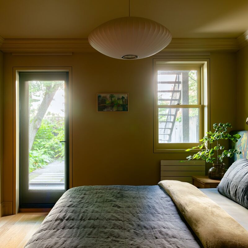
entering the master bedroom, where mandy&#8\2\17;s love for distressed wood 24
Above: Entering the master bedroom, where Mandy’s love for distressed wood and aged materials continues.
curtains conceal the walk in closet. &#8\2\20;i love a floor to ceiling cur 25
Above: Curtains conceal the walk-in closet. “I love a floor-to-ceiling curtain, because it creates the illusion of a higher ceiling. Plus it effectively divides the space when I need it to and does so very softly and warmly compared to actual panels. Last but not least, they’re a lot cheaper, too. I like to use natural linen-type materials with a certain level of translucency.”
an antique chinese low table works as an artful breakfast tray. 26
Above: An antique Chinese low table works as an artful breakfast tray.
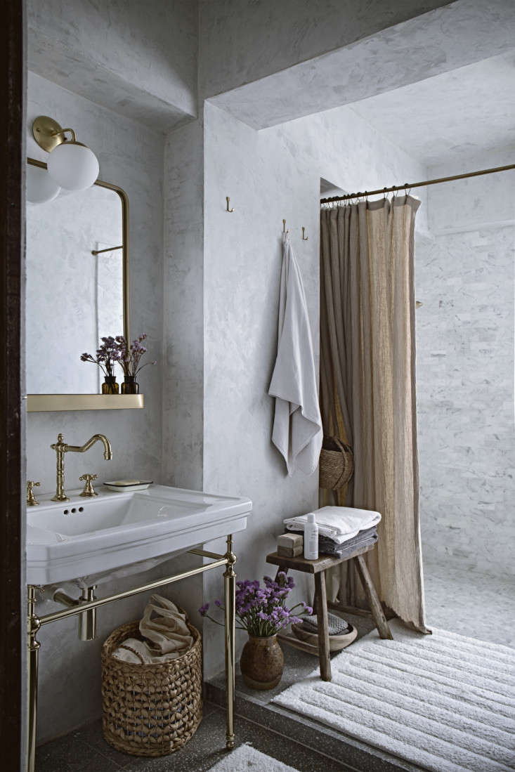
the master bathroom. 27
Above: The master bathroom.

For more on the homes of chefs and foodies, see:

(Visited 1,179 times, 1 visits today)
You need to login or register to view and manage your bookmarks.

Have a Question or Comment About This Post?

Join the conversation

v5.0