In designer Michaela Scherrer‘s all-white Pasadena bungalow, the guest suite comes with the ultimate minimalist spa bath, ancient Greek-style sunken bathtub included. Michaela is a member of the Remodelista Architect/Designer Directory, and we got to know her when we photographed her surpassingly calm quarters for the Remodelista book. Her style is meditative but far from monastic: She’s a master at using textural materials and layering pale tones (she mixes all her own paints—see DIY White Paint). Come dip into her Zen quarters.
Photography by Matthew Williams for Remodelista, styling by Alexa Hotz.
Above: The guest room has a wall of custom cabinets built around the window. “The window seemed very lonely in the corner and needed something around it. The cabinets also created a nice ledge.” The doors have pencil edges and magnetic closures; they offer enough storage that nothing needs to be left in the open except by choice. The chair is the Piona by Giancarlo Piretti for Anonima Castelli, a vintage design that Michaela modified: “I pulled off the back bar, lowered the seat, and then re-covered it in white leather.”
Above: The fifties desk is the Pyramid Table by Dutch designer Wim Rietveld, son of architect and designer Gerrit Rietveld of the De Stijl movement.
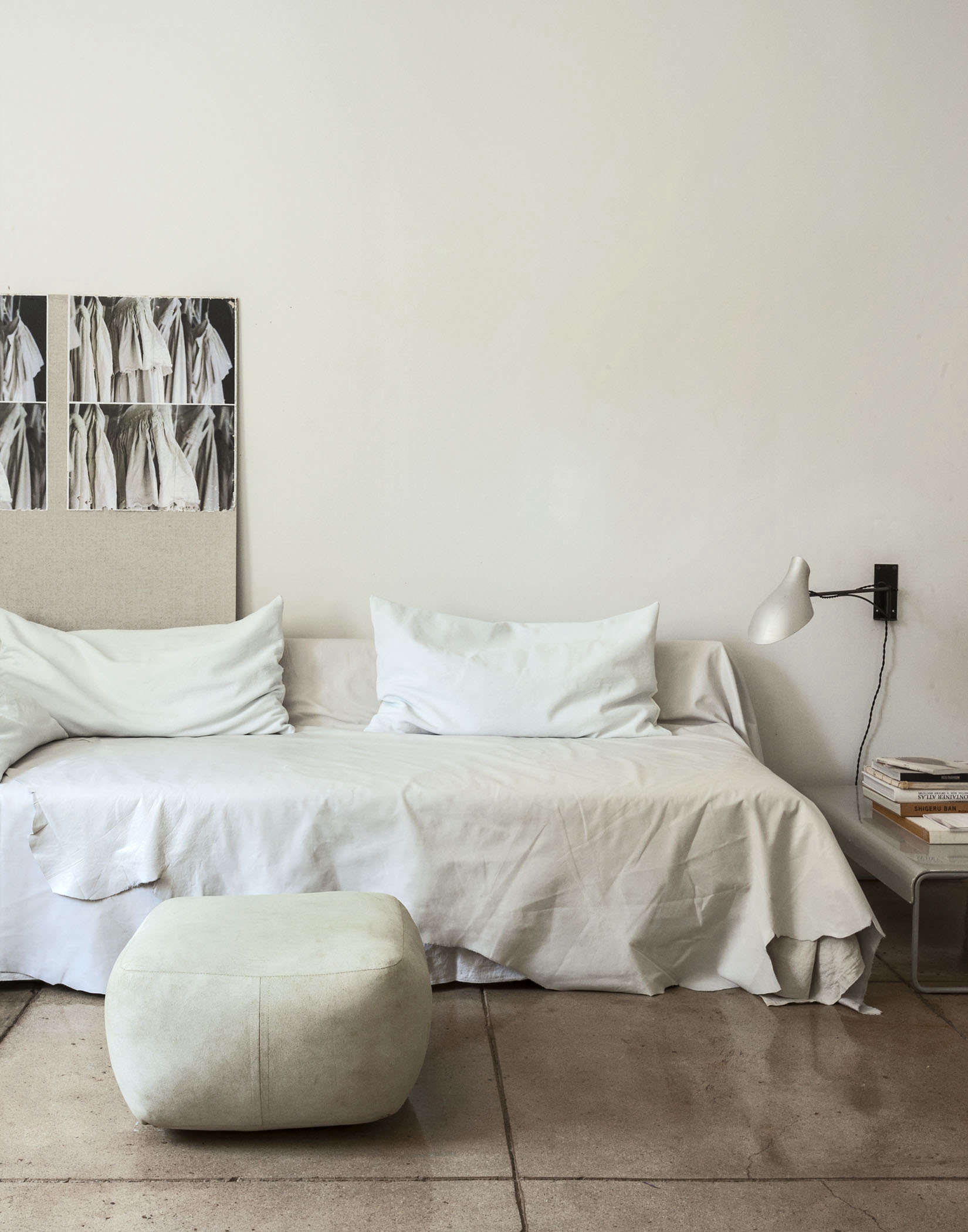
Above: Initially designed for a show house, the bed is covered with a white leather blanket stitched from Italian hides. Leather, Michaela points out, is relatively animal proof: It can be sponged off when her dogs leave paw prints and resists her cat’s claws. The wall art is one of Michaela’s mood boards (learn more about her technique and materials in our DIY Pinboards post).
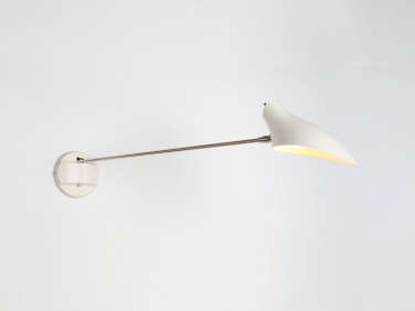
Above: A silvery bedside vignette. The low metal table is a Cassina design that Michaela has had for years; the One Arm Sconce is by New York designer David Weeks. A metallic tote hangs on the wall.
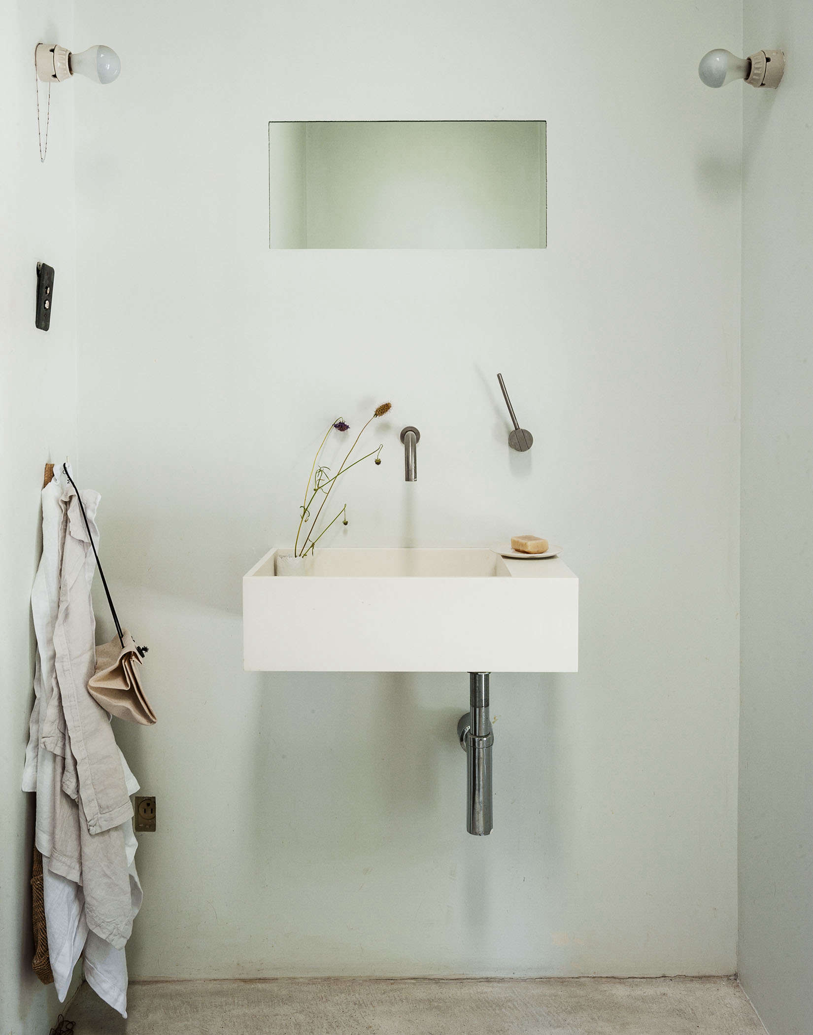
Above: Michaela gutted the original bathroom—an ornate French design—and created a tiny, stripped-down spa bath. To get the desired shade for the room, she mixed a pastel white base from Fine Paints of Europe with black, umber, and yellow pigments, a process that takes many trials. “I wanted a nuanced cool white,” she says. “But if I’m in a hurry, I use Decorator’s White from Benjamin Moore.” What looks like a niche above the sink is a piece of mirror inset into the wall.
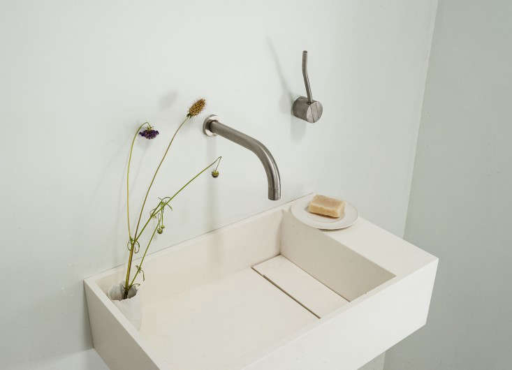
Above: The stone resin sink is a discontinued model by Como; the fixtures are Vola designs in matte steel.
Above: The room’s most arresting feature is its tub made of cast concrete tinted to “look like aged stone” and detailed with Vola fixtures. Inspired by a sunken bathtub in ancient Crete that Michaela spotted on a postcard, it has a square opening—and extends for an additional 18 inches under the floor, so that the bather’s legs are partly subterranean. To get the design exactly as she envisioned it, Michaela sat down in the dirt when the room was a construction site and figured out the dimensions. “I didn’t want it to feel like a big hole in the room,” she says. “I wanted to keep the tub as minimal as possible while still being practical. The Greek one was submerged as well. It was a sliver in the floor.”
To see the rest of the house, go to pages 150-161 of the Remodelista book. Also see our Designer Visit with Michaela Scherrer.
This is an update; it originally appeared on May 19, 2014, as part of our Greek Isles issue.






Have a Question or Comment About This Post?
Join the conversation (15)