Icon - Arrow LeftAn icon we use to indicate a rightwards action. Icon - Arrow RightAn icon we use to indicate a leftwards action. Icon - External LinkAn icon we use to indicate a button link is external. Icon - MessageThe icon we use to represent an email action. Icon - Down ChevronUsed to indicate a dropdown. Icon - CloseUsed to indicate a close action. Icon - Dropdown ArrowUsed to indicate a dropdown. Icon - Location PinUsed to showcase a location on a map. Icon - Zoom OutUsed to indicate a zoom out action on a map. Icon - Zoom InUsed to indicate a zoom in action on a map. Icon - SearchUsed to indicate a search action. Icon - EmailUsed to indicate an emai action. Icon - FacebookFacebooks brand mark for use in social sharing icons. flipboard Icon - InstagramInstagrams brand mark for use in social sharing icons. Icon - PinterestPinterests brand mark for use in social sharing icons. Icon - TwitterTwitters brand mark for use in social sharing icons. Icon - Check MarkA check mark for checkbox buttons.
You are reading

Kitchen of the Week: A Living-Room-Inspired Minimalist Kitchen in Stockholm

Search

Kitchen of the Week: A Living-Room-Inspired Minimalist Kitchen in Stockholm

October 7, 2021

We are loving the anti-kitchen kitchen trend we’ve been noticing of late. Instead of installing monolith walls of built-in cabinets and big shiny appliances, some designers are choosing to treat the room more like a living or family room and selecting finishes and furniture-like units to match.

Recently, Swedish kitchen company Nordiska Kök reached out to us about such an aytpical kitchen, a recently completed project in an elegant apartment in Stockholm’s Östermalm district. The clients, parents to three children, wanted the kitchen to be the heart of the home, but relocating it to the center meant it would now be visible from both the living room and the TV room. The solution: downplay the standard trappings of typical kitchens and elevate its design so that it blends in seamlessly with the other spaces.

Of course, the room still has to be functional. “We live a busy life, the children have many activities, and we often have friends at home,” says the wife, an interior designer. “It was important for us to have a natural gathering point at home, where homework and cooking can be done. We love to entertain, and my goal was to get a real kitchen island to be able to present food and drink to guests who can then move freely in the apartment.”

“We have renovated all the homes we have lived in,” she continues. “It’s fun to see my own development as I become more daring each time.” 

Join us for a tour.

Photography by Kristofer Johnsson, styling by Caroline Sandström, courtesy of Nordiska Kök.
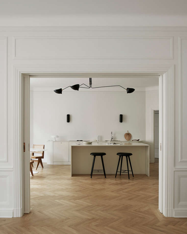
the view from the living room into the kitchen. for cohesiveness, the same warm 17
Above: The view from the living room into the kitchen. For cohesiveness, the same warm off-white paint—NCS 0500—was used in the three rooms (living room, kitchen, and den) that form the home’s “social hub.”
herringbone floors throughout add warmth to the minimalist design. 18
Above: Herringbone floors throughout add warmth to the minimalist design.
black accents—a serge mouille ceiling light, wall lights by serax, and s 19
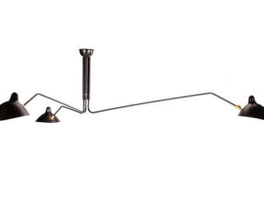
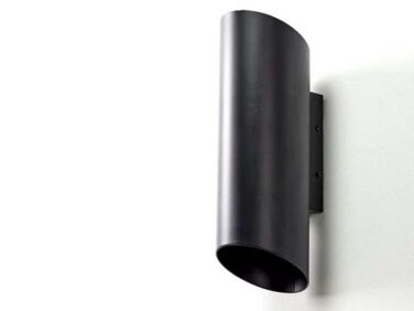
Above: Black accents—a Serge Mouille ceiling light, wall lights by Serax, and stools by Mater—punctuate the otherwise pale room.
the rounded lower cabinets and countertop, more akin to a sideboard than kitche 20
Above: The rounded lower cabinets and countertop, more akin to a sideboard than kitchen built-in, reference a curvy sofa in the living room. The faucet is by Dornbracht.
soft floor to ceiling curtains are another unusually elegant touch in this kitc 21
Above: Soft floor-to-ceiling curtains are another unusually elegant touch in this kitchen. And note how unobtrusive the Gaggenau cooktop is; it even has a built-in fan in lieu of a more prominent range hood.
a tabouret meribel stool by charlotte perriand sits next to a floating wall uni 22
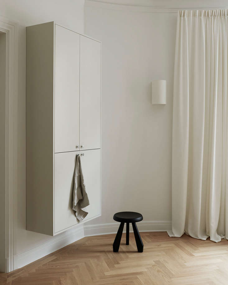
Above: A Tabouret Meribel stool by Charlotte Perriand sits next to a floating wall unit.
eero saarinen&#8\2\17;s tulip table and capitol complex chairs from cassina 23
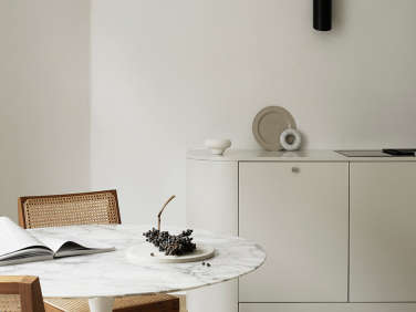
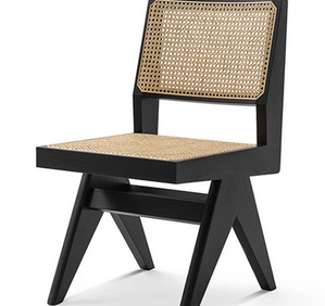
Above: Eero Saarinen’s Tulip Table and Capitol Complex Chairs from Cassina make up the breakfast nook.
hidden from the living room view is a wall unit that conceals the refrigerator  24
Above: Hidden from the living room view is a wall unit that conceals the refrigerator and freezer.

For more minimalist kitchens, see:

(Visited 2,411 times, 1 visits today)
You need to login or register to view and manage your bookmarks.

Product summary  

Have a Question or Comment About This Post?

Join the conversation

v5.0