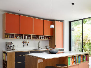
Another hard-to-ignore Uncommon Projects kitchen, this time in cheerful shades of coral and hot orange. This kitchen belongs to Rachel Kay, her husband, George, and their two daughters, Seren, nine, and Eira, six. It’s on the ground floor of a three-story Victorian terraced house in Stoke Newington, North London. They moved in just before the first UK-wide lockdown in spring 2020. “The previous family had been here for 25 years,” Rachel explains. “Every room was painted white, so we were keen to add some color and make it feel like home. For me, the kitchen is the hub of a family home so we wanted to create a space that was both functional and colorful.”

Coral was Rachel’s first choice: “It’s warm and optimistic, which felt like an antidote to the antagonistic drama of the outside world.” The designers and makers at Uncommon Projects—architect Alan Drumm and product designer James Hoy—embraced the choice. “We quickly hit upon the combination of an unapologetic shade of coral pink with orange,” explains Alan. “On its own, this could easily have been hard to live with long term, so we introduced a base of dark brown. It tones in well with the floor, pink and orange, and helps ground the colors,” Alan says. “Without it, the kitchen could easily have felt like a fashion choice; instead, it now looks like it has been there years, and could be for years more.”

The original kitchen wall had been removed and an under-stairs toilet incorporated into the design before Uncommon Projects were on board. They were brought in just in time to suggest some key changes to the arrangement of the plan. “Alan had the ingenious idea to bring the kitchen entrance forward so that the kitchen wall would sit flush with the units the entrance,” Rachel says. “It was these extra design decisions that made the whole process of working with them so rewarding.”

Rather than incorporate a bi-folding door across the entire rear wall, the couple decided to keep two apertures. These create a natural separation between the cooking and dining areas. “I also knew that I wanted a window seat, so I could read while looking out into the garden” says Rachel. “Uncommon Projects designed a beautiful bench with storage underneath which has become a real feature of the kitchen. It’s my favorite cozy spot in the house.”

“I’m someone who struggles with clutter,” Rachel says. “I love minimalist kitchens, but, with a busy lifestyle and two young children, we wanted a space that was functional as well as aesthetically pleasing.” A kitchen island was introduced to maximize cooking and storage space. “This is so much more practical for family life: we can cook while looking forward and chatting to the children at the table or bar,” says Rachel. “It’s also far more visually appealing having the washing up tucked away along the wall.”


An unusually bulky gas boiler that could not be moved is concealed behind a worktop-mounted cupboard to the right of the sink. “Using a series of different depth cabinetry and colors across the base and wall units helps to hide the scale of this boiler,” Alan says. “It actually adds interest to the design, rather than detracting from it.”
“I’m really glad we went with something less traditional than typically Victorian kitchen colors,” Rachel says. “My spirits lift every time I come into the kitchen.”


Have a Question or Comment About This Post?
Join the conversation (3)