Icon - Arrow LeftAn icon we use to indicate a rightwards action. Icon - Arrow RightAn icon we use to indicate a leftwards action. Icon - External LinkAn icon we use to indicate a button link is external. Icon - MessageThe icon we use to represent an email action. Icon - Down ChevronUsed to indicate a dropdown. Icon - CloseUsed to indicate a close action. Icon - Dropdown ArrowUsed to indicate a dropdown. Icon - Location PinUsed to showcase a location on a map. Icon - Zoom OutUsed to indicate a zoom out action on a map. Icon - Zoom InUsed to indicate a zoom in action on a map. Icon - SearchUsed to indicate a search action. Icon - EmailUsed to indicate an emai action. Icon - FacebookFacebooks brand mark for use in social sharing icons. flipboard Icon - InstagramInstagrams brand mark for use in social sharing icons. Icon - PinterestPinterests brand mark for use in social sharing icons. Icon - TwitterTwitters brand mark for use in social sharing icons. Icon - Check MarkA check mark for checkbox buttons.
You are reading

Kitchen of the Week: In Connecticut, a Japanese- and Mediterranean-Inspired Room

Search

Kitchen of the Week: In Connecticut, a Japanese- and Mediterranean-Inspired Room

July 8, 2021

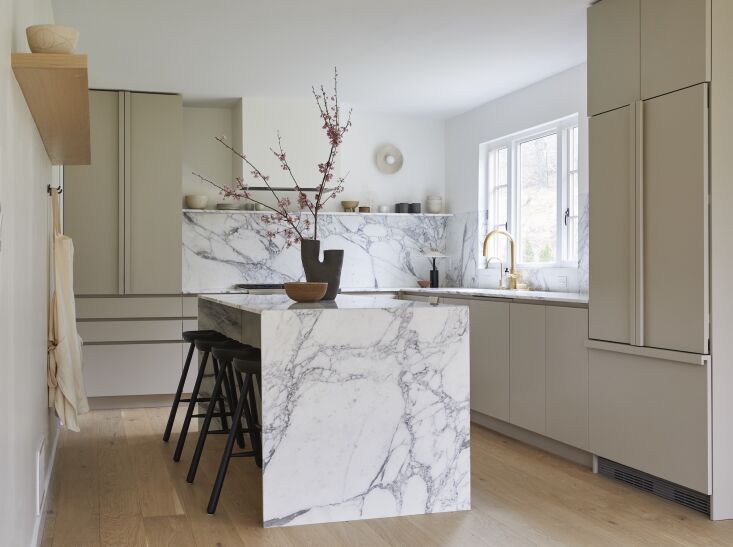
One of the tiniest details in this kitchen is also one of the most impactful: a slim, elegant floating marble shelf that bisects the wall above the counters. It’s designer Tina Rich‘s favorite element in the room, a minimalist space she reimagined for a young couple making the age-old migration from city (New York) to burbs (Greenwich, CT). “They are slowly renovating the entire home, but their priority was the kitchen since it is the space they spend the most time in and the space that needed the most love,” she says.

On the rehab to-do list: knock down the wall that separated the dining room and the kitchen, enlarge the window over the sink, and add a large door from the dining room to the patio. “Originally dark and dated, the kitchen is now soaked in natural light,” says Tina. (Be sure to scroll down to see the before shots.)

The most challenging part of the project turned out to be that aforementioned shelf: “We really wanted to keep the stone countertops and floating shelf thin (we wanted to maintain the two-centimeter thickness of the slabs). But doing a floating stone shelf this thin can be a challenge structurally; fortunately, we found a way to conceal metal brackets on the underside of the stone shelf,” she says. “The thinness of shelves and countertops really does help define the style of the kitchen,” a style Tina describes as “the perfect balance of modern yet warm, with a mix of Japanese and Mediterranean influences.”

Photography by Christian Torres, courtesy of Tina Rich.

&#8\2\20;we kept the overall layout pretty similar, with the range and sink 17
Above: “We kept the overall layout pretty similar, with the range and sink in the same location,” says Tina, who always advises her clients to choose panel-ready appliances. “They are more expensive than standard appliances but they allow you to hide the fridge and dishwasher behind cabinet doors to givesyou a clean, seamless look. I also suggest investing in a great freestanding range. While some clients want a professional range like a Viking or Wolf, which can be investments, you can find more affordable ranges with a similar aesthetic, like the Bertazzoni one we used here.”
&#8\2\20;the calacatta vagli stone was the biggest investment here (natural 18
Above: “The Calacatta Vagli stone was the biggest investment here (natural stone usually is!), and it really makes such an impact. The slabs we chose have the most gorgeous color and veining. One of my favorite details is that the stone along the sink wall is flush with the wall above. It’s such a small but beautiful detail.”
&#8\2\20;we went back and forth on wood cabinets versus painted cabinets an 19
Above: “We went back and forth on wood cabinets versus painted cabinets and settled on the perfect taupe painted cabinets with integrated hardware. They wanted open shelves (which we love!) so we skipped the upper cabinets. The space isn’t large so skipping the upper cabinets really opened up the room,” says Tina. Bookending the room are a full-height pantry (far left) and a paneled refrigerator (far right).
&#8\2\20;we used wood floors with a lot of character, handmade ceramics, an 20
Above: “We used wood floors with a lot of character, handmade ceramics, and unfinished brass accents to create a space that is natural and layered.” The sconce is from Allied Maker; the clay table lamp is from In Common With.
&#8\2\20;we spotlighted our favorite ceramicists: matthew ward, kati von le 21
Above: “We spotlighted our favorite ceramicists: Matthew Ward, Kati Von Lehman, Simone Bodner Tunrner, to name a few.” The stools are by Form & Refine, from Finnish Design Shop.
&#8\2\20;i love the simplicity of a single shelf to display a collection of 22
Above: “I love the simplicity of a single shelf to display a collection of handmade ceramics.”
the striking vase is by nur ceramics; the ramen bowl by kati von lehman. 23
Above: The striking vase is by Nur Ceramics; the ramen bowl by Kati von Lehman.

Before:

Above: “The original kitchen was dated with ancient appliances and linoleum floors,” says Tina.

For more modern kitchens, see:

(Visited 1,742 times, 1 visits today)
You need to login or register to view and manage your bookmarks.

Have a Question or Comment About This Post?

Join the conversation

v5.0