Icon - Arrow LeftAn icon we use to indicate a rightwards action. Icon - Arrow RightAn icon we use to indicate a leftwards action. Icon - External LinkAn icon we use to indicate a button link is external. Icon - MessageThe icon we use to represent an email action. Icon - Down ChevronUsed to indicate a dropdown. Icon - CloseUsed to indicate a close action. Icon - Dropdown ArrowUsed to indicate a dropdown. Icon - Location PinUsed to showcase a location on a map. Icon - Zoom OutUsed to indicate a zoom out action on a map. Icon - Zoom InUsed to indicate a zoom in action on a map. Icon - SearchUsed to indicate a search action. Icon - EmailUsed to indicate an emai action. Icon - FacebookFacebooks brand mark for use in social sharing icons. flipboard Icon - InstagramInstagrams brand mark for use in social sharing icons. Icon - PinterestPinterests brand mark for use in social sharing icons. Icon - TwitterTwitters brand mark for use in social sharing icons. Icon - Check MarkA check mark for checkbox buttons.
You are reading

Kitchen of the Week: An Ikea Kitchen, Elevated and Upgraded

Search

Kitchen of the Week: An Ikea Kitchen, Elevated and Upgraded

October 27, 2022

We love a good Ikea-hack kitchen. This delightful one comes to us courtesy of London-based architects James Alder and Thom Brisco (formerly of Alder Brisco, now practicing as James Alder Architect and Brisco Loran). Tasked with building an extension to a 1930s townhouse in West London for a couple with young children, they came up with clever, economical solutions—including selecting Ikea base cabinets and hard-wearing, no-fuss materials.

“Prior to the remodel, the tiny galley kitchen was isolated from the living and dining spaces,” explains Thom. “The clients hoped to see it enlarged and repositioned to become a focal center of the home, where the family might talk about their day together, prepare food, and overlook play and homework.”

With much of the budget allocated for the building of the dining room addition, James and Thom relied heavily on Ikea for the kitchen update, a strategy that they employed in the past to great success (see Kitchen of the Week: A Create-Cook-Eat Space Built on a Tight Budget). Birch plywood cabinet doors, topped with green Formica, from kitchen fabricator Farmwood front the Ikea cabinets for a custom look.

Scroll down to see all the smart design decisions the two architects made to create a singular heart of the home for their clients.

Photography by Nick Dearden, courtesy of Alder Brisco.

the kitchen steps down to the new addition, which houses the dining set. instea 17
Above: The kitchen steps down to the new addition, which houses the dining set. Instead of scrapping the old pine wood floor, the architects simply had the few damaged boards patched.
the kitchen was designed by alder brisco, with base cabinets all sourced from i 18
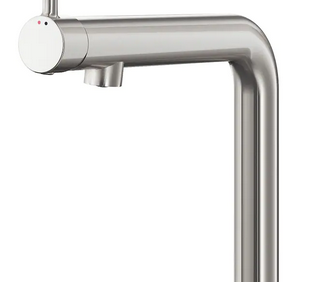
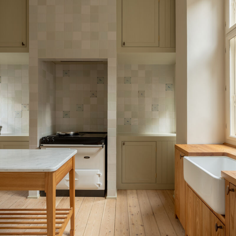
Above: The kitchen was designed by Alder Brisco, with base cabinets all sourced from Ikea’s standard white Metod range. The doors, drawer fronts, end panels, and worktop are all from a plywood kitchen fabricator called Farmwood. The Bosjön faucet is also from Ikea. The wood knobs are from Chocolate Creative. The stove is from the original kitchen.
the view from the kitchen out to the backyard. 19
Above: The view from the kitchen out to the backyard.
a rattan pendant light from matilda goad hangs above the dining table. the marm 20
Above: A rattan pendant light from Matilda Goad hangs above the dining table. The Marmoleum flooring, in “Cement 171” color, is from Forbo.
&#8\2\20;we were looking to build the extension with as few materials as po 21
Above: “We were looking to build the extension with as few materials as possible, keeping it fast and low-cost,” says Thom. “There are no plasterboard finishes within the extension. The same brick is used for the external walls, stepped terrace, and internal walls where it is painted [Benjamin Moore Brilliant White].”
a stacked freezer and refrigerator are hidden in the tall cabinets to the right. 22
Above: A stacked freezer and refrigerator are hidden in the tall cabinets to the right.
&#8\2\20;where the garden was previously accessed via steep, tall steps tha 23
Above: “Where the garden was previously accessed via steep, tall steps that were dangerous for their children, we have managed to soften this journey,” says Thom, who eased the transition in stages: first, with steps down to the dining room, followed by a wide brick terrace of gentle steps and planters.

For more Kitchens of the Week, see:

(Visited 2,300 times, 1 visits today)
You need to login or register to view and manage your bookmarks.

Product summary  

Have a Question or Comment About This Post?

Join the conversation

v5.0