Icon - Arrow LeftAn icon we use to indicate a rightwards action. Icon - Arrow RightAn icon we use to indicate a leftwards action. Icon - External LinkAn icon we use to indicate a button link is external. Icon - MessageThe icon we use to represent an email action. Icon - Down ChevronUsed to indicate a dropdown. Icon - CloseUsed to indicate a close action. Icon - Dropdown ArrowUsed to indicate a dropdown. Icon - Location PinUsed to showcase a location on a map. Icon - Zoom OutUsed to indicate a zoom out action on a map. Icon - Zoom InUsed to indicate a zoom in action on a map. Icon - SearchUsed to indicate a search action. Icon - EmailUsed to indicate an emai action. Icon - FacebookFacebooks brand mark for use in social sharing icons. flipboard Icon - InstagramInstagrams brand mark for use in social sharing icons. Icon - PinterestPinterests brand mark for use in social sharing icons. Icon - TwitterTwitters brand mark for use in social sharing icons. Icon - Check MarkA check mark for checkbox buttons.
You are reading

Kitchen of the Week: An Expensive-Looking Remodel for Just $13,000

Search

Kitchen of the Week: An Expensive-Looking Remodel for Just $13,000

July 30, 2020

We often recommend Ikea’s kitchen cabinets as a solid, bang-for-the-buck option for those looking to remodel. And nowadays, there are so many offshoot companies offering cabinet front styles specifically tailored to fit Ikea’s base cabinets that, if being economical is a priority, there’s little reason not to at least start with an Ikea skeleton. (See Ikea Kitchen Upgrade: 11 Custom Cabinet Companies for the Ultimate Kitchen Hack.)

Which is what we assumed this expensive-looking kitchen from architects Luke and Joanne McClelland was: a skeleton base by Ikea, upgraded with doors from another company. Turns out the whole thing is a combination of Ikea components!

The two, both architects (he has his own firm, Luke McClelland Design), normally work on high-end projects, but for their own kitchen remodel in Edinburgh, Scotland, they had to work with a budget that was a tenth of what they’re used to. Their solution: “We tried to use affordable products to recreate the specific qualities that previous clients associated with luxury: simplicity, symmetry, integration.”

Here’s how they overhauled their kitchen for under $13,000, including appliances (but not including labor).

Photography by Zac and Zac, courtesy of Luke McClelland Design.

joanne and luke moved into the apartment a couple years ago, attracted to the g 17
Above: Joanne and Luke moved into the apartment a couple years ago, attracted to the grand proportions and period details. They knocked down a wall to create an open kitchen and dining area.
all cabinet bases and doors are from ikea. the matte black fronts are from the  18
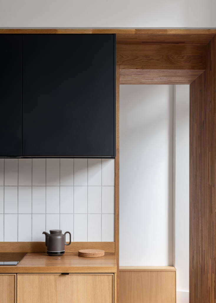
Above: All cabinet bases and doors are from Ikea. The matte black fronts are from the Kungsbacka line, all made from recycled wood and recycled PET bottles. The lower cabinets are from the oak Ekestad series, currently unavailable in the US. Classic subway tiles (theirs are from here) look modern when installed vertically.
&#8\2\20;all appliances are concealed within the lower cabinets,&#8\2\2 19
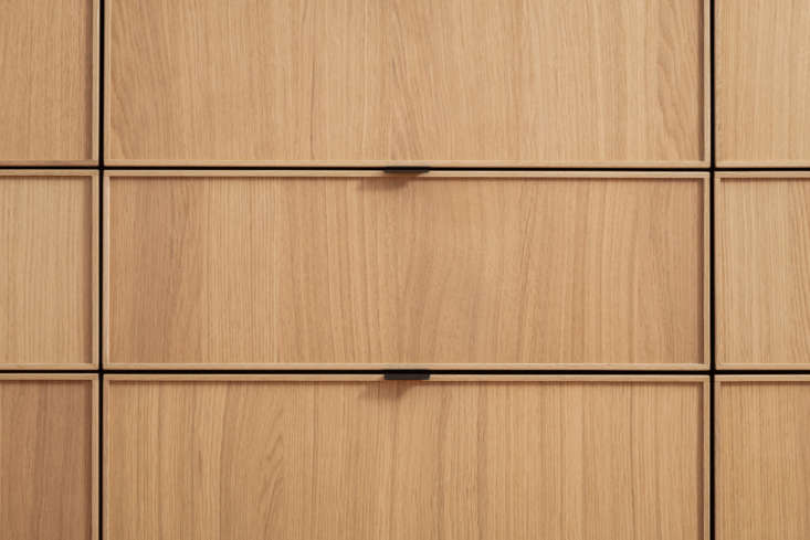
Above: “All appliances are concealed within the lower cabinets,” says Luke. “The cabinets all appear as drawers but in some cases are actually two drawer cabinet fronts fixed together to form a hinged cupboard.” The faucet is by Lusso. (See 10 Easy Pieces: Matte Black Kitchen Faucets for more ideas.) The lights are Ikea’s Ranarp Pendant Lamps.
&#8\2\20;the cabinets are encased in a stud bulkhead to look like they are  20
Above: “The cabinets are encased in a stud bulkhead to look like they are recessed into the wall. The bulkhead conceals the extract for the cooker hood which, in turn, is recessed into the cabinets. The oak surrounds are just standard worktops cut down and used to frame the cabinets and to give the impression of a more expensive ‘hand-crafted’ kitchen,” explains Luke. The electric induction cooktop is by Bosch.
to the right is the doorway to the utility closet, where the washer, dryer, and 21
Above: To the right is the doorway to the utility closet, where the washer, dryer, and freezer are housed.
the couple chose slim matte black aluminum cabinet pulls from the handle studio 22
Above: The couple chose slim matte-black aluminum cabinet pulls from The Handle Studio for the drawers.
&#8\2\20;we are very much influenced by scandinavian design,&#8\2\2\1;  23
Above: “We are very much influenced by Scandinavian design,” says Luke. “In particular I have always loved the work of Norm Architects in Copenhagen. I like natural materials and clean lines in a functional space like a kitchen.” The worktops are full stave oak; the couple treat it every 12 months or so with Osmo TopOil.
the framed art is lifted from london deco, a book of illustrations by thibaud h 24
Above: The framed art is lifted from London Deco, a book of illustrations by Thibaud Herem. “We moved to Edinburgh from London, and they provide a little reminder of the city,” says Luke. The walls are painted Farrow & Ball All White.

For more Ikea kitchens we love, see:

(Visited 9,024 times, 5 visits today)
You need to login or register to view and manage your bookmarks.

Have a Question or Comment About This Post?

Join the conversation

v5.0