Icon - Arrow LeftAn icon we use to indicate a rightwards action. Icon - Arrow RightAn icon we use to indicate a leftwards action. Icon - External LinkAn icon we use to indicate a button link is external. Icon - MessageThe icon we use to represent an email action. Icon - Down ChevronUsed to indicate a dropdown. Icon - CloseUsed to indicate a close action. Icon - Dropdown ArrowUsed to indicate a dropdown. Icon - Location PinUsed to showcase a location on a map. Icon - Zoom OutUsed to indicate a zoom out action on a map. Icon - Zoom InUsed to indicate a zoom in action on a map. Icon - SearchUsed to indicate a search action. Icon - EmailUsed to indicate an emai action. Icon - FacebookFacebooks brand mark for use in social sharing icons. flipboard Icon - InstagramInstagrams brand mark for use in social sharing icons. Icon - PinterestPinterests brand mark for use in social sharing icons. Icon - TwitterTwitters brand mark for use in social sharing icons. Icon - Check MarkA check mark for checkbox buttons.
You are reading

Kitchen of the Week: A New Heart of the Home for a Young Family in Columbus, Ohio

Search

Kitchen of the Week: A New Heart of the Home for a Young Family in Columbus, Ohio

August 12, 2021

Last year, I wrote about the off-the-grid guesthouse that architect Greg Dutton, of Midland Architecture, built on his parents’ rural property in Ohio (you can read it here.) A few weeks ago, he wrote to share news of his latest personal project: the renovation of the Columbus, Ohio, home he shares with his wife, Liz, and their two young children, Shep and Joan. Our favorite part? The kitchen, by all means, the kitchen.

Their prairie-style house comes with history: It was designed by Florence Kenyon Hayden Rector, Ohio’s first female architect. While the brick exterior remains largely unchanged, many of the original details in the interior were lost after years of neglect. A renovation in the ’90s helped make it inhabitable again, but the cramped, dark kitchen didn’t function, as the new parents had envisioned, like the heart of the home: “Aside from the aesthetics not being a great fit for us, the space was isolated from the rest of the house,” says Greg. (Scroll to the end to see the before.) “It was difficult to keep an eye on the kids while making dinner [because] there was literally no room for them to be in the kitchen while we made a meal.”

The renovation proved to be challenging, as most projects involving historical homes are, but theirs came with an unexpected layer of nail-biting angst: “We started the project in the first week of March 2020. So by the time we gutted our entire first floor, everything had gone into lockdown. Obviously, there were more serious issues at hand at the time, but being in the middle of a construction project when things were shutting down was really difficult to navigate,” recalls Greg. “We had no cabinets or walls in our house and we were like ‘Are we going to be able to put this place back together?’ ”

As was the experience for so many the past year and a half, they made do and persevered. Join us for a tour of their beautiful new kitchen, now the heart of the home.

Photograph by Alexandra Ribar, courtesy of Midland Architecture; interiors and interior design by Greg and Liz Dutton; staging by Studio Lithe.

&#8\2\20;we placed our kitchen table in the center of the kitchen, in the s 17
Above: “We placed our kitchen table in the center of the kitchen, in the spot where you would traditionally put an island. It seems like a small thing, but it creates so much more energy in the room. Now everything revolves around that table. It’s where we have breakfast every morning and dinner every night.  It’s where we spend time as a family,” says Greg.
&#8\2\20;all of the windows are in the original locations. the construction 18
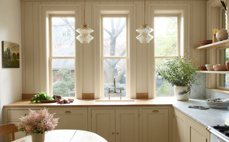
Above: “All of the windows are in the original locations. The construction of the house is early 1900s brick masonry, so it would have blown the budget to alter them,” shares Greg. “But in the kitchen, it became a fun challenge to make the layout work while keeping all of the window locations intact. I feel like it gives the house house an Old World feel.” The pendant lights above the sink are vintage from Skinflint. “They’re such a great resource because their lighting is all vintage but at really great prices.”
note the two different countertop materials, bianco gioia marble on one side, w 19
Above: Note the two different countertop materials, Bianco Gioia marble on one side, white oak on the other. The sconce is by Bestlite.
the cherry wood cabinets installed during the &#8\2\17;90s remodel were rep 20
Above: The cherry wood cabinets installed during the ’90s remodel were replaced with cabinets designed by Greg himself and fabricated by Schrock’s Woodworking, local Amish builders. (Their contractor was Hubbard Construction and Carpentry.) The 40″ stove is from Ilve’s Nostalgie line.
a hutch like built in lends itself to the modern old fashioned style of the roo 21
Above: A hutch-like built-in lends itself to the modern old-fashioned style of the room. The cabinets were all painted Farrow & Ball “Hay”; the walls are painted Farrow & Ball “Lime White.”
the couple removed the wall between the kitchen and the family room. &#8\2\ 22
Above: The couple removed the wall between the kitchen and the family room. “The wall was three layers of brick and the new opening is 10 feet wide, so it required a sizable steel beam that was no small feat to install. But it was totally worth it,” says Greg. Their biggest splurge, though, was the French oak flooring from Pave Tile Wood and Stone, a company located in Western Massachusetts that specialize in historic flooring.
&#8\2\20;our vision was really just to breathe some soul back into the hous 23
Above: “Our vision was really just to breathe some soul back into the house,” says Greg.  “I love that we took a room that was dark and isolated from the rest of the house and transformed it into the heart of our home. It’s now a space that’s bright and open and flooded with natural light.”

Before

greg dutton liz kitchen columbus ohio before
Above: The very ’90s kitchen featured cherry cabinets, huge appliances, and no space to congregate. “To take a room where formerly, only one person could occupy it comfortably, and turn it into a place where the whole family gathers is pretty special,” says Greg.

For more kitchens with dining tables in them, see:

(Visited 11,038 times, 3 visits today)
You need to login or register to view and manage your bookmarks.

Have a Question or Comment About This Post?

Join the conversation

v5.0