Icon - Arrow LeftAn icon we use to indicate a rightwards action. Icon - Arrow RightAn icon we use to indicate a leftwards action. Icon - External LinkAn icon we use to indicate a button link is external. Icon - MessageThe icon we use to represent an email action. Icon - Down ChevronUsed to indicate a dropdown. Icon - CloseUsed to indicate a close action. Icon - Dropdown ArrowUsed to indicate a dropdown. Icon - Location PinUsed to showcase a location on a map. Icon - Zoom OutUsed to indicate a zoom out action on a map. Icon - Zoom InUsed to indicate a zoom in action on a map. Icon - SearchUsed to indicate a search action. Icon - EmailUsed to indicate an emai action. Icon - FacebookFacebooks brand mark for use in social sharing icons. flipboard Icon - InstagramInstagrams brand mark for use in social sharing icons. Icon - PinterestPinterests brand mark for use in social sharing icons. Icon - TwitterTwitters brand mark for use in social sharing icons. Icon - Check MarkA check mark for checkbox buttons.
You are reading

Kitchen of the Week: Sunshine and Storage Aplenty in a Tiny Vancouver Remodel

Search

Kitchen of the Week: Sunshine and Storage Aplenty in a Tiny Vancouver Remodel

December 30, 2021

When it came time for Gillian Stevens to remodel her dated Vancouver kitchen (“let’s just say it needed some help,” she summarizes), she did what her training as a photographer had always taught her to do: look for light. In this case, there wasn’t much. “The previous owners had installed a cupboard over the only window,” she explains of the dark and small room.

moving the window placement to this spot &#8\2\20;was one of the best decis 17
Above: Moving the window placement to this spot “was one of the best decisions we made, and I am so glad that our designer thought of it!” says Gillian. The original window was on the left wall and looked into their neighbor’s window. The ceiling lights are simply lightbulbs screwed into porcelain lampholders by Leviton (just $8.22 each at Home Depot).

Instead of knocking down walls or adding more windows (which would have have meant less storage space), though, she and her husband, at their designer’s urging, opted to move the sole window. “We really struggled trying to fit everything we wanted into the room: unobstructed countertop space, open shelving, a 36-inch fridge, and a large window overlooking the garden. We couldn’t seem to make it all work without compromising,” says Gillian.

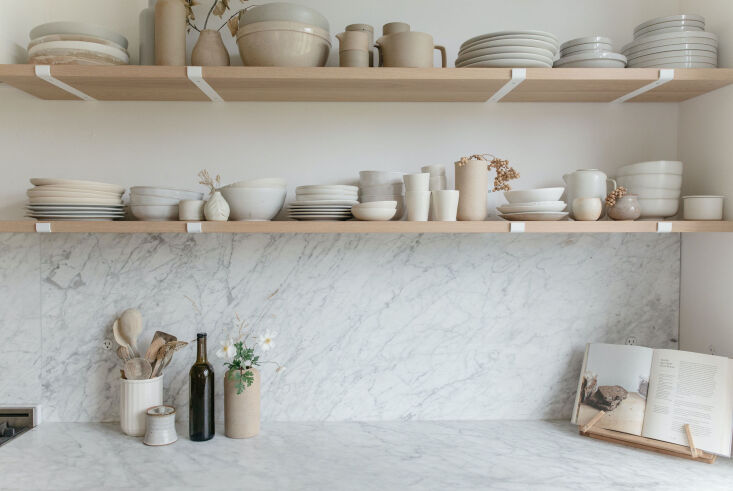
custom floating shelves by lock & mortice are now where the original window 18
Above: Custom floating shelves by Lock & Mortice are now where the original window once was. The stove is from Ilve’s Nostalgie line. The cabinets by Kitchen Art Design are painted Benjamin Moore Classic Gray; the walls painted in Bauwerk Lime Paint’s Chalk.

“When our kitchen designer suggested we remove the existing kitchen window, with my love of natural light, I couldn’t fathom removing a window. But doing that meant we could have all the things on our list, and with it being a smaller room, having a large window on the adjacent wall would replace the light we lost.”
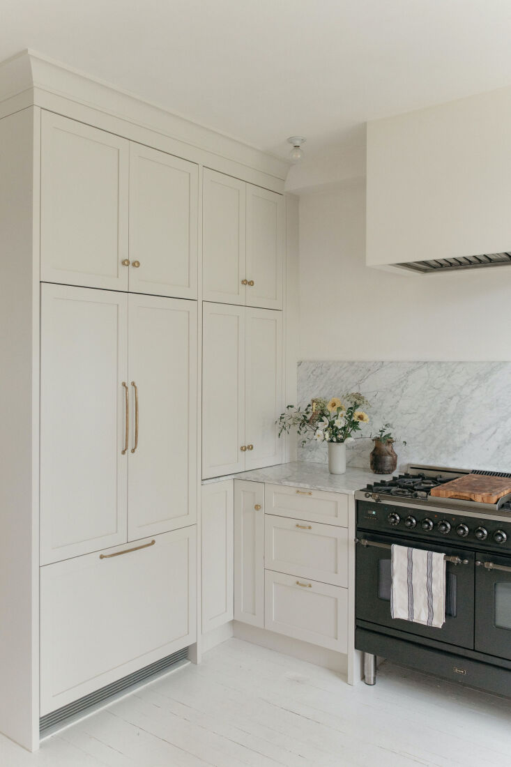
one of the perks of custom cabinetry is carving out storage space from the tini 19
Above: One of the perks of custom cabinetry is carving out storage space from the tiniest corners. The brass cabinet door knobs and drawer pulls are all from House of Antique Hardware. The refrigerator handles, in unlacquered brass, are from Rejuvenation.

The couple worked with Vancouver-based Kitchen Art Design on the remodel. “Our wish list was pretty long. I had been designing this kitchen in my head for many years, so I had a pretty specific idea of what I wanted to do,” says Gillian. “The biggest challenge was fitting all of the things we wanted into the space. There were many back and forth drawings with our cabinet designer.”
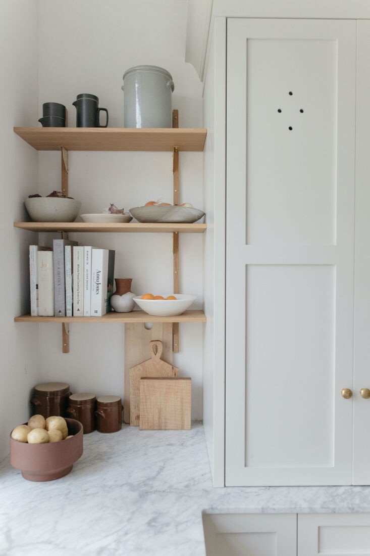
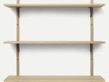
ferm living&#8\2\17;s oak and brass sector shelf is a perfect fit next to t 20
Above: Ferm Living’s oak and brass Sector Shelf is a perfect fit next to the pantry.

In the end, they got everything they wanted: “It’s a dream come true in every way.” Below, she details her best kitchen remodel decisions.

Photography by Gillian Stevens. (To visit her photography site, go here. To see her fashion brand, go here. To follow her on Instagram, go here.)

Pocket Doors

&#8\2\20;i really love our pocket doors on the pantry. it’s a hidden 21
Above: “I really love our pocket doors on the pantry. It’s a hidden coffee station, and I love being able to open those up while we’re making coffee or getting the kids’ lunches packed. It would have made the kitchen feel really closed off and awkward if they didn’t slide in the way they do.”

Integrated Appliances

&#8\2\20;our fridge, dishwasher, and garbage are all integrated into the ca 22
Above: “Our fridge, dishwasher, and garbage are all integrated into the cabinetry, along with the custom hood box that is painted to match the walls. And two pantries hide the coffee machine, toaster, and microwave. I really love that when I am in my kitchen, I am not looking at stainless steel appliances,” says Gillian (in an outfit from her line), who also gushed about her Fisher & Paykel two-drawer dishwasher. “I didn’t know I could love a dishwasher so much.”

Oversized Window

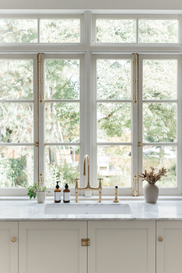
gillian&#8\2\17;s absolute favorite part of the remodel: these antique wind 23
Above: Gillian’s absolute favorite part of the remodel: these antique windows that look out onto the garden. Bonus? She found them for only $300 on Facebook Marketplace. “We had our contractor touch it up in places where the wood was in bad shape,” says Gillian. “I had gotten several quotes back for making a custom window exactly like the one we have. I was shocked when I saw the exact thing I wanted for basically pennies in comparison, and made my husband race over immediately!”

Carrara Marble

a must have for gillian? carrara marble countertops and backsplash. &#8\2\2 24
Above: A must-have for Gillian? Carrara marble countertops and backsplash. “I looked at so many different options and was told by most fabricators to stay away from marble, but they have been my dream countertops for so long and it was a total non-negotiable for me.” She found the marble at Bordingnon Stone.

Lazy Susans

the lower corner cabinets each have what gillian calls &#8\2\20;super susan 25
Above: The lower corner cabinets each have what Gillian calls “super Susans.” “They provide an impressive amount of storage space, much more than I thought they would. After years of awkwardly reaching to the backs of lower cabinets for heavy pots and pans, the turntables are a gift straight from heaven.”

Splurge-Worthy Faucet

the faucet wasn&#8\2\17;t the most expensive item in the kitchen, &#8\2 26
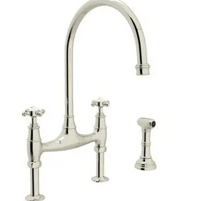
Above: The faucet wasn’t the most expensive item in the kitchen, “but because there were other options I was considering at lower price points, picking this Georgian-Era Bridge Faucet by Perrin & Rowe felt like a total splurge. I love it so much, and the way the brass has patina’ed is stunning.”

N.B.: This post is an update; the original ran on September 30, 2021.

For more on small kitchen designs, see:

(Visited 7,125 times, 1 visits today)
You need to login or register to view and manage your bookmarks.

Product summary  

Have a Question or Comment About This Post?

Join the conversation

v5.0