Icon - Arrow LeftAn icon we use to indicate a rightwards action. Icon - Arrow RightAn icon we use to indicate a leftwards action. Icon - External LinkAn icon we use to indicate a button link is external. Icon - MessageThe icon we use to represent an email action. Icon - Down ChevronUsed to indicate a dropdown. Icon - CloseUsed to indicate a close action. Icon - Dropdown ArrowUsed to indicate a dropdown. Icon - Location PinUsed to showcase a location on a map. Icon - Zoom OutUsed to indicate a zoom out action on a map. Icon - Zoom InUsed to indicate a zoom in action on a map. Icon - SearchUsed to indicate a search action. Icon - EmailUsed to indicate an emai action. Icon - FacebookFacebooks brand mark for use in social sharing icons. flipboard Icon - InstagramInstagrams brand mark for use in social sharing icons. Icon - PinterestPinterests brand mark for use in social sharing icons. Icon - TwitterTwitters brand mark for use in social sharing icons. Icon - Check MarkA check mark for checkbox buttons.
You are reading

Kitchen of the Week: A Not Too Precious Kitchen for “Faux Martha” in Minnesota

Search

Kitchen of the Week: A Not Too Precious Kitchen for “Faux Martha” in Minnesota

December 9, 2021

Over on our sister site, The Organized Home, we’ve tapped The Faux Martha blogger Melissa Coleman several times in the past for her expertise on streamlined, straightforward cooking. (See The Only 5 Pots and Pans You’ll Ever Need and  The Only Five Things You Need to Cook a Delicious Thanksgiving Turkey.) Recently, when images of her kitchen remodel landed in our inbox, we discovered she also prefers an appealing simplicity when it comes to design. Unfortunately, though, the renovation process itself was anything but simple.

Melissa and her husband had purchased their lakeside chalet (great bones but in desperate need of attention) in Grand Marais, MN, and decided to overhaul it at a particularly inopportune time—just before Covid hit and phrases like “global supply chain” and “Zoom meetings” entered daily lexicon. Compounding the poor timing: they were also about to welcome a new baby, their second child, into their lives. Suffice to say, the road to completion was bumpy and long—two years long—but they couldn’t be happier with the results and, in particular, with the kitchen.

“Being in this kitchen makes me want to pack up our life and head north,” says Melissa, whose full-time residence is 4.5 hours away in Minneapolis. “The steam somehow rolls off your coffee differently here. I love that the kitchen feels beautiful and special, yet not too precious. Like you can come in and cook and make a mess.” Below, she walks us through all of her design decisions that culminated in this hard-working space that also invites lingering.

Photography by Melissa Coleman, courtesy of The Faux Martha.

 &#8\2\20;the cabin was lined in perfectly preserved original cedar wa 17
Above: “The cabin was lined in perfectly preserved original cedar walls when we got ahold of it. And it smelled like it, too. Funny enough, the original kitchen didn’t have any cedar, outside the ceiling, so we lined the walls with cedar to make it feel like it had always been there,” says Melissa. The windows were replaced with new ones from Marvin.
because so much of their budget was spent on making over the exterior, the coup 18
Above: Because so much of their budget was spent on making over the exterior, the couple committed to remodeling the kitchen on a budget. They made this work by choosing Ikea base cabinets paired with Semihandmade fronts; Melissa opted for the brand’s DIY Shaker style for the cabinet doors and its DIY Slab fronts for the drawers.
melissa and her family use the chalet, nicknamed the minne stuga, as a vacation 19
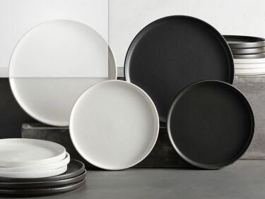
Above: Melissa and her family use the chalet, nicknamed the Minne Stuga, as a vacation home but because they also rent it out, she made sure the dishes would be durable; they’re everyday stoneware from Pottery Barn. The neat accordion light is an Etsy find.
melissa chose marmoleum tiles (in a checkered pattern in black and barbados) fo 20
Above: Melissa chose Marmoleum tiles (in a checkered pattern in black and Barbados) for the same reason: they’re hard-wearing and no-nonsense. Plus, they’re made from material that is all natural and mostly recycled.
richlite, an eco friendly paper composite material that has the look of natural 21
Above: Richlite, an eco-friendly paper composite material that has the look of natural stone, was used for the counters. “We have them in the bathrooms at the cabin as well. Ours has a muted matte black finish, which looks a bit like soapstone without the price tag,” says Melissa. (For more on Richlite, go here.)
melissa considered 50 different greens for the kitchen cabinets before ending u 22
Above: Melissa considered 50 different greens for the kitchen cabinets before ending up with a shade that’s between Benjamin Moore’s Trailing Vines and Tate Olive. The Ilve stove is from its Nostalgie line, in matte graphite.

Before

melissa liked the original kitchen and contemplated changing just the flooring  23
Above: Melissa liked the original kitchen and contemplated changing just the flooring but ultimately went for a full remodel in order to gain more room (it’s now bumped out by about four feet).

For more green kitchens, see:

(Visited 2,919 times, 7 visits today)
You need to login or register to view and manage your bookmarks.

Product summary  

Have a Question or Comment About This Post?

Join the conversation

v5.0