Icon - Arrow LeftAn icon we use to indicate a rightwards action. Icon - Arrow RightAn icon we use to indicate a leftwards action. Icon - External LinkAn icon we use to indicate a button link is external. Icon - MessageThe icon we use to represent an email action. Icon - Down ChevronUsed to indicate a dropdown. Icon - CloseUsed to indicate a close action. Icon - Dropdown ArrowUsed to indicate a dropdown. Icon - Location PinUsed to showcase a location on a map. Icon - Zoom OutUsed to indicate a zoom out action on a map. Icon - Zoom InUsed to indicate a zoom in action on a map. Icon - SearchUsed to indicate a search action. Icon - EmailUsed to indicate an emai action. Icon - FacebookFacebooks brand mark for use in social sharing icons. flipboard Icon - InstagramInstagrams brand mark for use in social sharing icons. Icon - PinterestPinterests brand mark for use in social sharing icons. Icon - TwitterTwitters brand mark for use in social sharing icons. Icon - Check MarkA check mark for checkbox buttons.
You are reading

Kitchen of the Week: ‘Wes Anderson Meets Provencal’ in West London

Search

Kitchen of the Week: ‘Wes Anderson Meets Provencal’ in West London

June 17, 2021

“Wes Anderson meets Provençal.” Designer Chris Graves (of Clarence & Graves) is describing his vision for his kitchen renovation. But what does that mean, exactly? For one thing, a memorable palette, in this case “a beautiful soft palette of pink, black and green”; for another, nostalgia for the past via quirky vintage and antique pieces. And then, there’s the more intangible element, a certain joie de vivre that all Wes Anderson sets seem to share: “I wanted it to feel joyous, convivial, bright, like we were abroad,” says Chris, who worked with deVOL’s in-house design team on the project.

All of which was accomplished with this charm-filled remodel. The once dark ’70s kitchen (think pine cupboards and purple plastic counters) is now a whimsical, welcoming, and meticulously considered space for his self-described “messy, colliding family.”

Let’s take a tour. (And don’t be surprised if you want to cue up The Royal Tanenbaums or Grand Budapest Hotel afterward.)

Photography courtesy of deVOL.
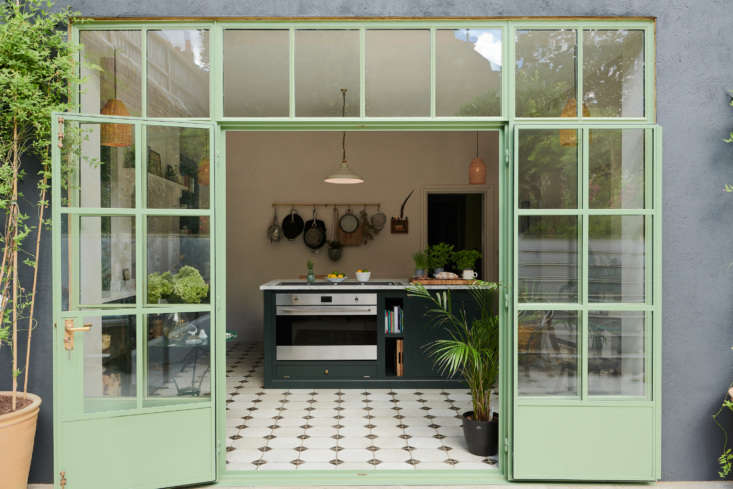
the kitchen is in a \19th century victorian house and originally had just two s 17
Above: The kitchen is in a 19th-century Victorian house and originally had just two small windows. Chris’s decision to install a wall of steel windows and doors transformed it into a bright and airy space. “I knew they would be green, connecting it to the outside courtyard,” he says. “I had several green samples sent as tiny circular discs and had to make a leap based on just those. It was a memorable day when they went in. The fitter commented that in 25 years of installation he had never seen green. The tones of the palette all came from there. They are a big talking point.”
inside, the mint green is offset by a pale pink walls (china clay mid by little 18
Above: Inside, the mint green is offset by a pale pink walls (China Clay Mid by Little Greene) and dark green cabinets (custom mixed by deVOL).
the view to the courtyard takes center stage in the kitchen. chris made the unu 19
Above: The view to the courtyard takes center stage in the kitchen. Chris made the unusual decision of positioning the cooktop to face the interior of the room. “The design is deliberate. My favorite seat in a restaurant is at the bar, feeling [like I’m] part of the cooking. Communal, convivial, connected. I didn’t want the cook to have their back to the room,” says Chris.
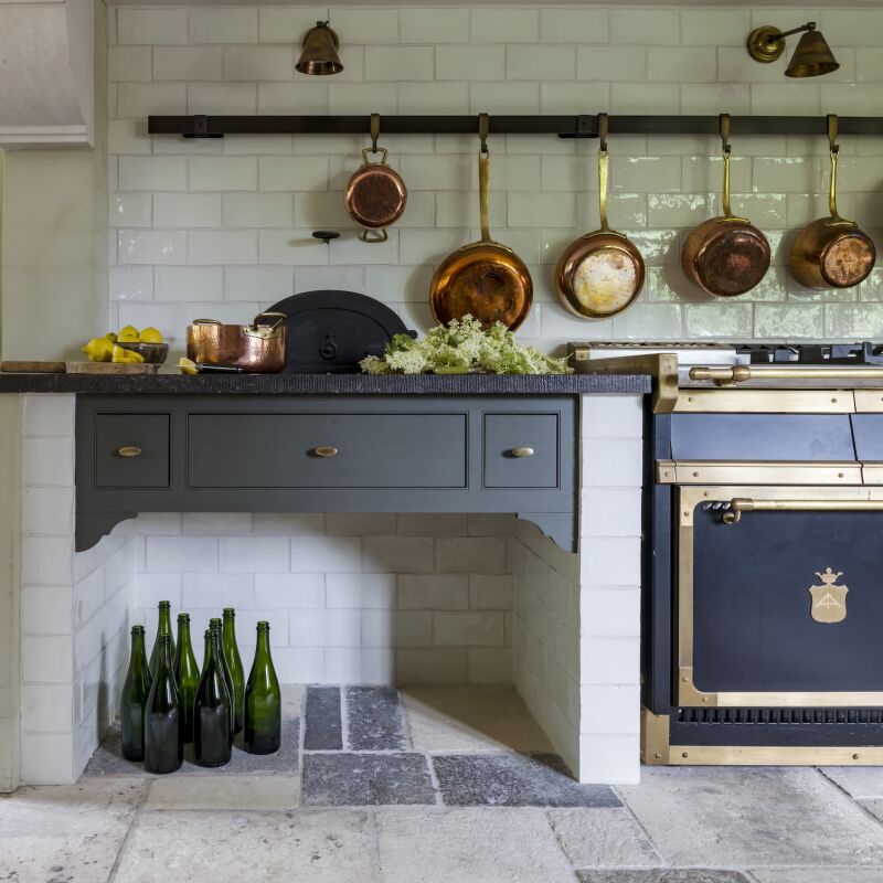
&#8\2\20;splurges include the sunken barazza gas hob—beautiful craft 20
Above: “Splurges include the sunken Barazza gas hob—beautiful craftsmanship and simplicity—and, of course, the tactile joy of the Statuarietto marble. The marble backsplash in the sink looks like a Pollock painting, it makes me smile,” says Chris. The stool is from deVOL.
another unique design decision: inserting the sink into a chimney breast. the c 21
Above: Another unique design decision: inserting the sink into a chimney breast. The cabinets are from deVOL’s Shaker collection.
a vintage chair and hungarian desk from a kempton antique fair set a sweet scen 22
Above: A vintage chair and Hungarian desk from a Kempton Antique Fair set a sweet scene. The Chianti Wicker Pendant Light is from Iconic Lights.
just off the main kitchen area is a wall of cabinets, painted in devol&#8\2 23
Above: Just off the main kitchen area is a wall of cabinets, painted in deVOL’s Mushroom. Hiding on the left side is a refrigerator and freezer.
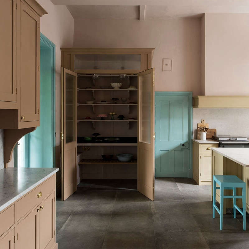
adjacent to the refrigerator is the pantry. an electrical outlet inside means c 24
Above: Adjacent to the refrigerator is the pantry. An electrical outlet inside means Chris can store the toaster and tea kettle on the middle shelf.
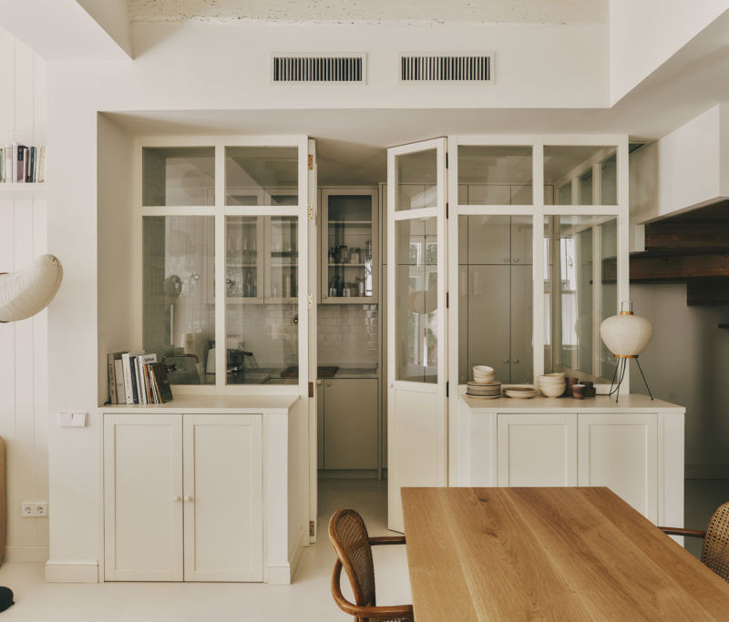
the next set of the doors on the far right conceal the washer and dryer. 25
Above: The next set of the doors on the far right conceal the washer and dryer.
&#8\2\20;i was mindful of keeping the integrity of a city kitchen, so it ha 26
Above: “I was mindful of keeping the integrity of a city kitchen, so it had to be luxurious and practical,” says Chris. “I didn’t want it to feel too country or twee.”

For more colorful kitchens, see:

(Visited 6,466 times, 2 visits today)
You need to login or register to view and manage your bookmarks.

Have a Question or Comment About This Post?

Join the conversation

v5.0