Icon - Arrow LeftAn icon we use to indicate a rightwards action. Icon - Arrow RightAn icon we use to indicate a leftwards action. Icon - External LinkAn icon we use to indicate a button link is external. Icon - MessageThe icon we use to represent an email action. Icon - Down ChevronUsed to indicate a dropdown. Icon - CloseUsed to indicate a close action. Icon - Dropdown ArrowUsed to indicate a dropdown. Icon - Location PinUsed to showcase a location on a map. Icon - Zoom OutUsed to indicate a zoom out action on a map. Icon - Zoom InUsed to indicate a zoom in action on a map. Icon - SearchUsed to indicate a search action. Icon - EmailUsed to indicate an emai action. Icon - FacebookFacebooks brand mark for use in social sharing icons. flipboard Icon - InstagramInstagrams brand mark for use in social sharing icons. Icon - PinterestPinterests brand mark for use in social sharing icons. Icon - TwitterTwitters brand mark for use in social sharing icons. Icon - Check MarkA check mark for checkbox buttons.
You are reading

Kitchen of the Week: A ‘New Old’ Project in Noe Valley, Ikea Cabinets Included

Search

Kitchen of the Week: A ‘New Old’ Project in Noe Valley, Ikea Cabinets Included

June 11, 2020

“Donald Judd and James Turrell’s ‘Lapsed Quaker Ware’ coupled with a sense of Japanese minimalism.” Amy Kwok is explaining the sources of inspiration for her kitchen design—and it’s immediately apparent that she’s not the average home remodeler. In fact, Amy was once a Fulbright Fellow, researching architecture and ceramics under Chinese architect Wang Shu (2012’s Pritzker Prize winner). After working for several distinguished architecture firms—and becoming a mom to twins—she decided to strike out on her own.

Among her first projects: her home, a 1,000 square-foot condo in San Francisco’s Noe Valley that had last been remodeled in the late ’90s. “The arrangement of space was good, but the finishes and details felt like they could be updated and made to feel more like ‘us,’ the owners,” says Amy.

“Us” is her and her husband, I Wei. Several years ago, the two had fallen in love with a pendant light at an exhibition of Taiwanese designers in Paris. It was dubbed “New Old.” That phrase—representing the idea of tweaking tradition and reimagining classics and, more literally, making “our old space…new again,” says Amy—would become the driving force behind their kitchen remodel.

Below, a peek at the couple’s New Old kitchen, a space that, finally, feels like them.

Photography by Mariko Reed, courtesy of Amy Kwok.

&#8\2\20;there had been water damage to some of the space and the flooring, 17
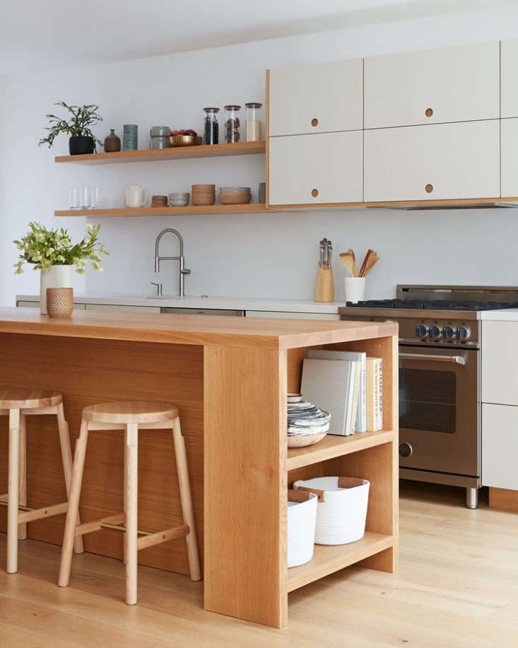
Above: “There had been water damage to some of the space and the flooring, and the kitchen had seen better days,” says Amy of the room pre-renovation. “It was not a gut renovation, but rather a quick renovation to clean and brighten up the space, and add more storage to the kitchen.”
the cabinets are made up of ikea frames with fronts from the basis line by refo 18
Above: The cabinets are made up of Ikea frames with fronts from the Basis line by Reform. Displayed on the open shelves are some of Amy’s hand-thrown ceramics. She made custom pieces just for this project. (You can see them in detail here.) The Barn Stools are by Corral.
the white oak kitchen island is designed by amy and constructed by a local wood 19
Above: The white oak kitchen island is designed by Amy and constructed by a local woodworker. “I had taken a trip to Marfa and visited Donald Judd’s home, and loved how his pieces felt timeless. The kitchen island was inspired by his library table, [which was] a work horse of sorts,” says Amy. “What I love about it is that in the future, we could detach the top and sides from the cabinet mass and use it as a true library table.”
the floors are engineered european oak planks. 20
Above: The floors are engineered European oak planks.
the kitchen is open to the living and dining areas. the walls are painted benja 21
Above: The kitchen is open to the living and dining areas. The walls are painted Benjamin Moore’s Steam.
hanging above the luciano bertocini dining table is the piece that inspired the 22
Above: Hanging above the Luciano Bertocini dining table is the piece that inspired their remodel: the New Old Light by Taiwanese lighting company Kimu. The benches are from Ikea.
&#8\2\20;the doors were inspired by japanese shoji screens. it’s a w 23
Above: “The doors were inspired by Japanese shoji screens. It’s a way to separate the primary bedroom from the more social areas of the house. I liked the idea of not adding any extra hardware but having the slats themselves serve as pulls to open and close the doors.” The sofa is from Blu Dot; Amy had it reupholstered. The cork table is by Michael Sodeau Studio.

For more Reform kitchens, see:

(Visited 3,625 times, 1 visits today)
You need to login or register to view and manage your bookmarks.

Have a Question or Comment About This Post?

Join the conversation

v5.0