When it comes to kitchen design, the team at Plain English are proud traditionalists. But they also have an inventive bent. Specializing in what they call “rooms defined by the dignity of utility,” they don’t stint on storage or clever detailing. Case in point, this two-toned remodel in a Dorset, England, farmhouse with a newly opened up ceiling and a simple but game-changing flourish: painted numbers on the doors of a bank of cupboards, decorative ventilation holes included.
Photography courtesy of Plain English.

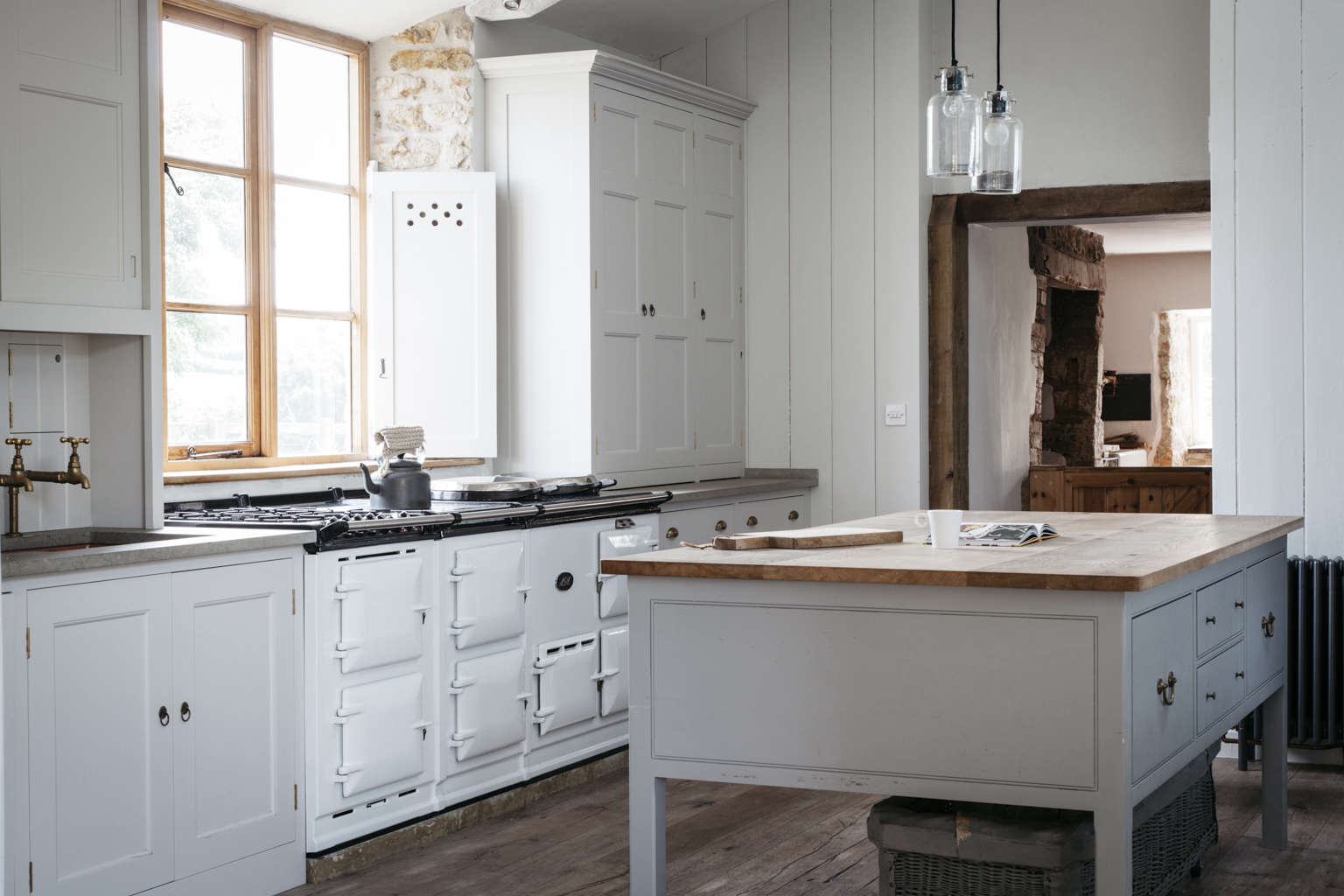
Above: Set in the footprint of the existing kitchen—with the owners’ white Aga left in its original location—the room was transformed by removing not only the flat false ceiling but also a fireplace (which cleared space for a wall of cabinets).
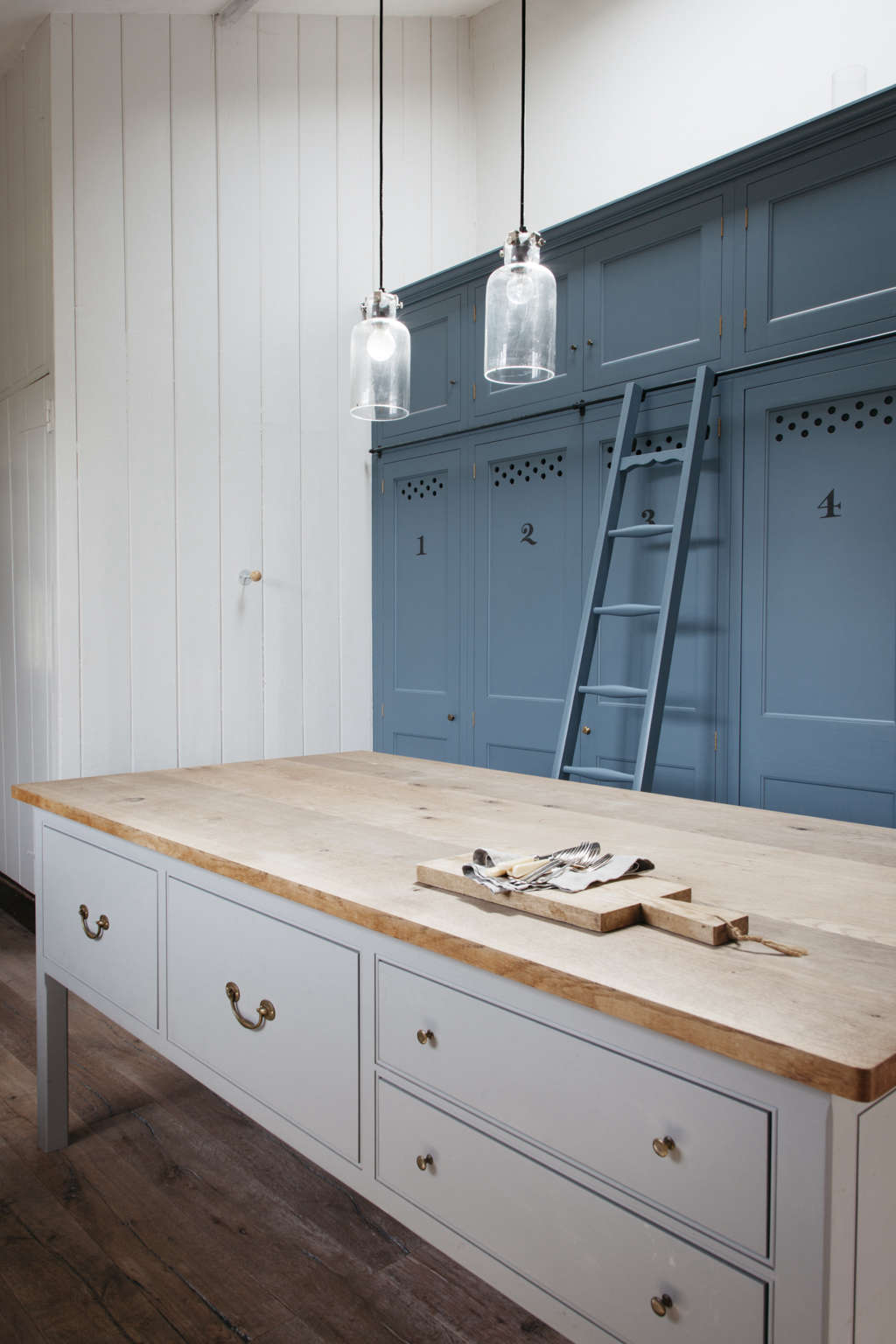
“The brief was to create a family kitchen with lots of storage and worktop space without overcrowding the room,” Plain English senior designer Tracey Hyde tells us. Pale clapboard walls and cabinetry (Little Greene’s French Grey Pale) give it an airiness that’s offset by floor-to-ceiling cupboards and a library ladder in blue (Little Greene’s Air Force Blue).
Above: How to create a kitchen island that looks as if it’s always been there? By designing a “preparation table” much like a dining room sideboard with antique Georgian brass knobs and pulls and a worktop of “untreated pippy oak,” selected to work with the new rustic oak floor, which extends from the kitchen into a living room addition on one end (shown) and dining addition (see below).
Above: The cabinetry flanking the Aga has limestone counters that can withstand the heat of the stove. The inset copper sink (from The Copper Store) has Barber Wilsons untreated brass faucets. The dishwasher is to the left of the sink and the overhead sliding door cabinets hold the family’s glasses; more tableware is kept in the “counter-standing” cabinet on the other end of the counter.
Another notable detail: As an architectural alternative to cafe curtains, Plain English introduced pierced wood shutters for privacy—the windows overlook a public footpath—while still allowing in natural light.
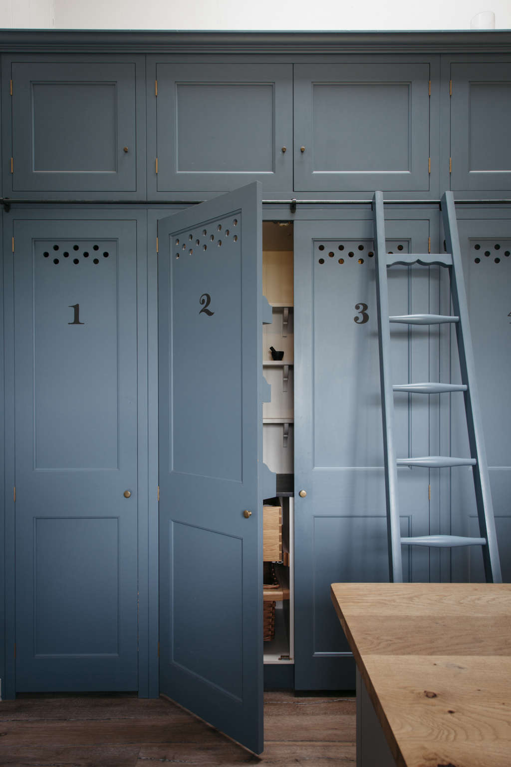
Above: The shutter design is echoed on the cupboards, where the holes provide ventilation for pantry items. What’s behind each door? Number 1 has wood shelves for food and general storage. Numbers 2 and 3 form a “double larder” with slate shelving. Number 4 conceals the freezer and number 5 the fridge, and numbers 6 and 7 are for tableware and trays. The ladder hangs on a steel rail and provides access to the upper cupboards which serve as overflow storage.
Above: Each cupboard is tailored for use. This double larder has “two baskets on wooden slips, two pullout oak trays, and reduced depth shelves on brackets,” says Hyde. “There are also two electrical points for storing and using small appliances within the cupboard.”

Above: The kitchen opens to a new dining area, which like the living room entry is framed by exposed beams. Practicality wasn’t overlooked: Note the electrical outlets installed on the end of the island.
Here are some more favorite Plain English designs:
- A Subtly Splendid Kitchen in North London
- Kitchen Confidential: 10 Ways to Achieve the Plain English Look
- Plain English Bespoke Kitchen Design Comes to the US
- A Kitchen for the People, Courtesy of Prince Charles
To see more country kitchens, go to Farmhouse Style.



Have a Question or Comment About This Post?
Join the conversation (4)