Icon - Arrow LeftAn icon we use to indicate a rightwards action. Icon - Arrow RightAn icon we use to indicate a leftwards action. Icon - External LinkAn icon we use to indicate a button link is external. Icon - MessageThe icon we use to represent an email action. Icon - Down ChevronUsed to indicate a dropdown. Icon - CloseUsed to indicate a close action. Icon - Dropdown ArrowUsed to indicate a dropdown. Icon - Location PinUsed to showcase a location on a map. Icon - Zoom OutUsed to indicate a zoom out action on a map. Icon - Zoom InUsed to indicate a zoom in action on a map. Icon - SearchUsed to indicate a search action. Icon - EmailUsed to indicate an emai action. Icon - FacebookFacebooks brand mark for use in social sharing icons. flipboard Icon - InstagramInstagrams brand mark for use in social sharing icons. Icon - PinterestPinterests brand mark for use in social sharing icons. Icon - TwitterTwitters brand mark for use in social sharing icons. Icon - Check MarkA check mark for checkbox buttons.
You are reading

Kitchen of the Week: A Client’s Narrow Childhood Home in Park Slope Gets an Airy Addition

Search

Kitchen of the Week: A Client’s Narrow Childhood Home in Park Slope Gets an Airy Addition

April 1, 2021

It turns out you can go home again—it just might need a few tweaks.

Such was the case for this client who, as an adult, was moving his own family into his childhood home in Park Slope. The problem was that the existing row house was dark, and the client envisioned interiors that were open and bright. It was also exceedingly narrow: At 16 feet wide, it was crossable in a few brisk strides, not exactly spacious for a family.

Enter the fittingly named Brooklyn-based firm L/AND/A Architecture (the “L” and “A” stands for “Light and Air”), who seemed preternaturally suited to the task. Rather than try to radically retrofit the space within its existing confines, founder Shane Neufeld, a painter turned architect, designed a box-shaped steel and brick addition off the back of the first and second floors of the row house to expand the living space. Of particular note in the design are several “apertures” with views to the outdoors as well as a generous skylight that pours sunlight into the kitchen and offers glimpses of the sky. The kitchen is positioned on the second floor of the extension, cleverly sandwiched between the kids’ spaces on the top floor of the row house and the parents’ bedroom on the garden level of the extension—a common-area buffer zone.

Join us for a closer look at the new cook space, with clean lines, light, and storage aplenty:

Photography by Kevin Kunstadt.

the kitchen features a floor to ceiling &#8\2\20;aperture&#8\2\2\1; tha 17
Above: The kitchen features a floor-to-ceiling “aperture” that looks out at the garden as well as a large elevated skylight that runs the length of the space, washing the kitchen in natural light.

Neufeld designed the space with concealed storage on both sides—minimizing the need for upper cabinets and clutter in the cook space—as well as a built-in bench closest to the window, for eating and gathering. The custom cabinets are made from white oak, and the countertops are Carrara marble (“3 cm thick,” Neufeld says).
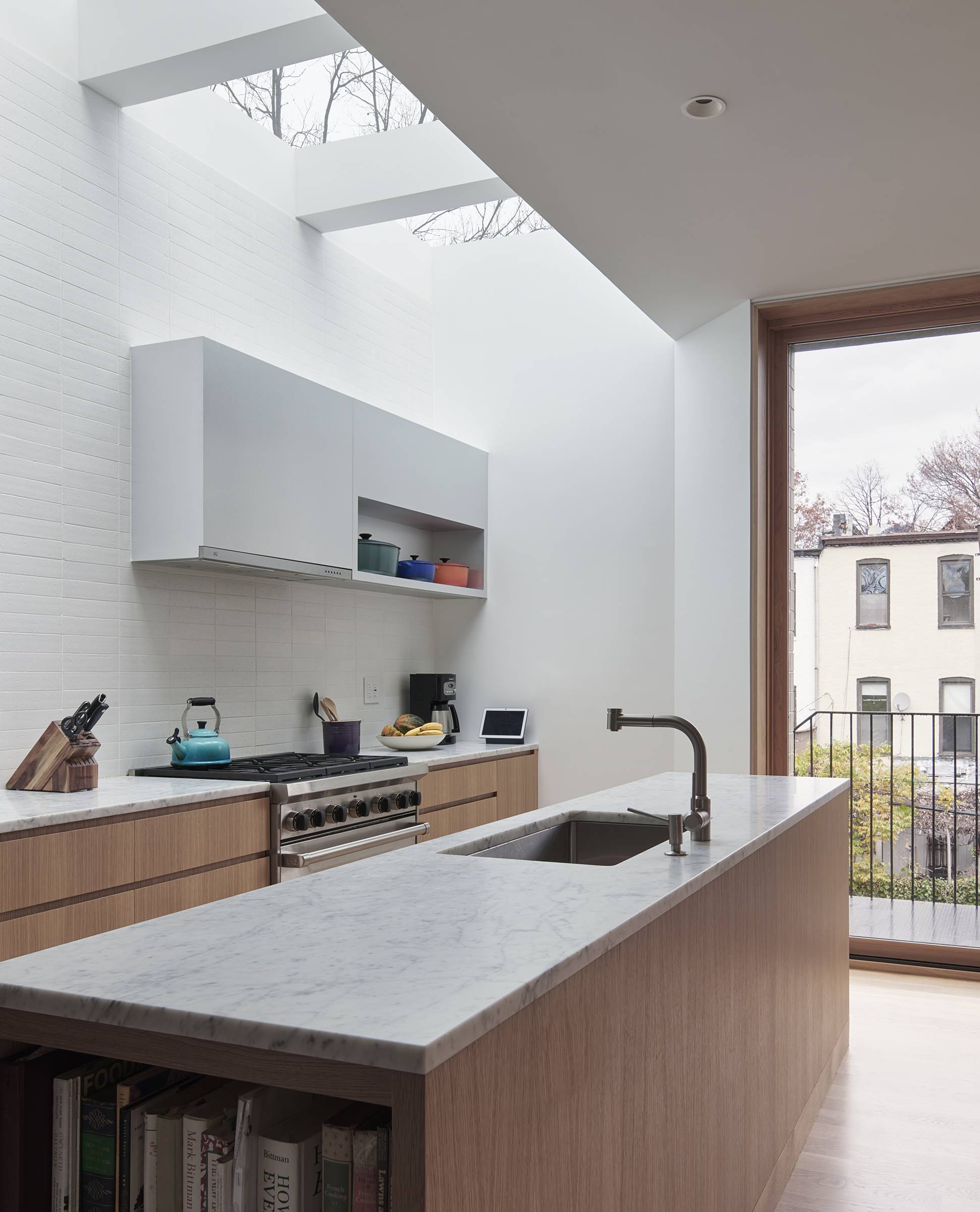
a tile backsplash extends all the way from counter to skylight. &#8\2\20;th 19
Above: A tile backsplash extends all the way from counter to skylight. “The wall tiles on the stove side are from Clé Tile,” says Neufeld. “It’s from their Modern Farmhouse collection. The sink is Pro Chef and the faucet is Graff.”
on the other side of the space is the dining nook and custom storage. what& 21
Above: On the other side of the space is the dining nook and custom storage. What’s behind the sleek wood doors? “A pantry, pull-out drawer storage, as well as a bar,” Neufeld says.
the built in dining bench offers the brightest space to sit in the house and ac 23
Above: The built-in dining bench offers the brightest space to sit in the house and acts as a clever hiding spot, given away only by the good-looking vent on the front. “There’s a wall-mounted hot water heater in there,” says Neufeld. “Since the kitchen is located in the addition, we needed to add heat in the space, and we didn’t want the wall heater to be visible since space was so limited in that area due to the building’s width. Radiant floor heating was also an option, but the wall heat was more cost effective.”

A Louis Poulsen pendant and Saarinen dining table complete the corner.

tucked in the back of the house on the garden level of the extension is the par 25
Above: Tucked in the back of the house on the garden level of the extension is the parents’ bedroom, with sliding glass doors to the garden.
an exterior switchback staircase allows for connection between bedroom and kitc 27
Above: An exterior switchback staircase allows for connection between bedroom and kitchen without extending the walls of the structure further into the garden.
the plans for the extension. 29
Above: The plans for the extension.

More stories of going home again:

(Visited 686 times, 1 visits today)
You need to login or register to view and manage your bookmarks.

Have a Question or Comment About This Post?

Join the conversation

v5.0