In 2009, when Antonio Martins bought his Victorian house in San Francisco’s Dogpatch, he was a new rising interior designer and his poetically named neighborhood was considered sketchy. Both have since come a long way. For Martins, who grew up in Brazil, studied hotel management in Switzerland, and worked in corporate positions internationally for Hyatt for 11 years, becoming a designer was a longstanding dream. And a second career leap: In 2001, when he was in his early thirties, he had moved to SF to study at the Academy of Art University, where he spent three years earning a degree in interior architecture and design. On graduation, he opened his own firm and the commissions started coming–which eventually led to the purchase of his own home.
When Martins bought his house, he was only its second owner and it had been largely–blessedly, he says–untouched but was in bad repair. He tackled the kitchen straight away, and five years later, with a very different budget and requirements (cue the romantic music), had another go at it. Here are the kitchen’s three lives to date.
Photography courtesy of Antonio Martins Interior Design.
Phase 1
Above: A classic SF Victorian, the house was built at the turn-of-the-19th century when Dogpatch was being settled by European immigrants, many of whom found work at the nearby American Can Factory. (The garage, by the way, was added likely in the 1930s.)

Above: The previous owner was born at home in the 1920s, worked at the can factory, and walked home every day to cook for her two sons on her 1948 O’Keefe & Merritt stove (Antonio learned this from his stove repairman). A niece inherited the structure and Martins bought it from her in 2009, when he snapped these shots. Note the opening in the wall to the left of range–it’s an old-fashioned pass-through to the dining room (on the other side, there’s a built-in china cabinet with glass doors).

Above: The kitchen–approximately 350 square feet with 12-foot ceilings, a beat-up floor, and beadboard paneling–had been last updated around when the stove was installed.
Phase 2

Above: “The first renovation was fast, inexpensive, and to the point,” says Martins, who estimates he spent $5,000 total. “I wanted a kitchen that would be my style–i.e. someone who does not cook and only has Diet Cokes and yogurt in the fridge. Accordingly, the old stove stayed in place, the only refrigerator was a mini bar from Costco, the cabinets were made out of industrial restaurant tables, and there was no dishwasher.”
He created the center island from another industrial restaurant table–remember, he was once in hospitality–outfitted the lower shelves with baskets from World Market, and installed custom cold-rolled steel shelves to hold essentials. As for the the old pass-through, Martins enlarged it to hold storage shelves partially concealed with a steel-framed barn door. The chandelier, Droog’s 85 Lamps, came out of his previous quarters and, he points out, is in the collection at SFMoMA. The wood floor was resuscitated and stained ebony.

Above: One of Martins’ projects for Hyatt took him to Mendoza, Argentina, which is where these framed photos by Rocca were taken.
Phase 3
Above: Fast-forward five years: Martins, now sharing the house with his partner, Cris, who likes to cook and entertain, decided it was time to upgrade and fully stock the kitchen.
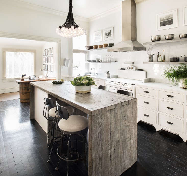
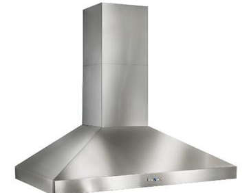
This time, working with a budget in the vicinity of $50,000, he introduced a custom island and cabinets by Fabian’s Fine Furniture. The old stove stayed–he bought a similar model on Craigslist and used the parts to have his fixed; “now it works like a Swiss watch”–and paired it with a Best Stainless Steel Chimney Hood and a wall of subway tiles from Floorcraft. (Get installation ideas in our Subway Tile Pattern Glossary.)

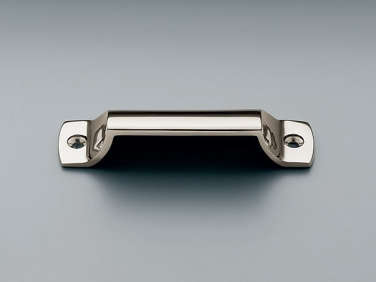
Above: The two cabinets that flank the stove were modeled after classic Victorian chests of drawers; they’re stained oak topped with Carrara marble and fitted with oil-rubbed bronze Duluth Pulls from Restoration Hardware. The new inset sink is by Blanco.

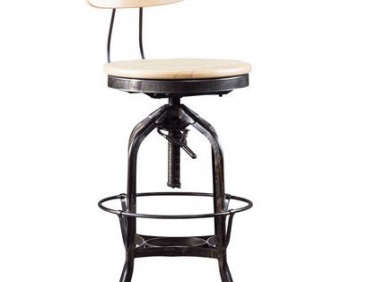
Above: The chandelier was given a second life as were the steel shelves and barn door storage. Built from reclaimed Douglas fir, the island has inset panels of birch ply to conceal two new under-the-counter refrigerator units. And there’s a Bosch dishwasher next to the stove. Complete with four Plywood Bar Stools from H.D. Buttercup (in a Holly Hunt linen), the kitchen is now fully put to use. “Love changes everything,” says Martins.
See the rest of the house at A Brazilian in San Francisco and take a look at a Martins-remodeled Sonoma cottage in Designer Visit. See more of his work at Antonio Martins Interior Design.



Have a Question or Comment About This Post?
Join the conversation (1)