In their remodel of a “dark and unpleasant inner-city terrace house” in a Sydney suburb, architecture firm Benn + Penna introduced a kitchen addition that blurs the lines between indoors and out. Sliding glass doors—and some architectural magic—enable the territories to merge, and weather-resistant materials allow for a counter that extends all the way from cooktop to integrated open-air grill.
Photography courtesy of Benn + Penna Architecture.
Above: “The mandate was to turn the structure into a home of abundant natural light and well-proportioned spaces,” say the architects. “Our strategy revolved around the insertion of a delicate steel staircase that the kitchen grows out of. We treat the kitchen as a core space by placing it between two of the main light sources, the rear courtyard and the stairwell. Its seamless connection to the living room and courtyard on either side provides a sense that these spaces are an extension of the kitchen.”
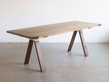
Above: Custom cabinets of limed oak with Dekton counters run uninterruptedly from indoors to out. The floor is also limed oak that shifts to concrete tiles. The fridge and pantry are concealed in full-height cabinets next to the “kitchen bench.” Henry Wilson’s A-Joint Table anchors the long, narrow space and can easily be moved into the courtyard; see more of Wilson’s work in A Designer on the Up from Down Under.

Above: Dekton by Consentino is a new counter and backsplash option composed, according to the company, of “raw materials used in the glass, porcelanic, and quartz surfaces production,” and well suited to indoor-outdoor applications: hard-wearing, heat-resistant, and impervious to stains. The limed-oak cabinets have stainless steel hardware from Madinoz. The paneled ceiling is painted wood.
Above: A sliding glass door with an oxidized white aluminum frame offers the option of barrier-free living. It can also be fully shut thanks to a sleight-of-hand design: “The first outdoor cabinet folds back outwards, and the top panel is removable to close the doors completely when needed,” explains architect Sean Tran of Benn + Penna.
Admiring the faucet? See High/Low Black Kitchen Faucet and 10 Easy Pieces: Architects’ Go-To Modern Faucets.
Above: The courtyard’s textural wall of hexagonal tiles is more than decorative: “The tiles are there to reflect northern light into the house,” says Tran.
Take a look at some more plein-air cooking setups:
- Beyond the Barbecue: 15 Modern Outdoor Kitchens
- The Ultimate Indoor-Outdoor Kitchen in East London
- And on Gardenista, 10 Easy Pieces: Outdoor Kitchen Workstations


Have a Question or Comment About This Post?
Join the conversation (0)