Icon - Arrow LeftAn icon we use to indicate a rightwards action. Icon - Arrow RightAn icon we use to indicate a leftwards action. Icon - External LinkAn icon we use to indicate a button link is external. Icon - MessageThe icon we use to represent an email action. Icon - Down ChevronUsed to indicate a dropdown. Icon - CloseUsed to indicate a close action. Icon - Dropdown ArrowUsed to indicate a dropdown. Icon - Location PinUsed to showcase a location on a map. Icon - Zoom OutUsed to indicate a zoom out action on a map. Icon - Zoom InUsed to indicate a zoom in action on a map. Icon - SearchUsed to indicate a search action. Icon - EmailUsed to indicate an emai action. Icon - FacebookFacebooks brand mark for use in social sharing icons. flipboard Icon - InstagramInstagrams brand mark for use in social sharing icons. Icon - PinterestPinterests brand mark for use in social sharing icons. Icon - TwitterTwitters brand mark for use in social sharing icons. Icon - Check MarkA check mark for checkbox buttons.
You are reading

Kitchen of the Week: A Backyard Kitchen in Berkeley, Ceramics Included

Search

Kitchen of the Week: A Backyard Kitchen in Berkeley, Ceramics Included

September 13, 2018

We like the formula that photographers and stylists apply to their own kitchens: simple, trend-proof bones, plus ad hoc lighting, stacks of ceramics, piles of flatware, and mix-and-match fabrics and textiles to create endless variations for shoots and dinner parties alike.

Our latest favorite example? Photographer Erin Scott‘s newly completed 500-square-foot studio kitchen in her backyard garden in Berkeley, California. “The cottage was formerly part garage/part office/part toolshed,” Scott says. Together with her best friend, Abigail Turin of architecture firm Kallosturin, she “opened up the space completely to make it into a flexible and malleable shooting space with tons of sparkling natural light.” Those who want versatile kitchens where collections take center stage, take note.

Photography courtesy of Erin Scott.

a doorway leads from the garden into the open, one room space. 17
Above: A doorway leads from the garden into the open, one-room space.

“Because of Berkeley’s rigid building regulations, we didn’t change the footprint of the cottage at all, but we totally reworked the interior,” Scott says. The team—Scott, Turin, local builder Matt Hooven (who built kitchens for Alice Waters and Michael Pollan), and woodworker Rusty Dobbs of Ghostown Woodworks—started by creating a bare-bones, lightbox-type space: They filled in the lower-level garage floor with concrete to make one large, level room; knocked down most of the interior walls, opened the drop ceiling to reveal rafters, swapped the garage doors for glass-paneled French doors, and added two large skylights. The result? “All sorts of wonderful, manipulatable natural light,” Scott says.

The project took five months to complete, not counting the year it took to get the proper permissions from the city. “But the cottage is now considered its own separate dwelling with its own address, which I think is a huge plus!” Scott says.

in keeping with the idea of a flexible photo studio, the team stuck to a &# 18
Above: In keeping with the idea of a flexible photo studio, the team stuck to a “soft, chalky, tonal palette,” Scott says, with whitewashed ceiling beams, concrete floors, and interior walls painted in Benjamin Moore’s Distant Gray.
Scott fitted the windows with blackout shades to help control the light, “depending on the mood of the shoot and the time of year we’re shooting,” she says. She also made soft white linen scrims and hung them from the windows with eye hooks and brass curtain clips: a solution that is both “super flexible” and artful.

The rolling workspace was a small-world find: “I looked and looked for a great worktable and finally I found one on Etsy. It turned out that the seller, Dorset Finds, has his shop less than five miles from my house. It felt meant to be.” Scott spray-painted the legs white to fit in with the space. The stools are also from an unlikely source: “By the time I bought stools, I just didn’t want to spend any more money,” Scott says. “I ended up buying National Public Seating’s school lab stools. They’re so cheap and quite comfy. I’ve since realized I’m not the only one hip to this cheat—the local Blue Bottle Coffee uses these stools too.”

 adding to the space&#8\2\17;s endlessly changeable spirit: apart 19
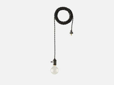
Above: Adding to the space’s endlessly changeable spirit: Apartment Plug-In Pendant lights from Schoolhouse slung around the rafters. (The team attached outlets to the ceiling beams for flexible plugging-in.)
But the space needed to be more than just a photo studio: A team of stylists cooks all of the dishes in Scott’s food shoots, so it needed to include a functioning kitchen. Though the cottage was outfitted with running water and gas, both systems had to be reworked to comply with code. The result: an efficient kitchen along one wall. “It’s a minimal kitchen, but we have everything we need,” Scott says. “And of course we can always pop into my house kitchen to grab any gear that might not be living in the studio.”

the centerpiece of the kitchen is a new cormatin range by lacanche (&#8\2\2 20
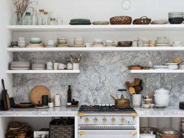
Above: The centerpiece of the kitchen is a new Cormatin range by Lacanche (“It was the first thing I ordered; the jewel of the space,” Scott says). The counters and backsplash are made of a stone called “super white” that Scott sourced from United Marble & Granite. “Funny thing: While the stone looks and feels really luxe, in reality it’s not a fancy stone at all,” Scott says. “It’s at the very low end of cost—less than Carrara, I think. It’s a workspace where I often have a big crew of stylists working with me, so it needs to be functional. And the stone backsplash was less expensive than a backsplash of basic white subway tile!”
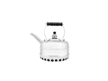
On the range: a Simplex Heritage Kettle, left to patina.

shelves are piled high with ceramics, baskets, and wooden spoons—used fo 21
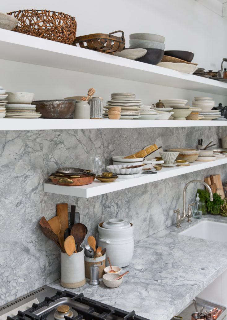
Above: Shelves are piled high with ceramics, baskets, and wooden spoons—used for cooking and for props. “Fully open shelving is an inexpensive option and is very utilitarian: I can access my extensive prop collection,” she says. Among her favorite makers: Luvhaus Ceramics, Malinda Reich, MM Clay, and Black Creek Mercantile.
on sourcing props (or adding to a tableware collection), scott says: &#8\2\ 22
Above: On sourcing props (or adding to a tableware collection), Scott says: “I don’t believe in buying too many things at once: I like an eclectic vibe and it takes time to build a soulful, personal collection. That said, I’m constantly on the lookout for props: I definitely scour antique stores and flea markets; I shop at favorite local shops like March, Perish Trust, Morningtide, Elsie Green, and Atomic Garden; and when I travel I’m always looking for goodies—I’ve picked things up in Bali, Australia, New Zealand, France, Italy, Turkey. I’m heading to Mexico this week where I imagine I’ll find a treasure or two.”

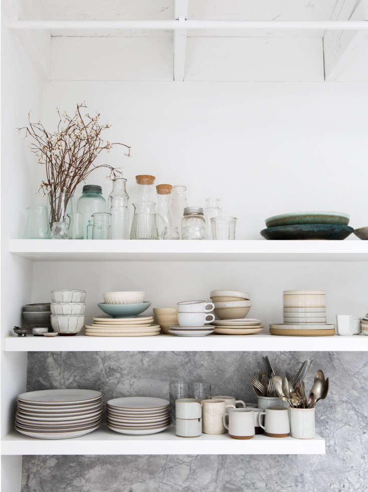
Note how Scott groups ceramics by color or material to keep shelves looking considered, not cluttered.

Above: The sink is an apron-front model by Shaw, but Turin installed it set back within the counter. The faucet is Perrin & Rowe; “it’s a nickel finish so it will take on a nice patina,” Scott says. Above the sink, ceramic canisters hold flatware.

in the corner next to the kitchen is a small &#8\2\20;cube&#8\2\2\1; th 25
Above: In the corner next to the kitchen is a small “cube” that houses the pantry (behind the door on the left) and a small bathroom (behind the door on the right). The fridge is housed in the pantry: “totally within reach but tucked away at the same time,” Scott says. An industrial rolling cart provides moveable storage.
around the corner, scott installed a simple office with a long built in desk. & 26
Above: Around the corner, Scott installed a simple office with a long built-in desk. “For my shoots, my office area can double as a second ‘kitchen space’ with different materials and vibe,” Scott says. “The raw elm desktop can look like a kitchen counter.” Looped around a ceiling beam is a vintage industrial light from England that Scott found on 1st Dibs.
more glassware and ceramics above the desk. note the little wood baskets on the 27
Above: More glassware and ceramics above the desk. Note the little wood baskets on the right: “I’m obsessed with these little boxes, but I have no idea how to get more,” Scott says. “Boulette’s Larder used to use them as takeaway containers and I treasure them. I use mine as bins for wood and brass flatware.”

Above: A shelf vignette, at left; at right; a vintage loaf pan (Scott found a few for 50 cents each at Urban Ore in Berkeley) holds mix-and-match steak knives.

glassware in earth tones, sourced from elsie green and terrain. &#8\2\20;i  30
Above: Glassware in earth tones, sourced from Elsie Green and Terrain. “I love color, but for the most part I try to keep a neutral palette for my props—I like to let the food itself bring the color to the picture, and the props are just supporting actors,” Scott says.

Despite her stacks of ceramics and props, Scott is embracing a more pared-down approach to her work these days: “I used to always use fabric to bring in softness to a shot, but now I find myself just wanting the food to be straightforward, bold, and simple. I don’t even find that flatware is always necessary anymore. A fantastic wide, low bowl is probably the most useful prop for me these days—Sarah Kersten makes my favorites. There’s something homey and welcoming about a bowl, and a low edge means the food doesn’t get lost—it has room to breathe.”

N.B.: This post is an update; the original ran on February 22, 2018.

Take a look at the home kitchens of these stylists, photographers, and chefs:

(Visited 1,721 times, 5 visits today)
You need to login or register to view and manage your bookmarks.

Product summary  

Have a Question or Comment About This Post?

Join the conversation

v5.0