Icon - Arrow LeftAn icon we use to indicate a rightwards action. Icon - Arrow RightAn icon we use to indicate a leftwards action. Icon - External LinkAn icon we use to indicate a button link is external. Icon - MessageThe icon we use to represent an email action. Icon - Down ChevronUsed to indicate a dropdown. Icon - CloseUsed to indicate a close action. Icon - Dropdown ArrowUsed to indicate a dropdown. Icon - Location PinUsed to showcase a location on a map. Icon - Zoom OutUsed to indicate a zoom out action on a map. Icon - Zoom InUsed to indicate a zoom in action on a map. Icon - SearchUsed to indicate a search action. Icon - EmailUsed to indicate an emai action. Icon - FacebookFacebooks brand mark for use in social sharing icons. flipboard Icon - InstagramInstagrams brand mark for use in social sharing icons. Icon - PinterestPinterests brand mark for use in social sharing icons. Icon - TwitterTwitters brand mark for use in social sharing icons. Icon - Check MarkA check mark for checkbox buttons.
You are reading

Kitchen of the Week: A Something Old, Something New Kitchen in Brooklyn

Search

Kitchen of the Week: A Something Old, Something New Kitchen in Brooklyn

April 5, 2018

The back parlor of this 19th-century Brooklyn townhouse was converted into a small kitchen a while back. Its new owners, a couple with a young son, loved its original features, especially the stone mantel and 10-foot pocket doors, but otherwise wanted a clean slate. Their architect, Shauna McManus, was given the challenge of preserving the old parlor look while fitting in a lot of hardworking elements, a dining table included, into approximately 325 square feet. To get the job done, she collaborated with kitchen systems masters Henrybuilt.

Photography courtesy of Henrybuilt.

 &#8\2\20;we wanted the kitchen to be ‘inserted’ into th 17
Above: “We wanted the kitchen to be ‘inserted’ into the shell of the brownstone space—to be completely different from the historic details, which we took a lot of care to preserve), but we didn’t want it to be cold or sleek,” McManus told us. Her clients regularly host foreign houseguests; they asked that the new features allow for serious cooking to go on—hence the large work island—while looking more like furniture than kitchen components. Toward that end, McManus selected teak: “It’s warm and durable but different from traditional brownstone woods.”
after considering many different floor plans, mcmanus and the henrybuilt t 18
Above: After considering many different floor plans, McManus and the Henrybuilt team slotted in the teak table at the end of the island, creating its own territory and preserving room to maneuver.

The table is one of five distinct areas that, as McManus explained, “are tightly woven into the existing footprint, and are tailored for food prep on the island, cooking at the stove, breakfast/coffee prep at the cabinet next to the fireplace, and cleanup at the main sink.”
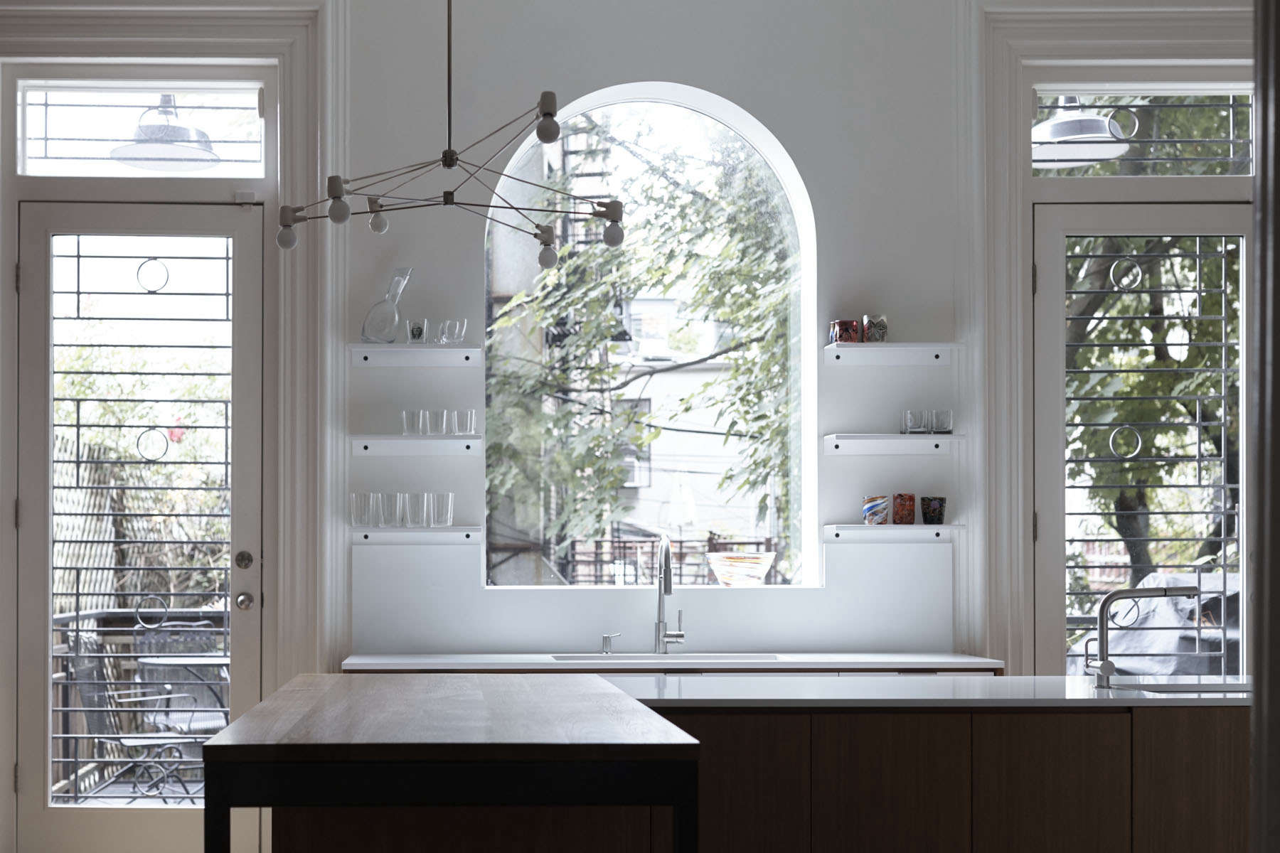
the existing arched window over the sink was opened up to create a big vie 19
Above: The existing arched window over the sink was opened up to create a big view of the garden and to bring in sunlight. It’s flanked by powder-coated steel shelves with black hardware, a Henrybuilt signature design. A Brendan Ravenhill Church light helps define the eating area.
a microwave is tucked into the coffee counter. the tall cabinet on the other si 20
Above: A microwave is tucked into the coffee counter. The tall cabinet on the other side of the mantel holds appliances, such as the blender, and pantry goods. The print over the mantel is by Shepard Fairey.

The new floor is four-foot-long rift and quartered white oak with a medium walnut stain.
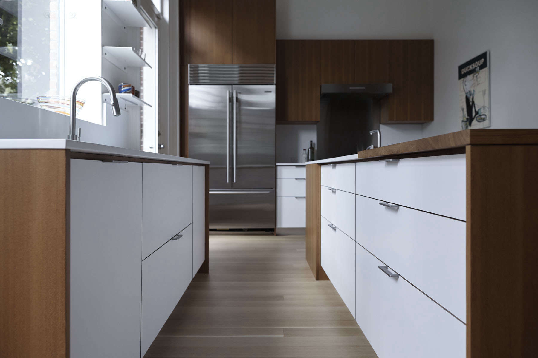
caesarstone counters and cabinet faces of high pressure, &#8\2\20;truly kid 21
Above: Caesarstone counters and cabinet faces of high-pressure, “truly kid-proof” laminate contrast with the teak. McManus chose white “to reflect more light all around.” The pulls are stainless steel (and, alas, not sold separately). The kitchen’s faucets are by Bulthaup and are paired with Julien sinks.
cabinets and drawers are kitted out for use; this one has movable dividers. 22
Above: Cabinets and drawers are kitted out for use; this one has movable dividers.
a wolf range stands at the far end of the island, which is conveniently fitted  23
Above: A Wolf range stands at the far end of the island, which is conveniently fitted with a prep sink.
shelves, leather pouches, and a small desk of walnut topped with paperston 24
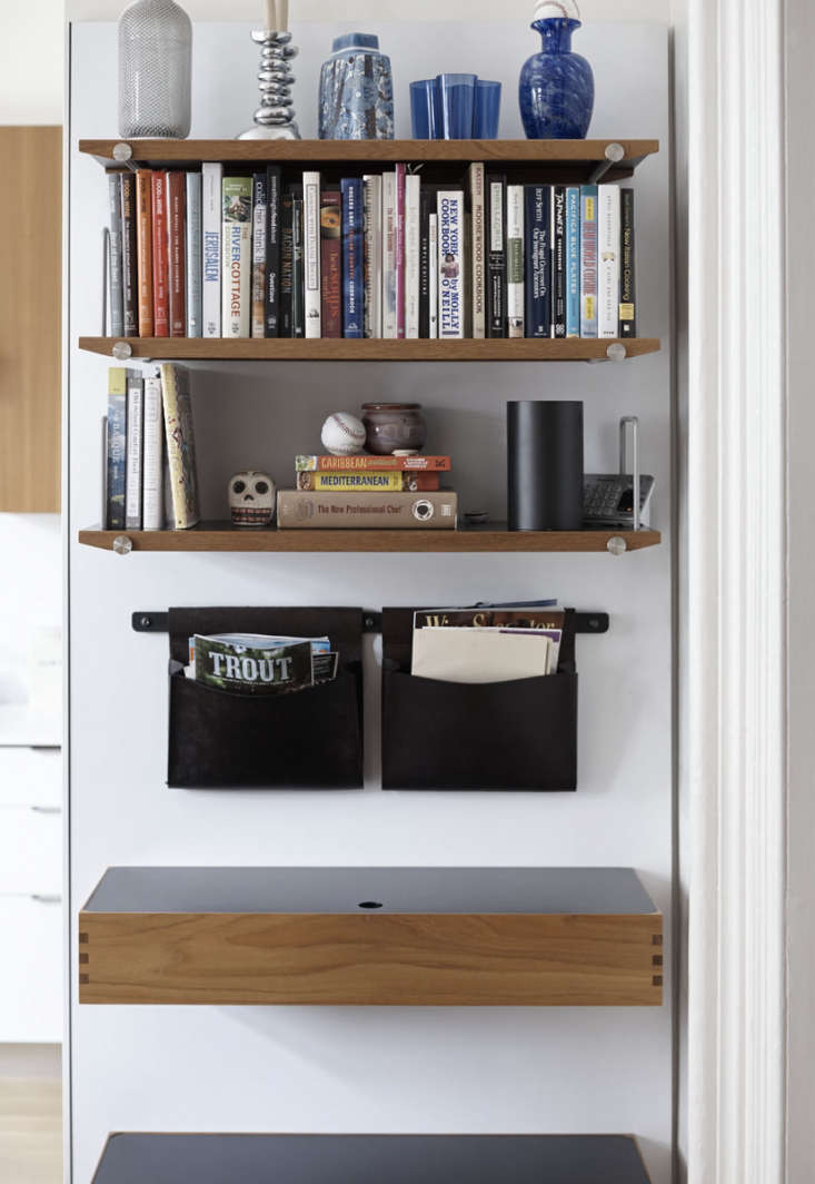
Above: Shelves, leather pouches, and a small desk of walnut topped with Paperstone create an additional zone, a family control center in the entrance to the room.
the storage components are from henrybuilt&#8\2\17;s panel based openc 25
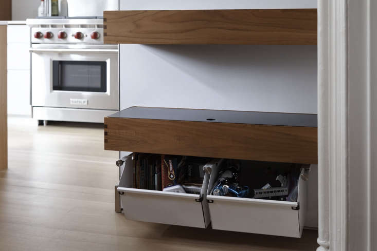
Above: The storage components are from Henrybuilt’s panel-based Opencase line, which hangs from steel rods and can be configured in a number of different ways. The lower steel bins currently serve as a toy chest.
a pair of henrybuilt opencase pouches solves the issue of where to put the 26
Above: A pair of Henrybuilt Opencase pouches solves the issue of where to put the mail.

N.B. This post is an update; the original ran on November 17, 2016.

For more on Henrybuilt, see A Storage System for the Whole House. Explore more inventive remodels in Kitchen of the Week, including:

(Visited 1,159 times, 1 visits today)
You need to login or register to view and manage your bookmarks.

Have a Question or Comment About This Post?

Join the conversation

v5.0